art // windy chien


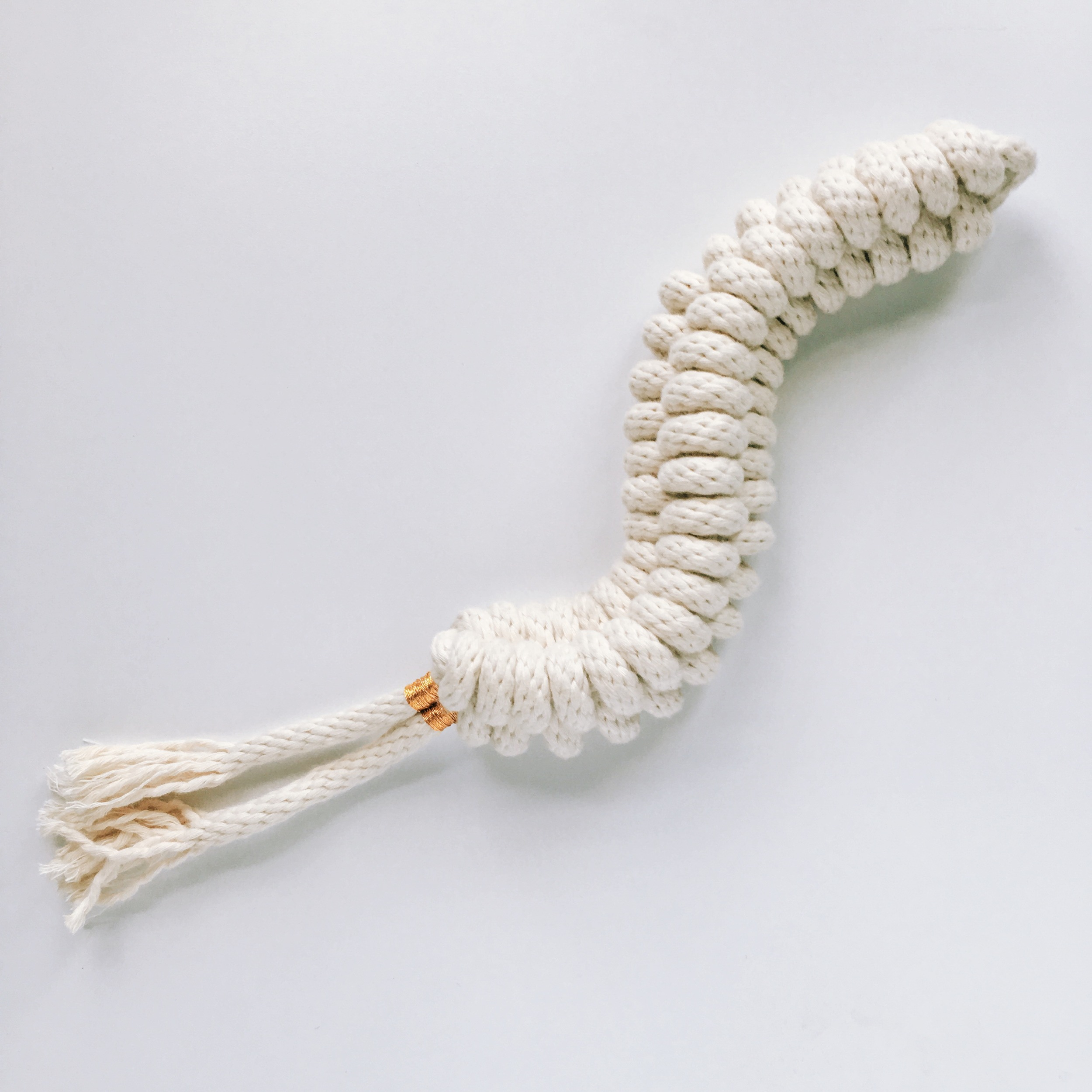
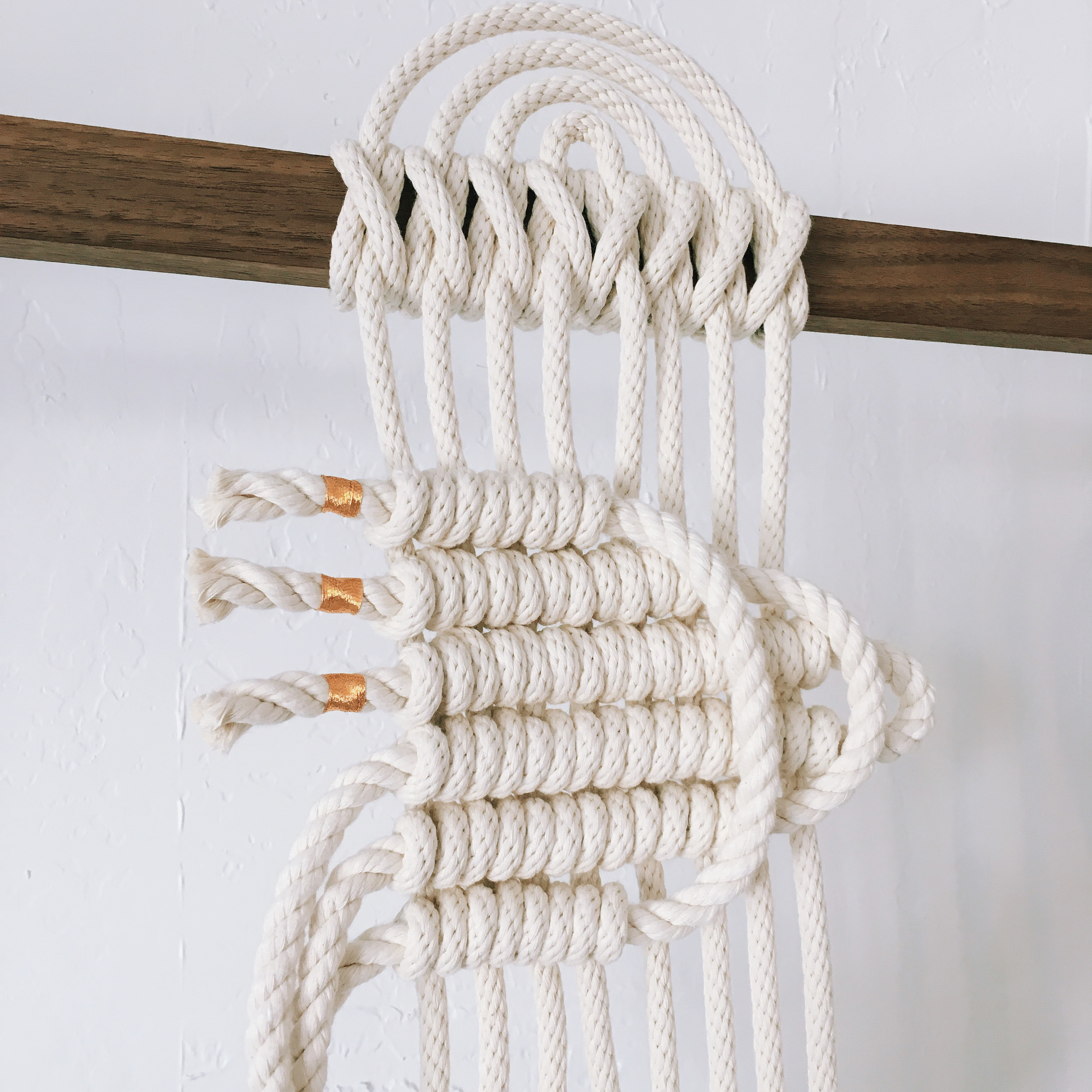
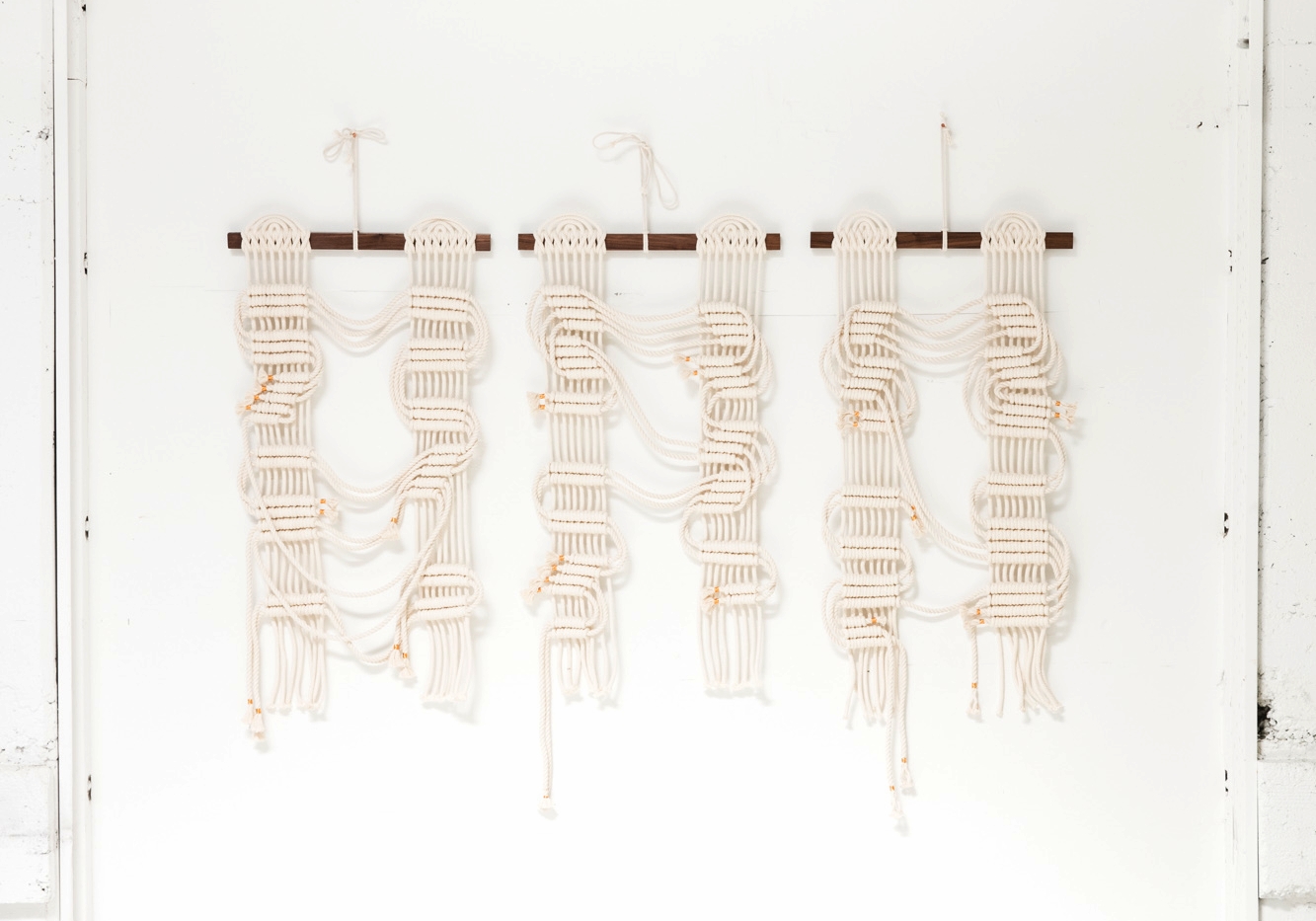
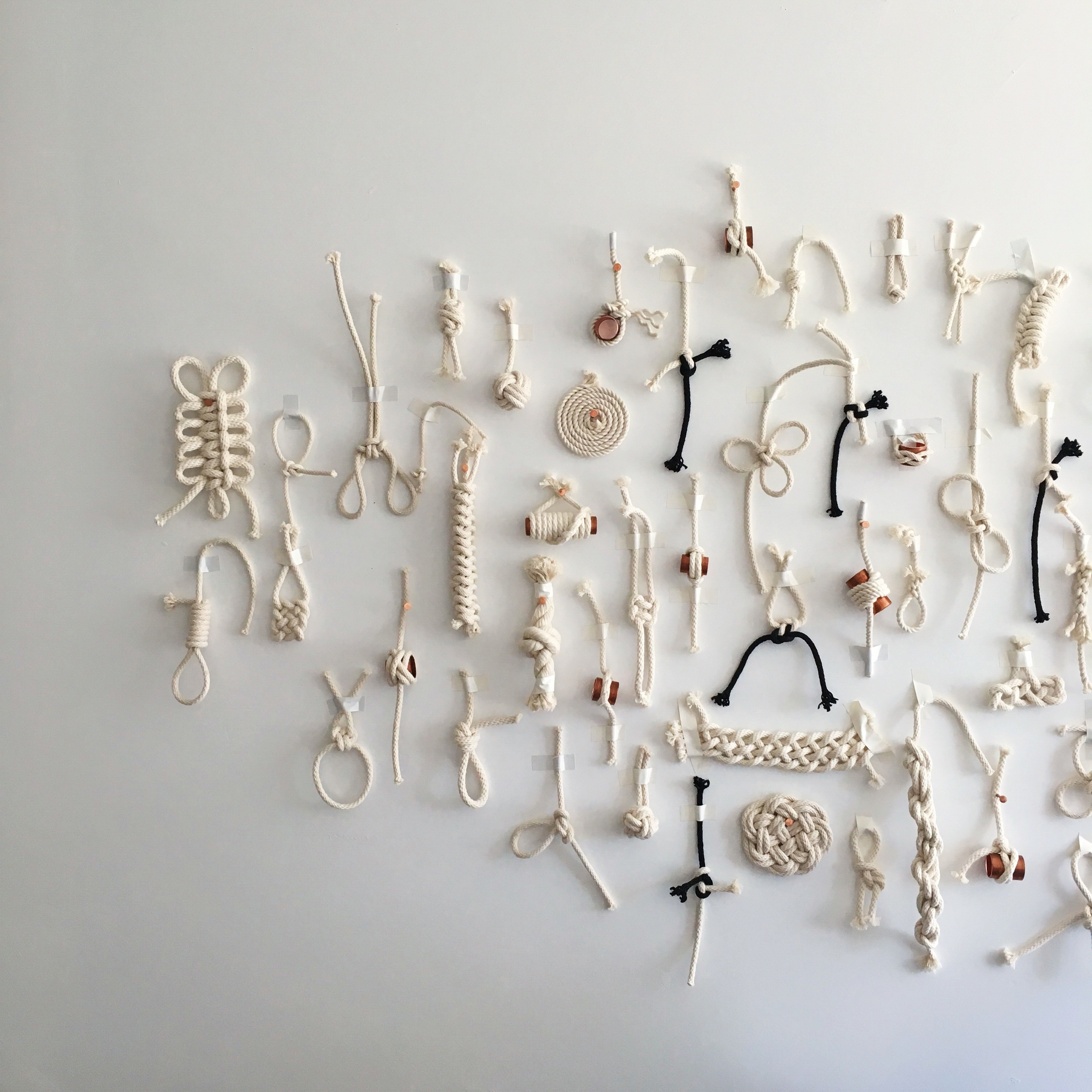
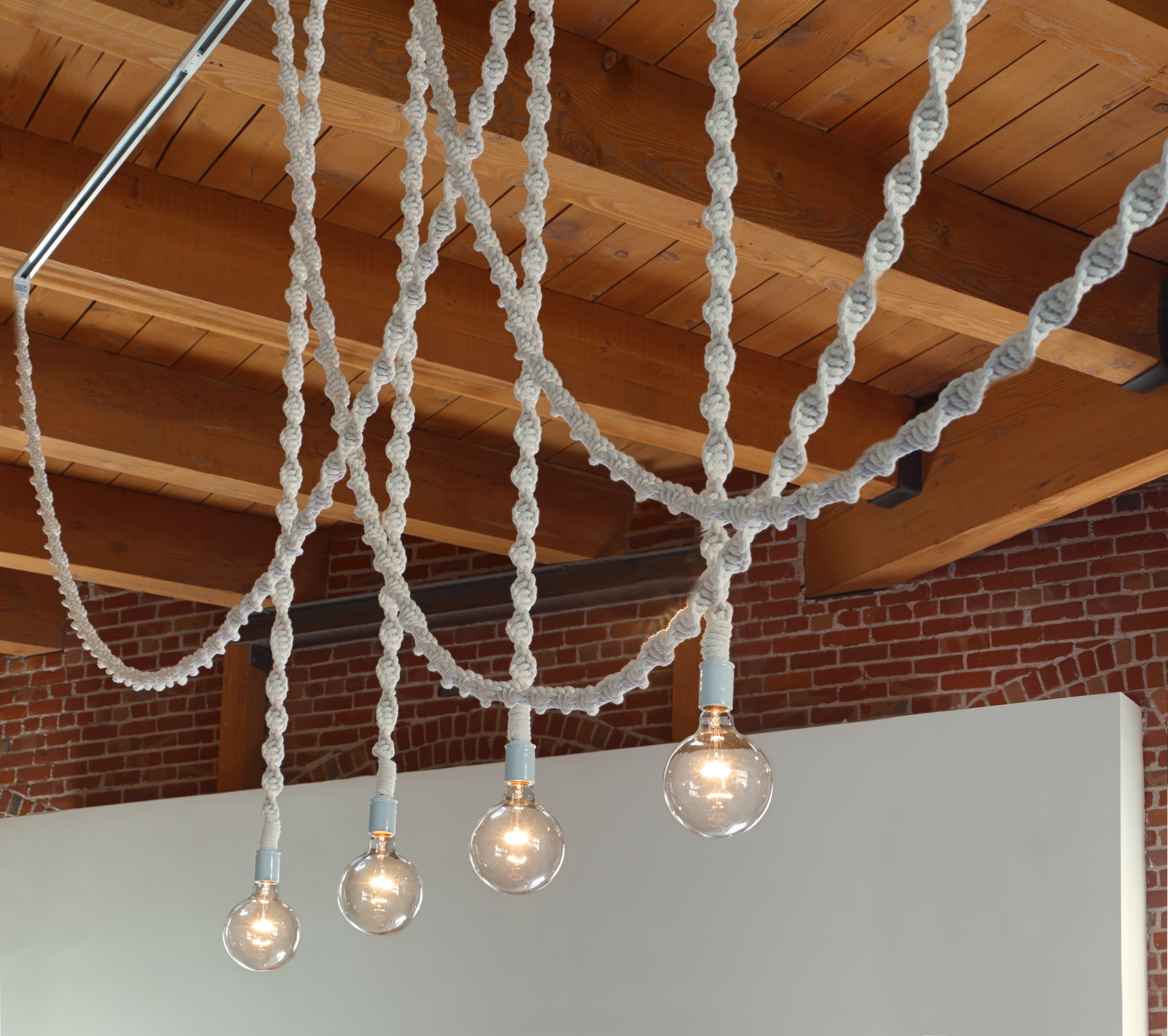
when i was in SF i had the opportunity to spend some time with artist windy chien. windy creates knot macrame work and has been doing "a new knot a day" project (she has declared 2016 a year of knots) in which she challenges herself to learn a new technique each day. windy says it's a lot like learning an entirely new language and the project has helped her improve and grow more confident in her work everyday. the medium allows her to modernize a traditional craft in a minimal, clean and new way. windy has had a unique journey -- she once owned a popular record shop and then worked for apple in the itunes department. eventually she decided to quit after wanting to get offline and create with her hands more. yet she didn't know what exactly she wanted to create, so she took a ton of classes in anything that interested her and ultimately found her chosen medium. today you can really see the bridge between technology, music and handicraft in her work, especially her pieces aptly titled "circuit boards." windy spoke a lot about the concept of giving oneself permission to leave identities behind and use past learnings to push forward and create a new "you." this concept really resonated with me. in the next few years, she plans to think bigger and create larger scale work. see more of her work here and follow her on instagram here.


art exhibit // nic rad // perennial millennial at victori + mo gallery


a few weeks back, i saw artist nic rad's latest exhibit, perennial millennial at victori + mo gallery in bushwick, brooklyn. victori + mo is quickly becoming one of my favorite galleries. every exhibit i've seen there has wowed me and i continue to love the work they show. what i liked most about nic rad's show was his clever approach to assemblage, paintings and pop-culture centric text-based artwork.

the gallery's space isn't very big and yet its gallerists, celine + ed, always make great use of it -- this time that meant showing the work in a salon style and coloring the walls with blue and yellow paint. did i mention there was even a large smiling emoji hanging from the ceiling? moreover, nic hosted a beer pong competition in the space, which i unfortunately couldn't make but it sounded quite literally rad. images and more info from the exhibit below:

perennial millennial is a a group of gestural assemblages incorporating pop culture and textual tropes rooting this series in the language and preoccupations of social media and internet culture, a through line to the unique state of the so­-called millennial generation—sometimes derisively so—who occupy a dichotomous space of anxiety and full­-throated confidence.

as seen by the invented millennial “jackson johns,” the theoretical progeny of robert rauschenberg and jasper johns within the alternative reality where such a thing might be possible, the works constitute an imaginative revival of dada image making.

as rad says, “this kind of lightly­worn hat of a persona seems very natural for anyone who had 10 screen names growing up.” expanding on rad’s fluid exploration of the rifts and frissons between the physical, textual, and digital worlds, perennial millennial conjures an expressive lexicon layered with references to corporate information design, emoji, social media, and other modern detritus from a constantly evolving and imploding contemporary visual vocabulary. shifts in scale, brusquely applied strokes and varying degrees of layering and impasto lend an immediate physicality to the works. as a dialectic about who paintings are for, and the real and invented narratives generated therein, a second, self­ reflexive commentary emerges, one which engages generational attitudes toward painting as a medium, and the self­ assurance/self­ doubt feedback loop that seems to characterize contemporary art. as a deconstruction of the built associations of recognizable imagery, they distill the aggressive momentum and anxiety of the information age.

* see more of nic's work here *


art exhibit // tangerine dream collective // galerie pangée, montreal


to my delight, my delicatessen collaborator, sarah osborne, was also showing work in another exhibit during our pop-up/my montreal stay called tangerine dream collective. it took place at montreal's galerie pangée and featured work by sarah plus two of her friends, joani tremblay and elise windsor. the exhibit was playful, colorful, bright and fun. although the three girls have diverse styles, their artworks complemented each other well and i most definitely wanted to buy all of it. see pictures and more info below:

the tangerine dream collective is composed of artists sarah osborne, joani tremblay and elise windsor. with a young and contemporary vision,  the collective plays with simple and bold forms as well as large-scale installations composed of several works on paper seen and presented as objects. what influences this collective the most are flora, architecture and the world of art, as well as their status as women. for the occasion of this exhibit, the gallery was transformed into  a living sculpture in the form of an installation using pop colors and mixing paintings, drawings, photographs, objects, plants, shelves and other sculptural devices. works on paper became objects displayed as in a showcase window such as to question the relationship between staging and curation.

more images of the work can be found on artsy here.


art // women words, phrases, and stories: 1,000 paintings by betty tompkins // flag art foundation


one of my latest, favorite exhibits just closed: women words, phrases and stories: 1,000 paintings by betty tompkins at the flag foundation. there the walls were full of various sized paintings covered in words that describe women. i felt a lot of synergy with the artist and her process as she is at heart a collaborator. i even had the chance to attend a special event in the exhibition space, where betty allowed women from all backgrounds to get up in front of the group and read out the words on the walls. it was empowering and magical. 

more about this exhibit below (from the flag website):

in 2002 and 2013, tompkins circulated the following email: “i am considering doing another series of pieces using images of women comprised of words.  i would appreciate your help in developing the vocabulary.  please send me a list of words that describe women.  they can be affectionate (honey), pejorative (bitch), slang, descriptive, etc. the words don’t have to be in english but i need as accurate a translation as possible. many, many thanks, betty tompkins.” the response was overwhelming, with over 3,500 words and phrases in seven languages submitted, equally split between men and women. in 2012, tompkins was invited to create a performance in vienna where 500 of the words and phrases were read aloud. inspired by that performance, the artist then set out to create 1,000 individual word paintings, intending the series to be presented en masse once complete. on january 1, 2013, tompkins created the first painting slut (#1).

throughout women words, tompkins layers stenciled, freehand drawn, and pressed-on text over imagery, which includes lace overlays, gauzy close-ups of the female body, and a sampling of styles from what the artist refers to as the “old-boy painting” network – de kooning, fontana, guston, morris louis, newman, pollock, and richter.  derogatory, reductive, and dismissive language such as venus, piece of ass, and the only thing that would make her more beautiful is my dick in her mouth, seem to reveal that women are often still viewed through the lens of desire or reproach. is such language the result of love, fear, control, or anger? tompkins does not offer answers, presenting women words in the same straightforward and non-judgmental approach as her renowned fuck paintings.

tompkins’s oeuvre has never demurred from provocative subject matter; the artist’s ongoing fuck paintings (1969-1974; reprised in 2003) center on tightly cropped photorealistic images of sexual intercourse. according to the artist, “my first husband had this great collection of porn and i was looking at it one day and thought: if you take out the heads and legs—all this boring stuff—and get down to the money shot, this is beautiful…really formally beautiful.” highly sexualized imagery and language have since become ubiquitous in mainstream culture and have shifted the context and reaction surrounding the fuck paintings, once dismissed as too explicit and because of tompkins’s position as a female artist with a sex-positive attitude. it wasn’t until the paintings’ presentation at the lyon biennale in 2003, that the work received an extraordinary reception and established tompkins at the forefront of first generation feminist art.

* photos are by genevieve hanson, nyc -- all images are copyrighted by betty tompkins


art // heather garland 'love is like a butterfly' // at honey ramka


a few weeks ago i saw the below image of a palm tree painted on a ceramic spoon on instagram and freaked out (i'm obsessed with all things tropical and palm tree related, go figure cultureisland). the piece is by heather garland and her exhibit love is like a butterfly is currently showing at honey ramka gallery in bushwick, brooklyn until april 3rd. heather reinterprets found objects that are typically banal, adding paint, fringe, pearls, lace and fabric to make them new. she collects plates from the street, junk store, and from friends and takes them back to the studio. heather says, "sometimes i know exactly what will happen when i am in the shop; i know what intervention will happen when i start to paint. other times the plates sit around for years, waiting." this idea resonated me, since i'm an inspiration hoarder myself. i collect pages from magazines, art cards, images on tumblr/instagram plus words and phrases i see everywhere. i am constantly trying to figure out how i can use these hoardings in my work or save the ideas for later. about her plates, heather explains, "i am interested in things sounding or looking so sweet it almost hurts. i am interested in different conceptions of love and domesticity. in the sweetness of domestic life there can also be darkness and mystery." indeed, heather's plates are so sweet it hurts, plus i love the clever names of her pieces.

heather garland // florida // 2016 // oil and glitter on found ceramic spoon rest // 9.5” x 4” x 1.5”

heather garland // florida // 2016 // oil and glitter on found ceramic spoon rest // 9.5” x 4” x 1.5”

heather garland // rainbow brite iud // 2016 // oil and fringe on broken found ceramic platter // 10” x 10”

heather garland // rainbow brite iud // 2016 // oil and fringe on broken found ceramic platter // 10” x 10”

heather garland // pearl harbor // 2016 // oil and pearl necklace on found ceramic bowl // 9” x 9” x 3”

heather garland // pearl harbor // 2016 // oil and pearl necklace on found ceramic bowl // 9” x 9” x 3”

heather garland // something blue // 2016 // ralph lauren sampler under found glass dish // 10” x 4.25”

heather garland // something blue // 2016 // ralph lauren sampler under found glass dish // 10” x 4.25”

heather garland // courting // 2016 // oil on found ceramic plate with 22k gold // 6” x 6”

heather garland // courting // 2016 // oil on found ceramic plate with 22k gold // 6” x 6”

heather garland // standing in the doorway // 2016 // oil and on found ceramic plate with faux fur coat // 33” x 21” x 5”

heather garland // standing in the doorway // 2016 // oil and on found ceramic plate with faux fur coat // 33” x 21” x 5”

heather garland // father and son // 2016 // lace applique on found ceramic plate // 10.5” x 10.5”

heather garland // father and son // 2016 // lace applique on found ceramic plate // 10.5” x 10.5”

heather garland // grandma’s courting dress // 2016 // found ceramic plate with handkerchief // 8.5” x 8.5”

heather garland // grandma’s courting dress // 2016 // found ceramic plate with handkerchief // 8.5” x 8.5”

heather garland // inner strength // 2015 // oil and gorilla glue with plate hanger on found ceramic plate // 9” x 9”

heather garland // inner strength // 2015 // oil and gorilla glue with plate hanger on found ceramic plate // 9” x 9”


art // collages by giulia bernardi


my friend giulia first found me on instagram. she reached out over email and we became instant friends, irl. giulia lives in milan but spent time in new york this past summer. i introduced her to some of my friends and showed her aspects of my life in new york. then last fall, i had the incredible opportunity of visiting giulia in italy. i spent time with her family and friends and she showed me aspects of her life in milan. giulia is now one of my e-galpals. we keep in touch through the interwebs and share aspects of our lives from afar.

giulia is a trend researcher and a collage maker too, so we have a lot of shared interests and passions. she also does social media for nou magazine. here, she shares about her recent collages, which you can also find here.

giulia bernardi: i like spontaneous art. i'm fascinated by images of daily life. it’s at the heart of everything i do. it's my main inspiration. i like to observe what happens around me. i like to see and watch people as way to find new ideas to understand what's going on around me. my favorite spot to do research is at the bar or coffee shop. drink a coffee and watch what happens around me.

i see my collage work as an act of research. i put all the images together and change their meaning and context. i like to tell stories with my collages. they are realistic. i don't like surrealism. life is true. my work is me, 100%. it's the only place where i'm honest and have full self-confidence. i use collage as a way to calm myself down, to help me realize what's going on in my life and to talk about my current or latest obsessions. i use collage to heal from what has hurt me. making a collage helps me fully realize and work through periods of my life.

i like images of daily life. i like to mix fashion photos with documentary photos and snapshots. i really like documentary photos. i like blurred and faded photos. i like photos taken with old cameras. i want to learn how to make good photos so i can use them in my collages but i don't have that skill right now. instead, i would like to think of myself as a collector of images. when you don't know how to make something, you have to work with what you got. i’m good at collecting images and researching things. collage allows me to use those skills and make something with it.

some of these collages are inspired by a guy i fell in love with, but he's not into to me anymore. it sounds cheesy, i know. but after a lot of tears, i was able to turn my pain into something positive. sometimes i feel like i wasted a lot of time on him, so some of the collages are inspired by that feeling. others are inspired by my experience and love for travel. ulysses and penelope are my favorites characters from when i was a child. i created scrapbook for nou magazine inspired by them, seeing penelope as a woman who doesn't wait around for ulysses at home, instead she is a woman who is out and about, experiencing the world while also trying to find herself. but, you know, more discover new things and more you don't want to bring you back your past! in some of my other collages, there isn't really a specific idea behind them. instead they are simply striking images with words that i heard in a song or read somewhere. words are really important to my collage making process. other collages are pages from scrapbooks i made during school when i was studying fashion design, showing the creative process of making a fashion collection.

i look for images on the internet and don't stop searching until i find what i want. then i print the images or scan images from magazines or books. i hate to ruin and cut images from magazines or books, even if it's the crap/worst magazine in the world. for me, printed periodicals are sacred! also i use found images and scraps collected from my travels, or from my daily life. i like objects that represent a sort of memory. i love old memories. also i used some digital elements thanks to photoshop or illustrator or indesign...it depends! 


art // drake ghosts by anthony hawley


my friend/amazing artist anthony hawley has been making some awesome daily drawings inspired by drake's recent hotline bling video.

anthony on this inspiration: "it’s a really catchy song; like i’ve listened to it dozens of times, but it’s such a weird and bizarre music video. think about what the video would look like without the turrell-inspired spaces. it would essentially consist of a good-looking drake sitting on steps, posing, and dancing around by himself; good-looking women posing on stairs and moving in slow motion; then drake and one of his female dancers joining forces to do some synchronized moves together. the turrell-inspired spaces are beautiful, a little ufo-like and provide an amazing glow of color, but at the same time there’s really no reason whatsoever that the turrell spaces are there. half the video looks like an itunes add circa 2004 and half of it creates this sense of space that’s reminiscent of the original tron or star wars. i keep thinking that those slow motion pan-outs by the camera are going to expose drake as a tiny player in a giant video game or that the millennium falcon is going to appear, caught in the death star’s tractor beam, and plow down drake. by far, the most interesting parts are drake’s hand motions and movements. they’re glorious! in all my drawings drake has six fingers on each hand.
 
i liked the idea of doing a series of small drawings where drake and turrell kind of haunt each other and meld. the drawings use an existing set of imagery from other small drawings of mine and expand on it. the little ghostesses seemed to fit the zeitgeist of the music video. i mean why wouldn’t you make drawings of drake and turrell turning into ghosts?
 
i’ve always been a bit obsessive with my listening. like i just get obsessed with a sound, a mood, or a theme in a certain song or album and i can’t stop listening to whatever it is. and there’s not really a logic—it ranges from oneohitrix point never to mozart string quintets to demi lovato. i don’t necessarily love demi lovato or anything about her, but last friday i think i listened to “cool for the summer” all day non-stop without any breaks or anything in-between. i think that i’ve been like this since i started listening to pop music when i was six or seven, sitting by the stereo recording different top 20 hits with cassettes at the end of each year. sometimes it’s not even an artist i love; it’s just a sound, a synthesizer, or an explosive moment, you know? then this all feeds into my daily practice and art.
 
there’s a link between the obsessive listening and the daily practice that i’m just now becoming aware of—the doing something over and over to get to a feeling or idea without thinking too hard about it."

check out his drawings and purchase them here on his site!


art // flowers by irving penn


i was very excited to see a few of irving penn's photographs from his flower series, circa the 1960s, at the gucci museum in florence a few weeks ago. i love how their stark contrast highlights each flower's more unusual beauty; penn injected some deep emotion into these blossoms, showing their darker side. i'm really into older studio shots lately. i also bought a few vintage books in italy i will share here very soon.

art // purse curse by suellen rocca // 1968

saw this work last friday at the what nerve! alternative figures in american art, 1960 to the present exhibit at matthew marks gallery in chelsea. i love how rocca took a handbag and made it an art piece. the work was created during a period of rocca's life in which she took a break from art-making; instead the piece was part of what she considered her autobiography. i previously interned in handbag design at coach and it's interesting to consider this artful handbag and those that coach made around this time. then, bonnie cashin was the creative director; she was known for creating some of the first colored leather bags as well as the use of industrial hardware in accessories.

purse curse // suellen rocca // 1968 // oil on plastic purse // img via hyperalleric

purse curse // suellen rocca // 1968 // oil on plastic purse // img via hyperalleric

art // inspiration // kueng caputo // sand chairs


kueng caputo // sand chairs

kueng caputo // sand chairs

last night at the spring masters new york art fair, i saw these awesome sand chairs by kueng caputo from salon 94. i love how the artists have taken a common object, a stool, and transformed it into an abstracted and colorful work of art.

more about the work: "the sand chair series by young swiss-born design collaborative kueng caputo are scupltural, colorful furniture. the works are made from cut blocks of styrofoam cast with a mixture of sand, mortar and colored pigments. the unique all-purpose pieces are functional stools or side tables that can be used indoors or outdoors.

sara kueng and lovis caputo have worked together since they were both students of design at the hgkz zurich from 2004 to 2008. their design practice emphasizes color and the handmade, understatement and improvisation."

kueng caputo // sand chairs

kueng caputo // sand chairs


small talk // lyrical imagery by graphic designer wes niven


back when i worked for converse, we started an employee art exhibition program called art / work. the idea was to give our employees, in whatever job they were in, the chance to exhibit their art around the office for a month. i'm happy to hear from my friends still there that the exhibition program is going strong. last month, my friend and converse graphic designer wes niven showed some killer prints titled "lyrical imagery." more about wes + his art below:

cultureisland: tell us more about you.

wes niven: i was born in toronto, canada. i grew up around a creative setting at home and was exposed to the art world from a young age. i developed a comfort around studios, galleries and hands-on workshops. i got into skateboarding and underground comics around age 9 or 10. but i think once i discovered music everything was different. high school was kinda crazy for me, but a lot of development came out of all that turbulence. at that point i was deep into painting graffiti and making music with my friends, which lead me to look out west and move to calgary where i attended the alberta college of art and design. i graduated with a bachelors of design and earned a scholarship to do a 1 year design program at sva in nyc. right now, i work full-time at converse as a graphic designer.


wes niven // flyer for lyrical imagery // 2015

wes niven // flyer for lyrical imagery // 2015

cultureisland: what is your artistic process?

wes niven: recently i've been messing around with motion graphics, doing some freelance artwork, sketching out a few tattoo designs.

wes niven // "the world is yours" by nas << click for music video

wes niven // "the world is yours" by nas << click for music video

cultureisland: tell us more about lyrical imagery.

wes niven: lyrical imagery is a series of band posters and compositions that visually examine the lyrics from a personal selection of some of my favorite songs at the moment. the prints are presented as arrangements existing somewhere on the border between illustration, typography, design and graffiti. the music i listen to while i'm working is what informed the idea, so consequently i was inspired by the lyrics and melodies to start drawing these images as they generated in my head. all the artwork was hand painted or screen printed onto various colors / stocks of paper using textile ink, acrylic paint, sumi ink and krink markers.

wes niven // "get no better" by clear soul forces &lt;&lt; click for music video

wes niven // "get no better" by clear soul forces << click for music video

cultureisland: where do you find inspiration? who are some of your favorite artists?

wes niven: sometimes just walking around the city does it for me. i'm snapping photos and taking notes with my phone all the time it's crazy. i take inspiration from music, movies, books, zines, the internet, friends/co-workers... i keep a hard drive of this big archive of reference material and my own work i've been putting together for a while. it helps me get ideas when i start a new project. as for favorite artists... jean michel basquiat. i saw his paintings up close in new orleans and they were dope. i really like barbara kruger's work too. definitely into some of the old greats: da vinci, michelangelo, van gogh, monet, the list goes on. lately, i'm pretty into 123-klan from montreal, canada. very stoked on the work they're putting out.

wes niven // "the one feat. t3 from slum village" by onra &lt;&lt; click for music video (i had to take this one home)

wes niven // "the one feat. t3 from slum village" by onra << click for music video (i had to take this one home)

cultureisland: what are you listening to right now?

wes niven: just everything really. lately i go on soundcloud and listen to mixes, whatever is good that day, doesn't matter. i can't stay on the same genre too long. most played lately though: the doors greatest hits, breakbot, mf doom, childish gambino, tupac, nirvana, massive attack and those majestic casual mixes on youtube.

wes niven // "bring da ruckus" by wu tang clan &lt;&lt; click for music video

wes niven // "bring da ruckus" by wu tang clan << click for music video

check out more of wes's work on his site and follow him on instagram here.


curatorial // art + other stories from 2014


looking back, i traveled a lot more than usual last year. in each unique place, i collected memories of people met, food eaten, stores discovered and art seen just like they were souvenirs. i was actually in stockholm when i decided to start this site. i realized i wanted a way to document my journey to find inspiration wherever i may be; whether it's the color of the restrooms in the antwerp train station or misspelled signs on the streets of new york, i try to savor every second as if it is a unique visual happening worth acknowledging (and often instagramming).

for awhile now, i've been wanting to post a collection of art i saw last year through out my travels. selecting which works to post was the hardest part of the process but in doing so, i realized all of my favorite pieces were from new york. last year, i considered leaving nyc. and some day i will, but for now i find myself falling more in love with this city, every damn day. there's never a dull moment, there is always a new place to discover and a new person to meet. i'm insanely grateful for the travel opportunities i've had but i'm more focused on building and creating my life in new york than ever. recently, i've been reaching out to a lot of the people and places i found on past adventures. and in the process, i've connected with incredibly eclectic and interesting people. i am learning so much more than i ever anticipated. i also started this site as a virtual place to collect and explore ideas. i'm already working on making some of these concepts realities in 2015. so here's to another year of curating, collaborating and creating!

// a curated collection of art i saw in 2014:

tribble mancenido // 381 prospect avenue // 2014

tribble mancenido // 381 prospect avenue // 2014


nostalgia // james turrell // across the globe


james turrell //&nbsp;key lime // 1994 // the israel museum

james turrell // key lime // 1994 // the israel museum

some thoughts: forever in awe of james turrell, whose work i saw in 3 different cities in recent times -- at the guggenheim in new york city, at the lacma in los angeles, and now at the israel museum in jerusalem. although i didn't eat turkey this year since i was in israel, i feel pretty thankful (and grateful) for inspiring transcontinental experiences like this. what i love about turrell is that his art completely engulfs the viewer in his colorful installations. when sitting in these spaces, one is able to appreciate some sweet silence amidst a characteristically noisy museum.

these works challenge the way in which the audience experiences and sees light: "treating light as a material in his impressive and magical works, turrell examines accepted conventions of consciousness and sight. in his spectacular installations, the spiritual and the technological intersect as light is framed, multiplied, altered, and isolated."


israel inspirations // shosh kormosh // order + cleanliness


shosh kormosh // order and cleanliness // 1994-1995 // silverprint

shosh kormosh // order and cleanliness // 1994-1995 // silverprint

found myself mesmerized by the work of photographer shosh kormosh while in israel last week // "...she who spoke and researched unceasingly, seeking to absorb and know everything, [creating] a static space of stillness and silence."

the israel art museum's curator noam gal says: "[shosh kormosh] is a very significant photographer in israeli art history. though her career was brief since her artistic path only started at 40 and she died at 53, her influence has been enormous on artists in her time as well as after. [what was so unique about her work?] she would take images she found in home design magazines that she cut out and pasted, along with actual objects such as dried flowers, photographed and repeatedly enlarged them, and then arranged as photo collages. kormosh's biography plays a critical role in her works. after her birth to holocaust survivors in a displaced persons camp in germany following wwii, her family immigrated to israel. various onerous restrictions and rules regarding cleanliness and order marked kormosh's childhood. her life story was expressed largely through her works, which carry something dark, gloomy, and defiant in reaction to her up-bringing."

shosh kormosh //&nbsp;order and cleanliness&nbsp;// 1994-1995 // silverprint

shosh kormosh // order and cleanliness // 1994-1995 // silverprint

shosh kormosh //&nbsp;order and cleanliness&nbsp;// 1994-1995 // silverprint

shosh kormosh // order and cleanliness // 1994-1995 // silverprint

shosh kormosh //&nbsp;order and cleanliness&nbsp;// 1994-1995 // silverprint

shosh kormosh // order and cleanliness // 1994-1995 // silverprint

some thoughts: the black and white contrast of shosh kormosh's work is reminiscent of man ray's surrealist photographs. with common imagery collaged and placed in a stark black background, you begin to see these objects in a new light. the interesting repetition and placement of these items seems to highlight the harsh rules of the artist's upbringing. ultimately each piece feels like a snapshot or critique of a specific moment in the artist's life.


* images via gordon gallery *

small talk // artists tribble & mancenido


atwood road // 2014 //&nbsp;panels 1 -5 // tribble &amp; mancenido

atwood road // 2014 // panels 1 -5 // tribble & mancenido

* my friends * frank tribble and tracey mancenido, or tribble & mancenido, are recent graduates of sva's art practice graduate program. they met back in 2004, while both in undergrad working at the same jean georges' restaurant in the meatpacking district of nyc. after helping each other out with personal projects, they started collaborating and creating projects together. their ideas became seamless and they decided to collaborate from that point on. they have now been making work together for almost a decade. 

tracey and frank say, "if outkast and wu-tang had babies, we could be those babies." their work featured in this post will be shown at miami project with sasha wolf gallery, during art basel miami (from dec 2-7 in the wynwood district).

255 W 88 //&nbsp;2014 //&nbsp;panel 1 // tribble &amp; mancenido

255 W 88 // 2014 // panel 1 // tribble & mancenido

cultureisland: what is your artistic process?

tribble & mancenido: for us, art is deliberately and precariously held together without formal resolve. we see our work as allegories of connectedness and similarity, touching on themes of personal space, memory and the domestic. our practice is photo-based, with express regard for being both voyeur and subject, and a particular interest on social interactions and its documentation. these interests range across three areas: the everyday, the home and the archive. embedding ourselves into different social and cultural situations has become an integral part of how we make art. for a former project, hurry up & wait, we became truck-drivers in the united states for an entire year to live, work and be part of that subculture- documenting our journey, and the anonymity of living on the road.

255 W 88 // 2014 //&nbsp;panel 2 // tribble &amp; mancenido

255 W 88 // 2014 // panel 2 // tribble & mancenido

cultureisland: can you tell us more about your recent work?

tribble & mancenido: our current practice considers the similarities of the everyday of the domestic space, of the necessities of each individual’s life, and the familiarity of a home. in the work atwood road, we continue our investigations of being both subject and voyeur, investigating the interiority of our shared lives, moments and objects while using each other as a mirror reflection of one another. our constant dialogue as a collaborative is also a constant reflection. our intent is for the viewer to contemplate its interiority in relationship to his or her own domesticity. they may not even know it was once our own, but what is most important is that it is a distinct portrait of a home. an actual physical place for a person to simply exist. from august 2013 - august 2014 we lived in and sublet 7 apartments mostly through the commonly used online platform airbnb. during this time we stayed in many apartments and differing neighborhoods such as bed-stuy, clinton hill, south slope and the upper west side. in doing so, we stepped into the domestic lives of others, temporarily assuming their daily rituals and surrounded by their objects, both precious and utilitarian. we focused on the details that could possibly tell the story of a person’s life, while also addressing the anonymity of such constructions. the significance of personal objects was transferred onto us by the owners, and now onto the viewer as objects and photographic archives that we have created. the work ranges from nuanced shifts in dimension created by printing inside the edges of the frame taking on the subtlety of sculpture, to using actuals grids as an ode to typography often used in photography, to several polyptychs with fading color that visually mimic the fading of memory and time. our work challenges the everyday perceptions of our environments with close studies of photography’s materiality and subject at hand. we are all creators and anthropologists of the dailyness of daily life.

255 W 88 // 2014 //&nbsp;panel 3 // tribble &amp; mancenido

255 W 88 // 2014 // panel 3 // tribble & mancenido

cultureisland: where do you find inspiration? who are some of your favorite artists?

tribble & mancenido: we find inspiration everywhere everyday, concentrated on a shared experience, with lots of reading, seeing, doing and conversation. some of our favorite artists include judd, irwin, kosuth, duchamp, gary simmons, tim rollins and kos, lorna simpson, bernd and hilla becher, taryn simon, do ho suh, on kawara.

255 W 88 //&nbsp;2014 // panel 4 // tribble &amp; mancenido

255 W 88 // 2014 // panel 4 // tribble & mancenido

cultureisland: what are your favorite places to see art in nyc?

tribble & mancenido: les galleries, bushwick galleries, museums and other artists' studios. 

255 W 88 //&nbsp;2014 // panel 5 // tribble &amp; mancenido

255 W 88 // 2014 // panel 5 // tribble & mancenido

cultureisland: what other places in miami do you plan to check out during art basel?

tribble & mancenido: the private collections -- rubell, margulies and de la cruz. the moca and perez museums. the nada and independent fairs.


* photographs are by tribble & mancenido // frank tribble & tracey mancenido // check out more of their work here + here, follow them on instagram here *

nostalgia // when barry met keith haring


keith haring // untitled // 1985 from artnet

keith haring // untitled // 1985 from artnet

in 1985 my cousin barry met keith haring outside of his pop shop in new york city and asked him to sign his denim shirt. the above, unrelated artwork was created around the same time // here's what happened when barry met haring: "in 1985 i happened to ride my bike past the pop shop on lafayette the day it opened. a small crowd of 15 or 20 people were huddled around keith haring who was signing prints, t-shirts and other merchandise they just bought from haring's new store. having always loved his work but not carrying a lock to ditch my bike and run to buy something, i asked him if he could draw a crawling baby on my back. we talked for a minute about how wonderful the new store was and that i was always a big fan of the murals he used to do in the subways and at construction sites on the black paper they covered up old advertisements with. he agreed and said he especially liked those posters. i still have the shirt he signed. i keep it in a box with the new york times announcement of his death from 1990."

inspiration // winter wardrobe


winter wardrobe // cultureisland 2014

winter wardrobe // cultureisland 2014

* preparing for a long, cold winter with oversized peacoats, chunky black leather boots, champagne colored silks, cozy + oversized neutral-toned knits, delicate lingerie, geode + rose gold jewelry, sleek + simple hair with extra pale skin and brick red lips/lids. time for a chilly trip to the beach *

runway // doodled dior homme // spring 2015


dior homme // ss 15

dior homme // ss 15

dior's homme spring 2015 collection emphasized traditional tailored menswear updated with brightly colored doodles. the artful scribbles look like new, abstract stripes in which creative director kris van assche expressed the feeling of "letting it go." next spring, i'll be sporting the doodled sneakers and denim pieces from the men's department (despite cost + size!).

dior homme // ss 15

dior homme // ss 15

dior homme // ss 15

dior homme // ss 15

dior homme // ss 15

dior homme // ss 15

dior homme // ss 15

dior homme // ss 15

* images via style.com *