art exhibit // nic rad // perennial millennial at victori + mo gallery


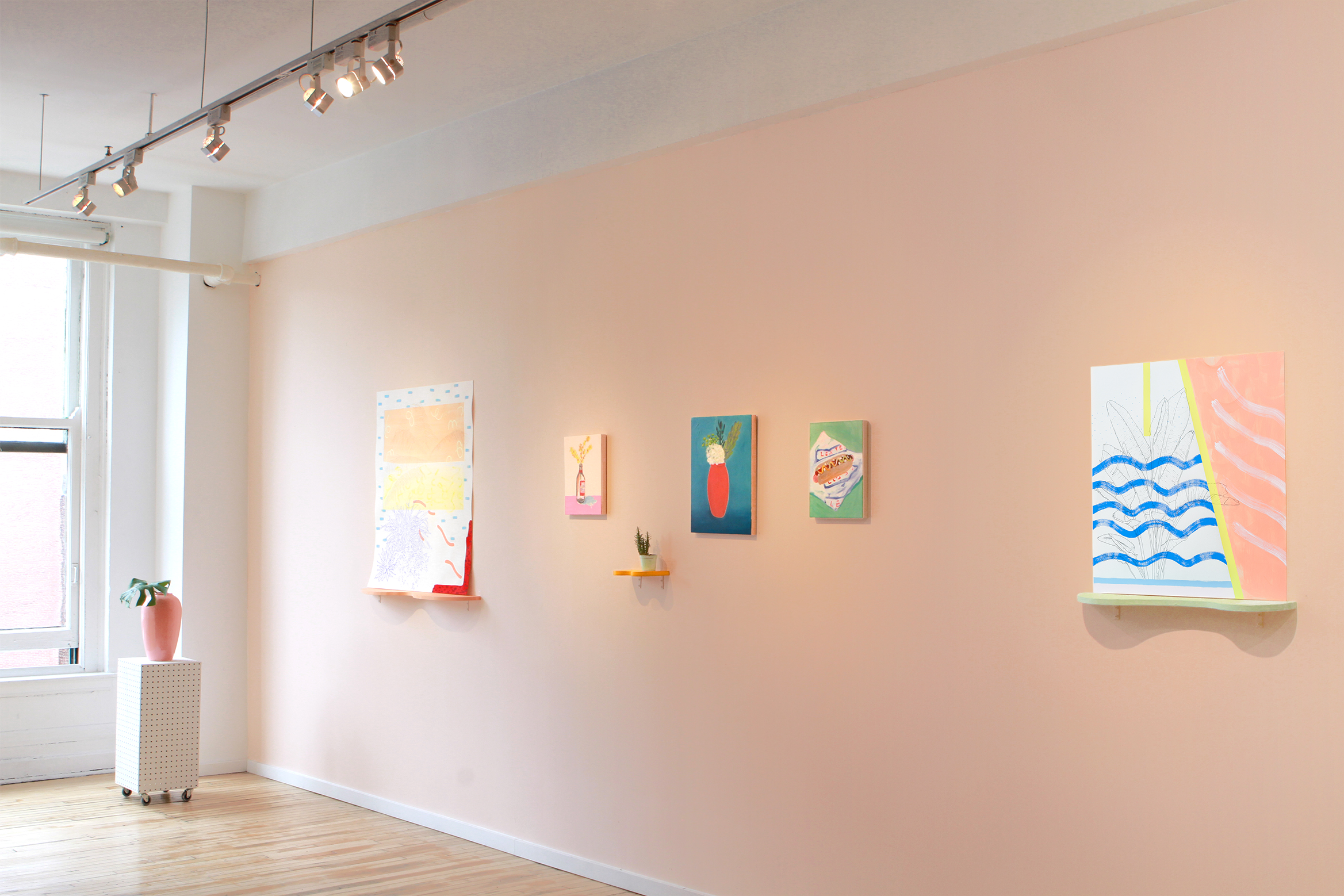
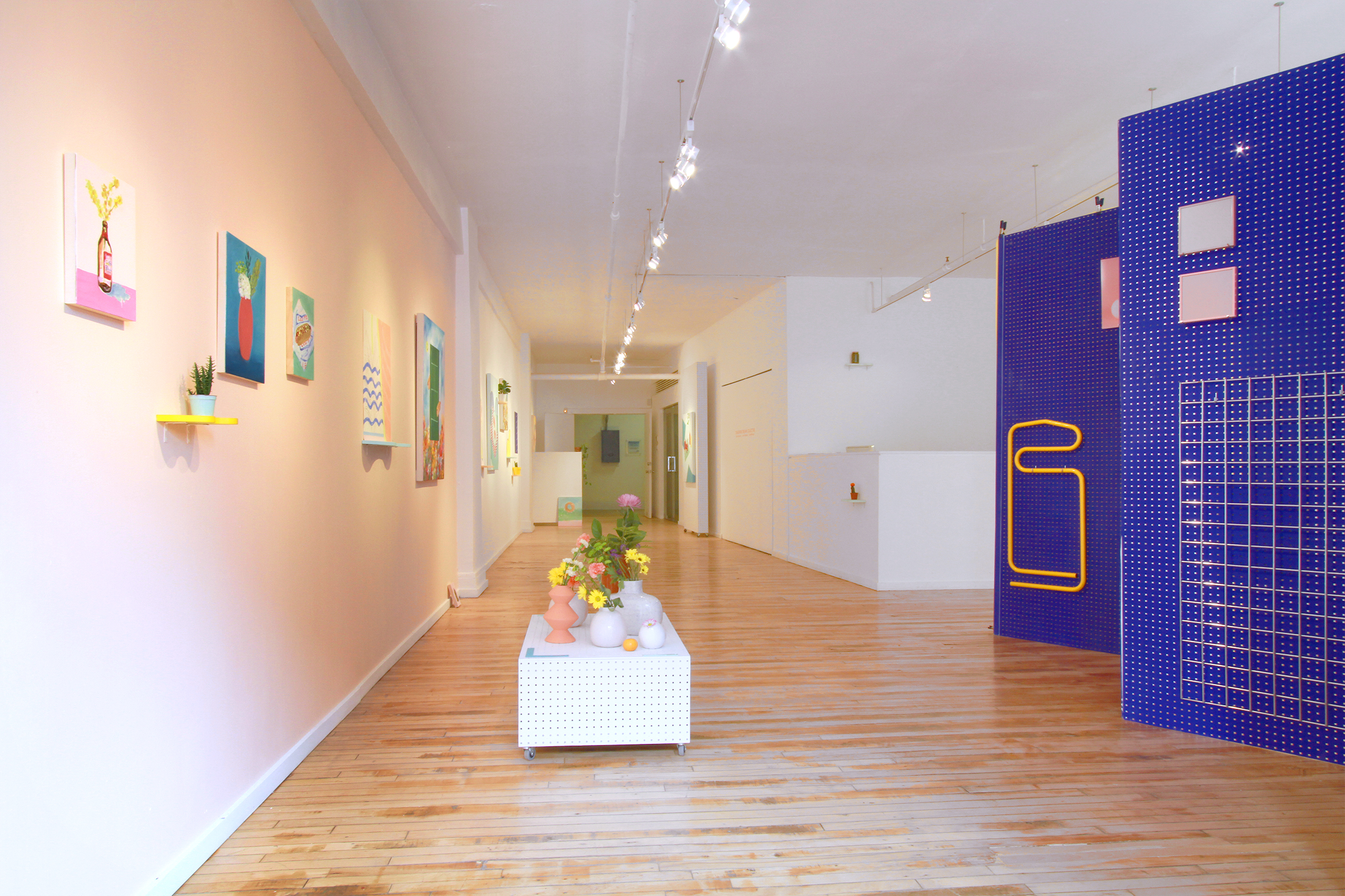
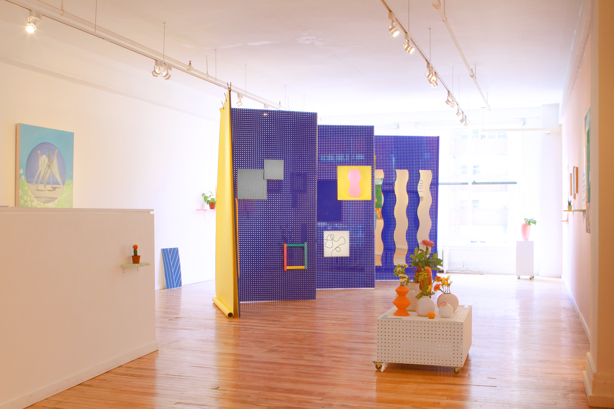
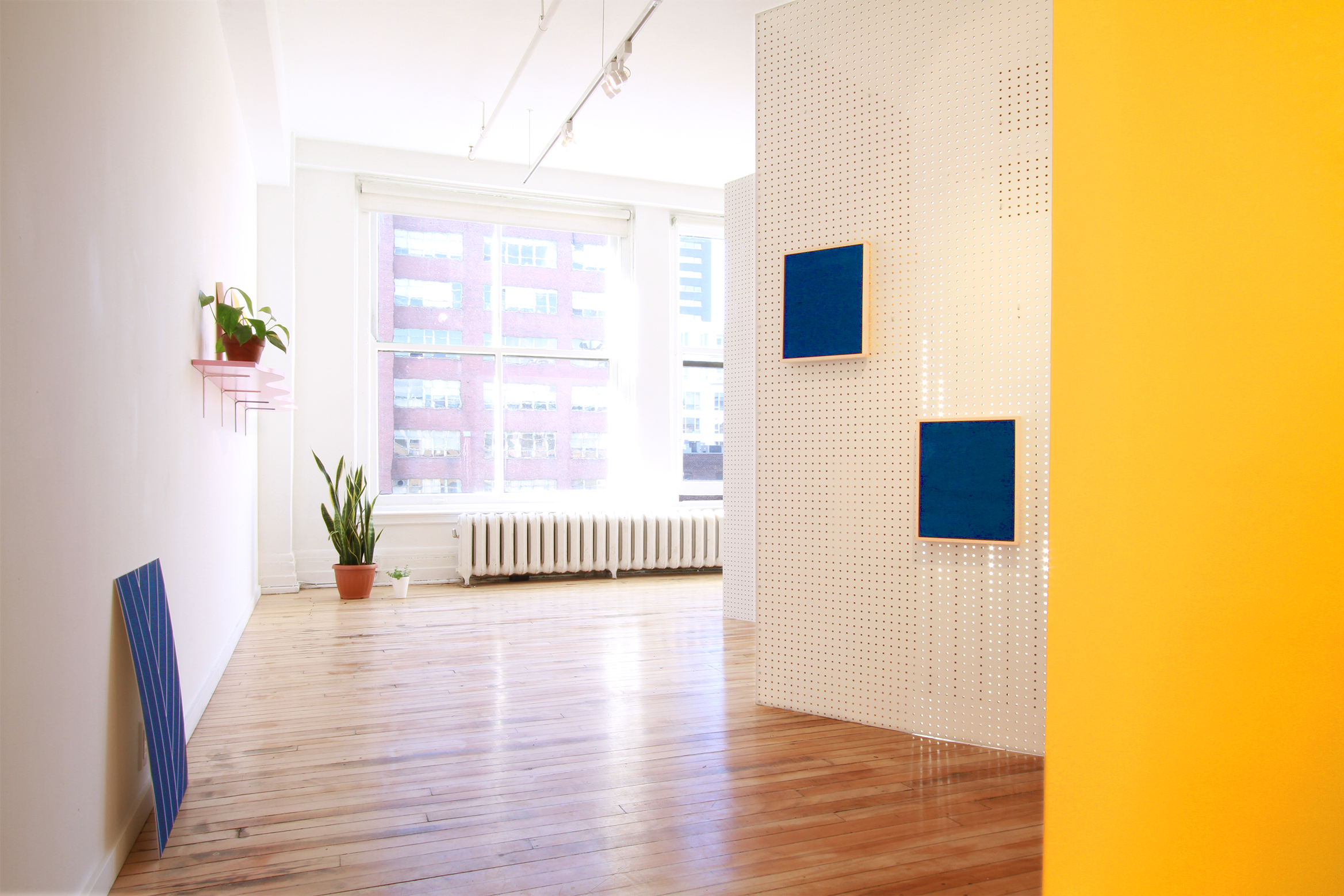
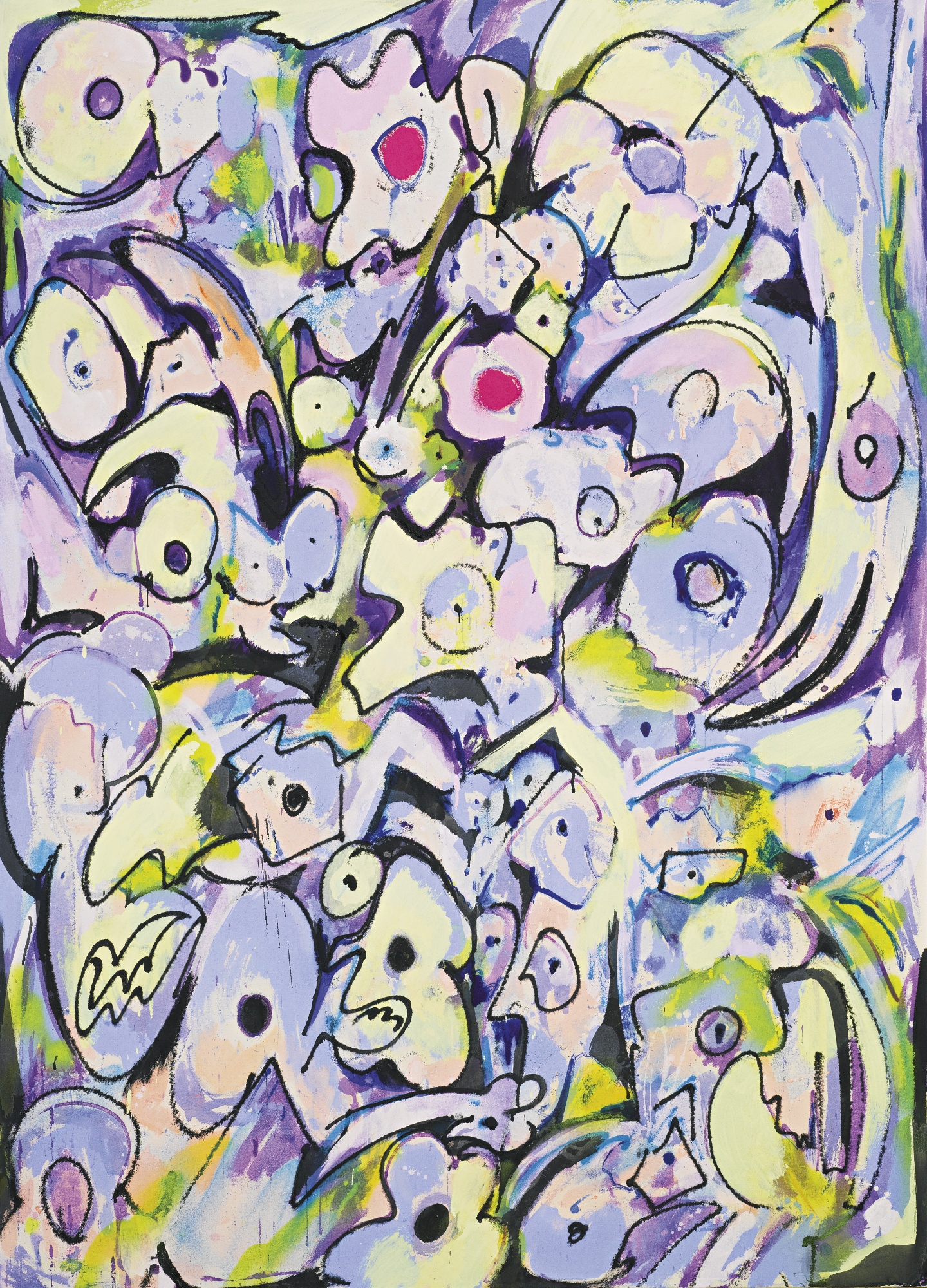
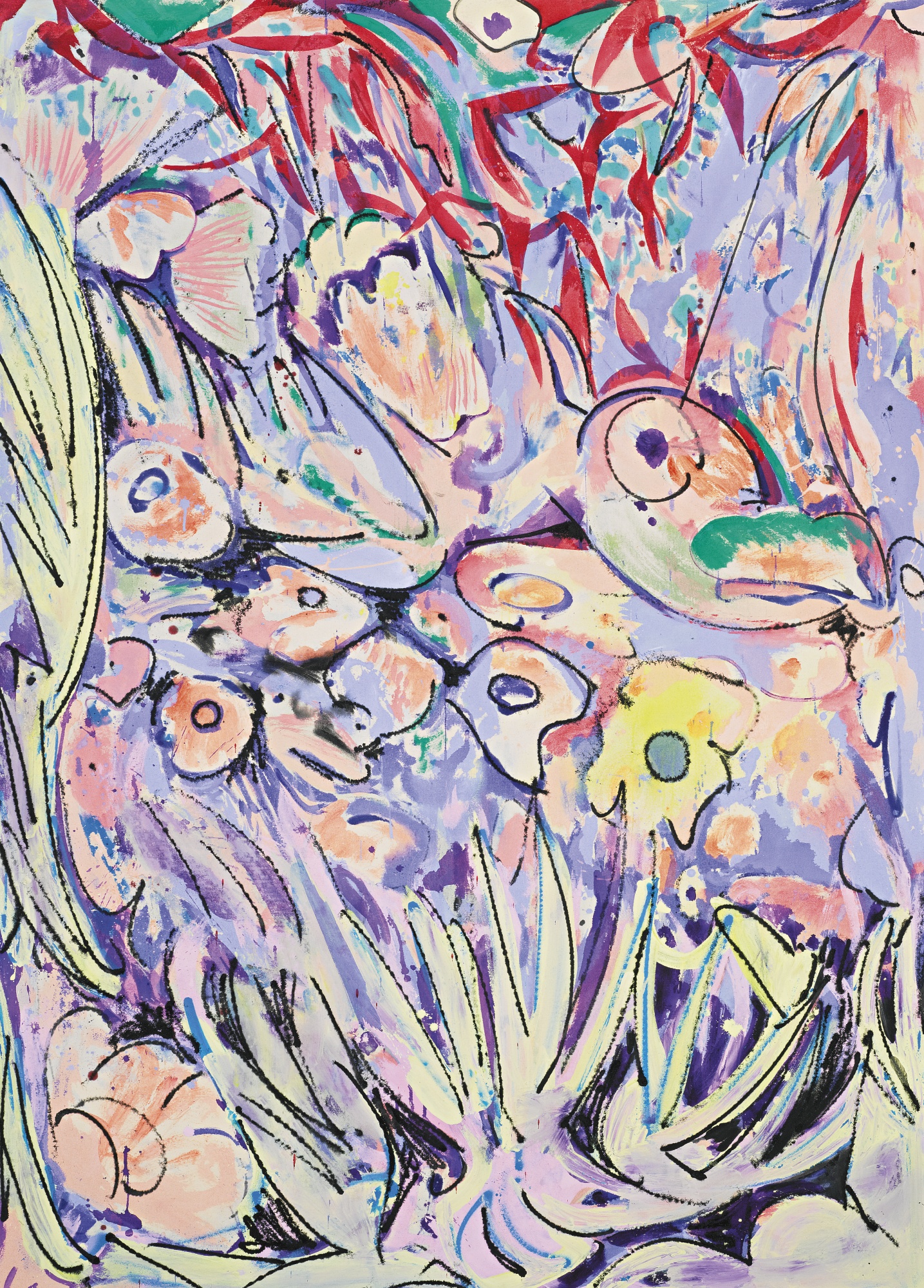
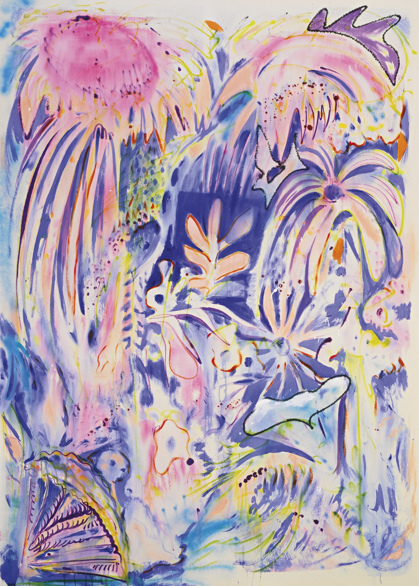
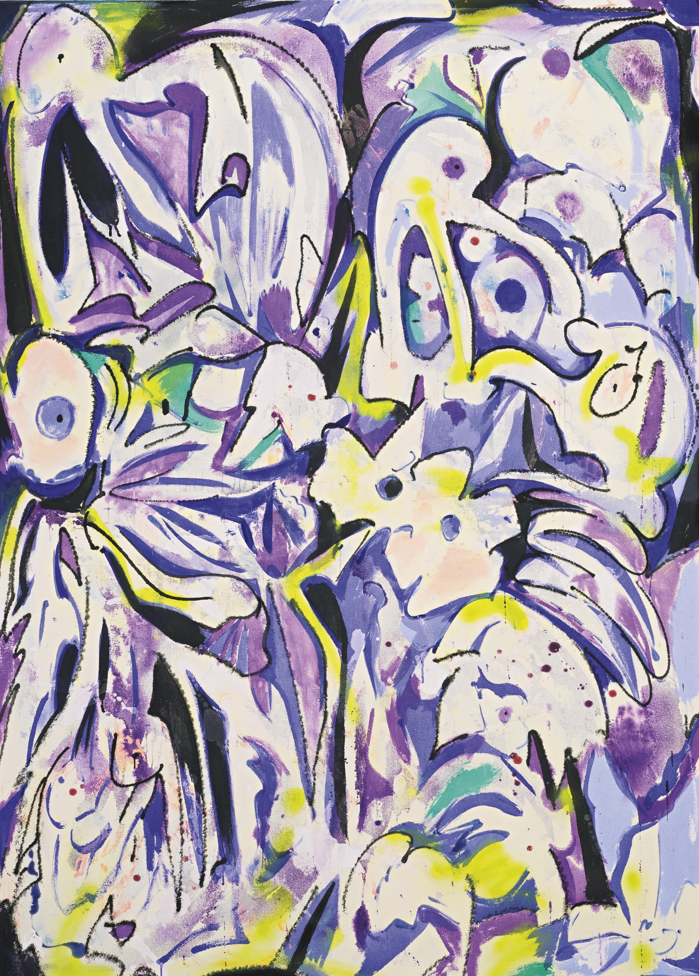
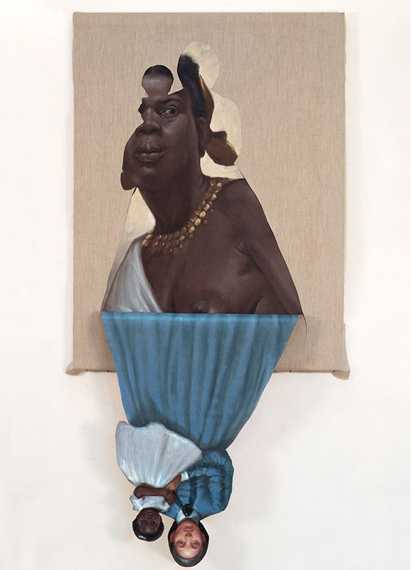
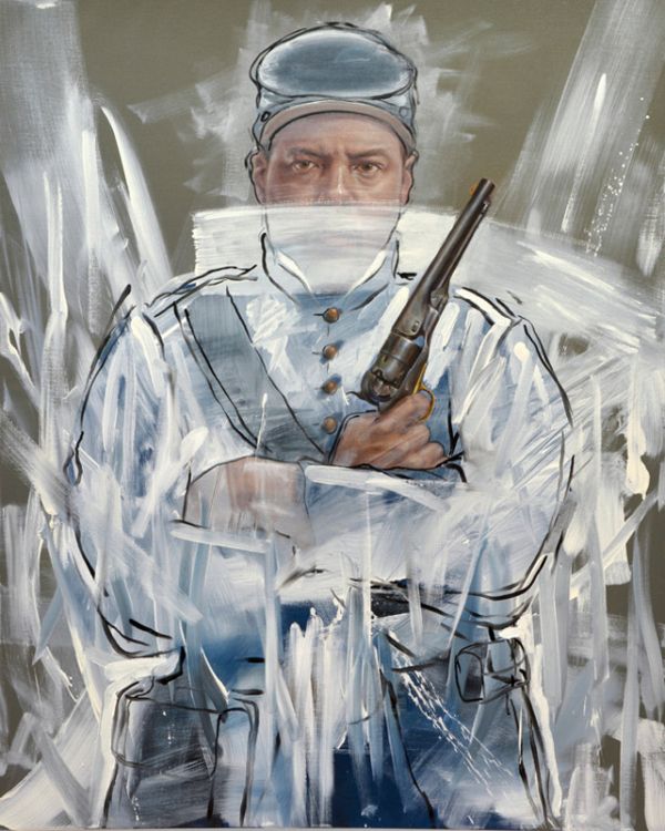
a few weeks back, i saw artist nic rad's latest exhibit, perennial millennial at victori + mo gallery in bushwick, brooklyn. victori + mo is quickly becoming one of my favorite galleries. every exhibit i've seen there has wowed me and i continue to love the work they show. what i liked most about nic rad's show was his clever approach to assemblage, paintings and pop-culture centric text-based artwork.

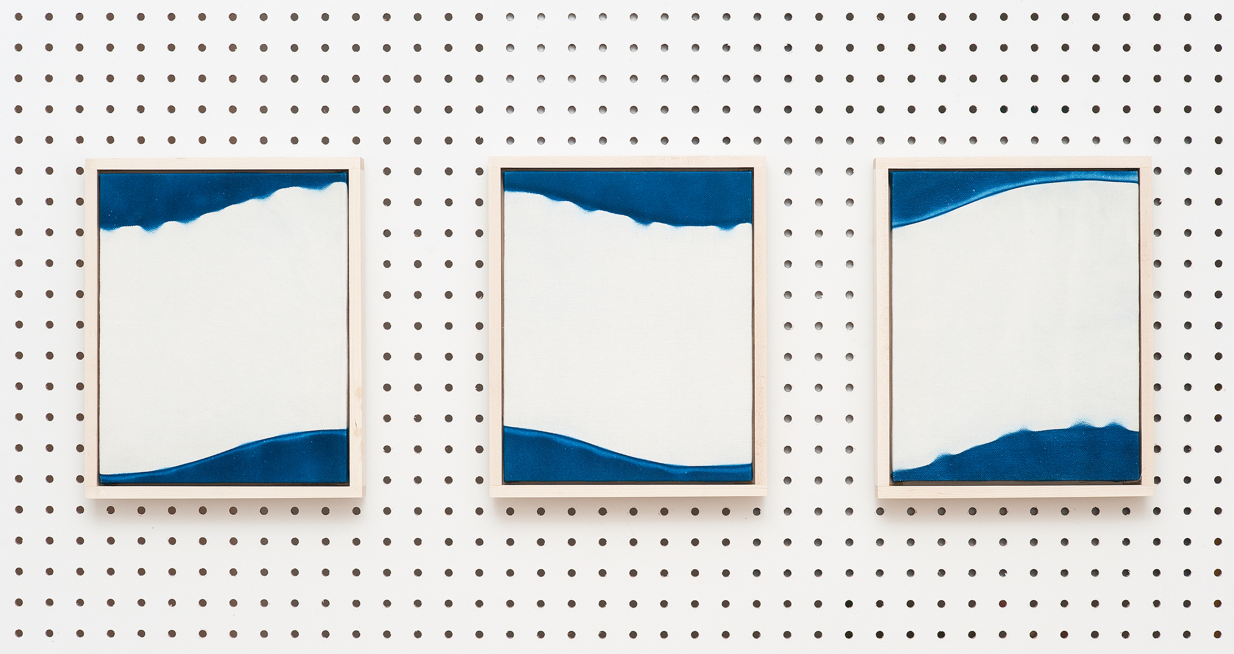
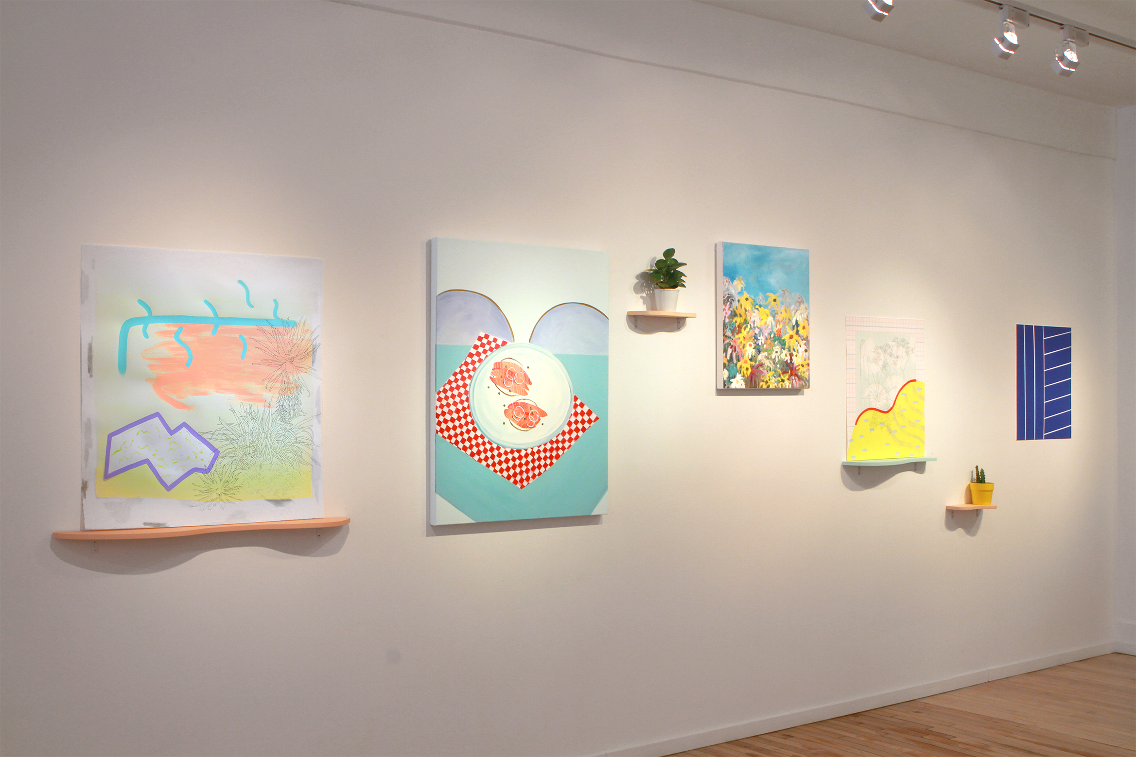
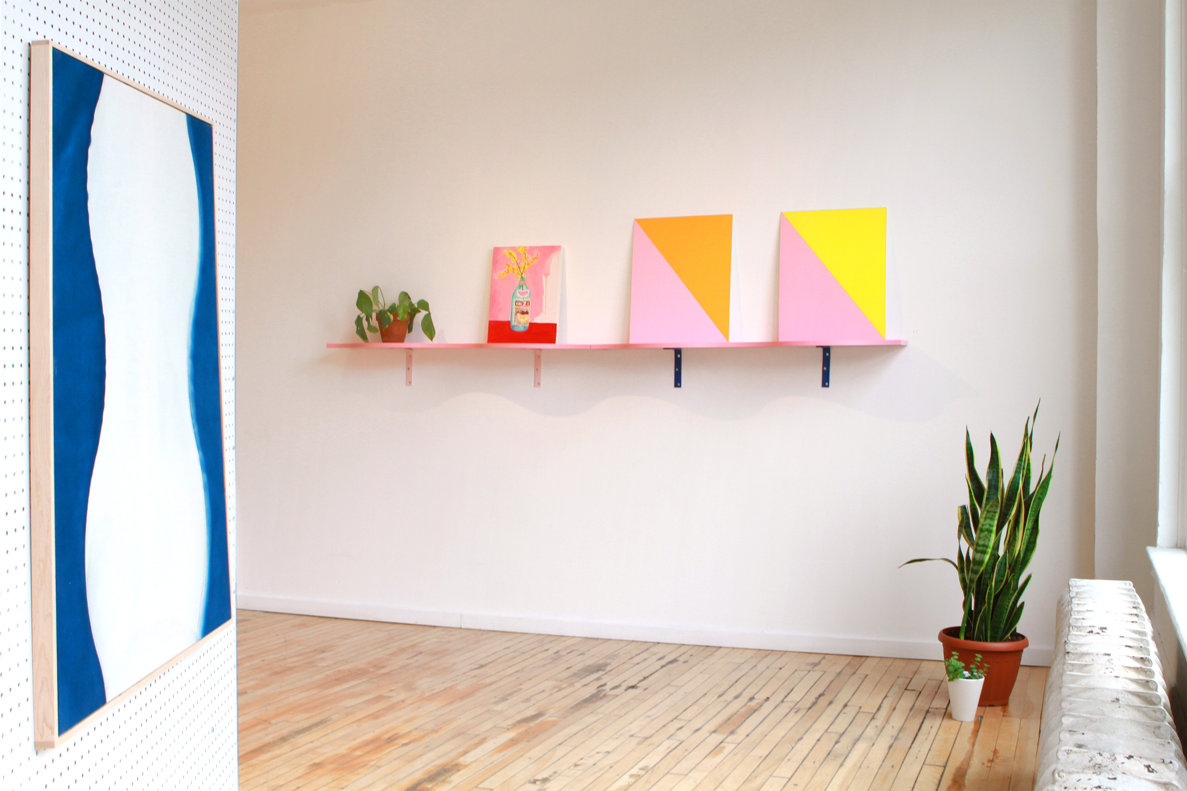
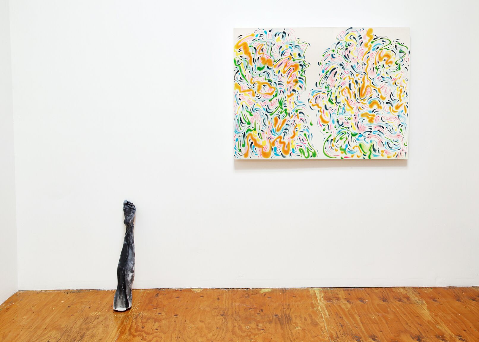
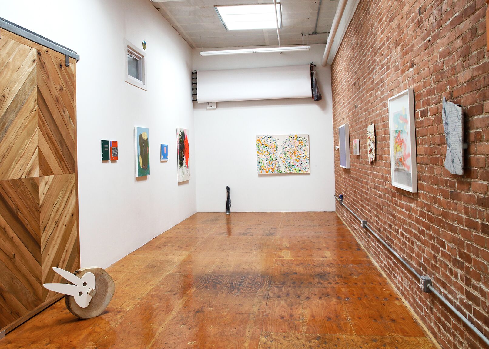
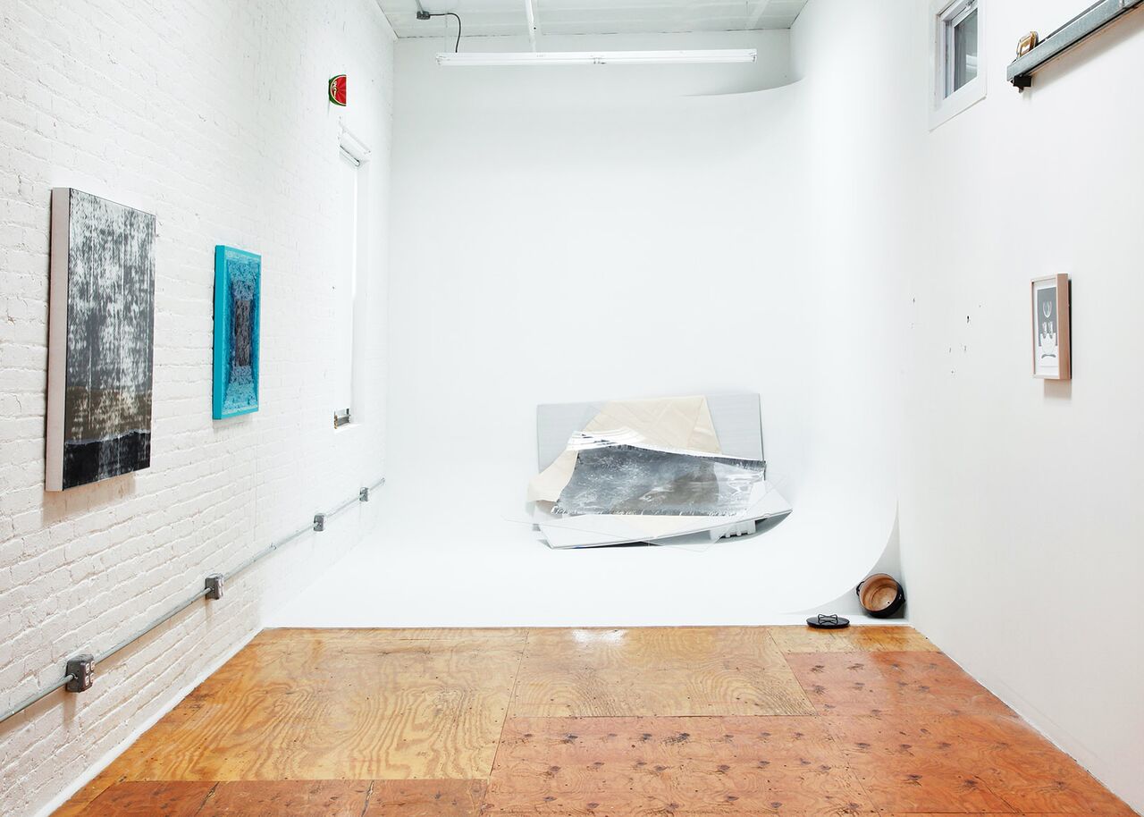
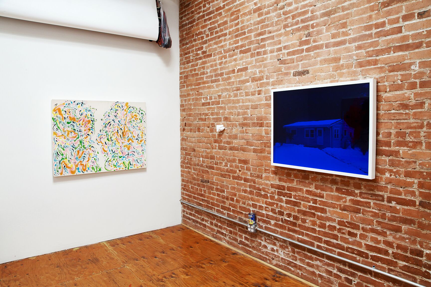
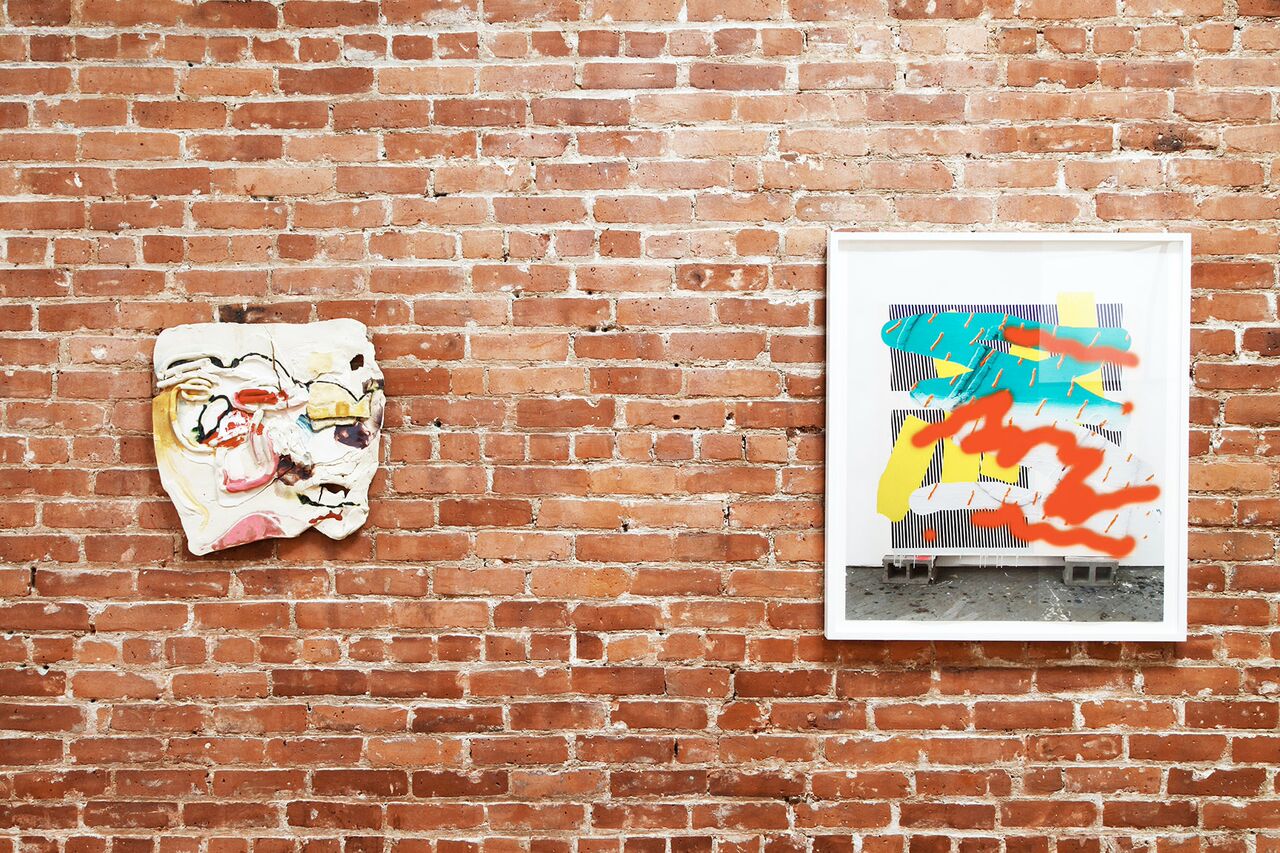
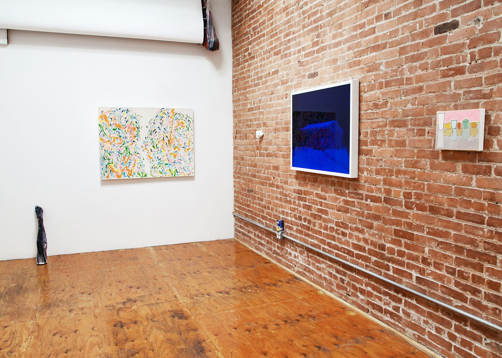
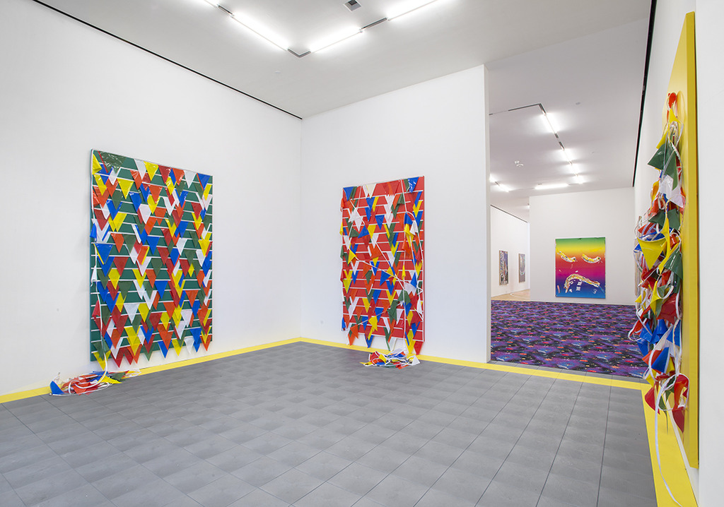
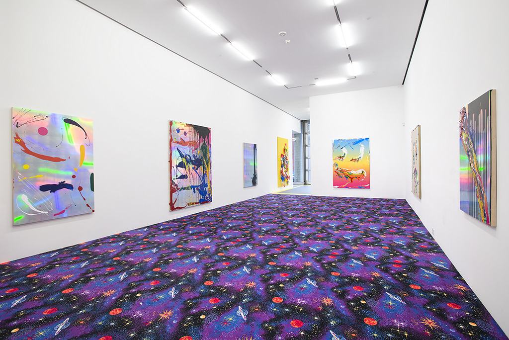
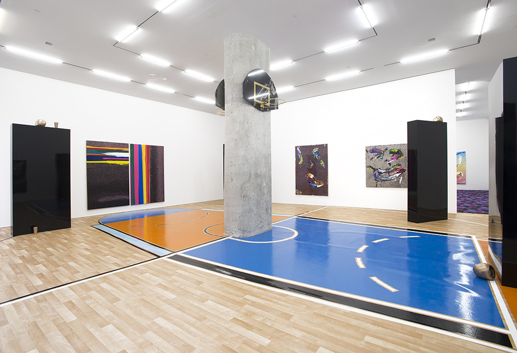
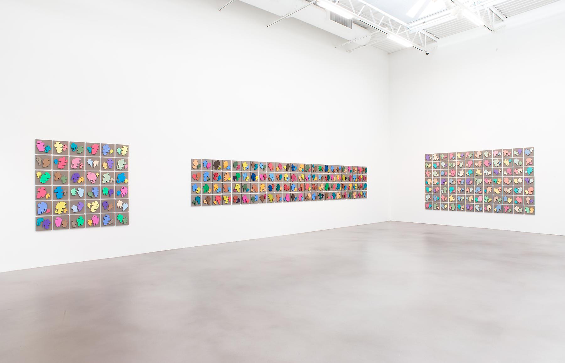
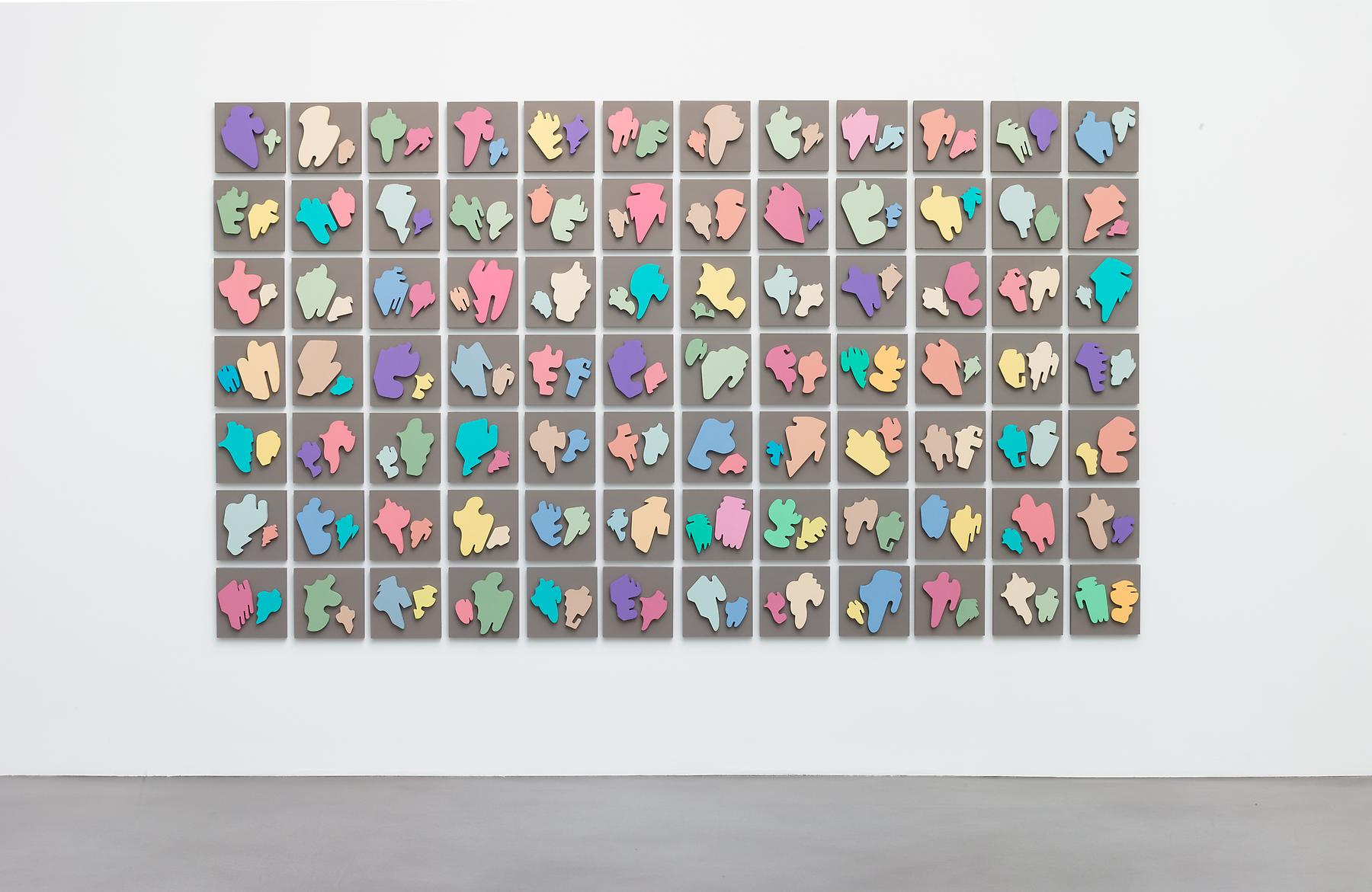
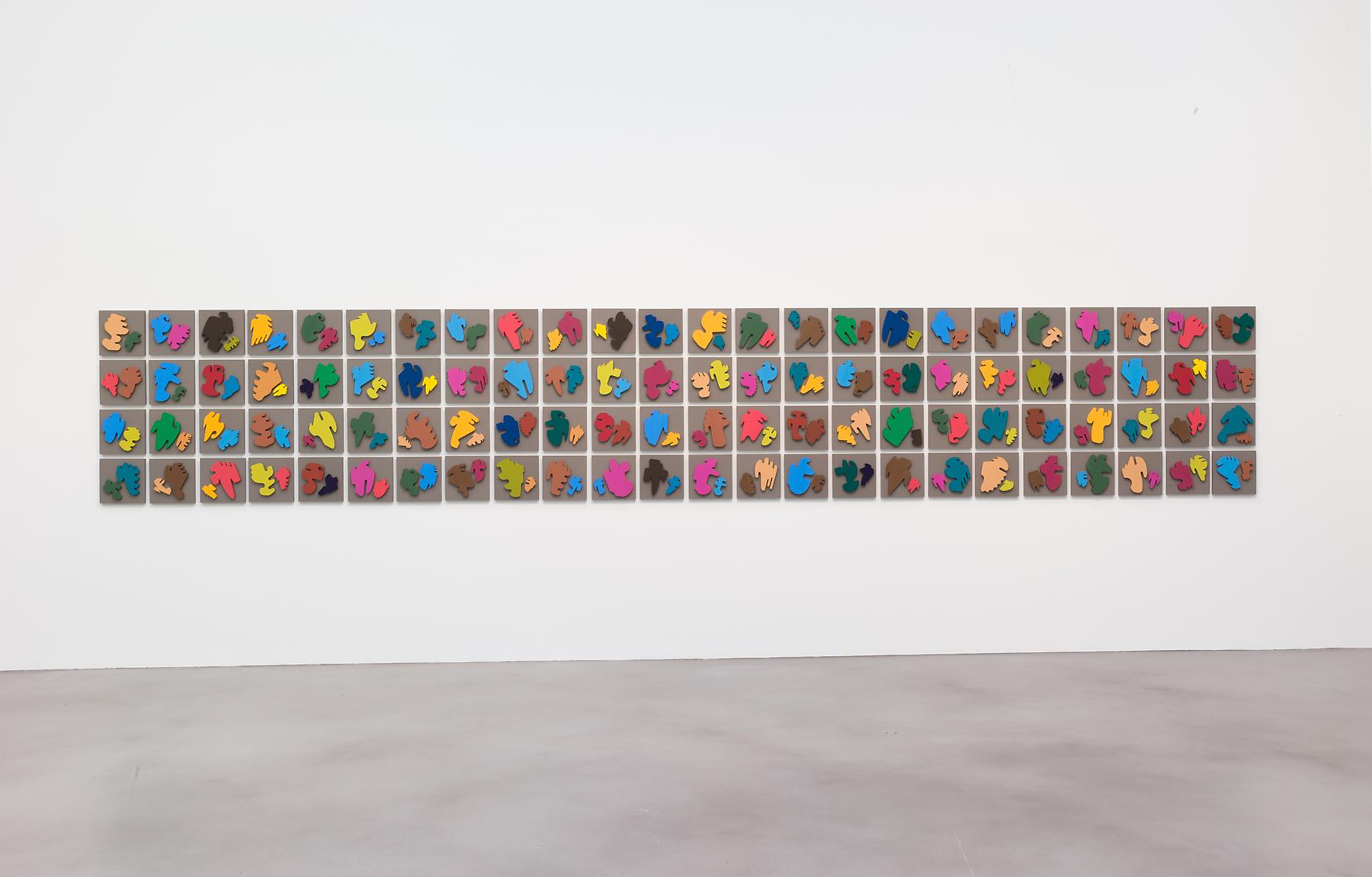
the gallery's space isn't very big and yet its gallerists, celine + ed, always make great use of it -- this time that meant showing the work in a salon style and coloring the walls with blue and yellow paint. did i mention there was even a large smiling emoji hanging from the ceiling? moreover, nic hosted a beer pong competition in the space, which i unfortunately couldn't make but it sounded quite literally rad. images and more info from the exhibit below:

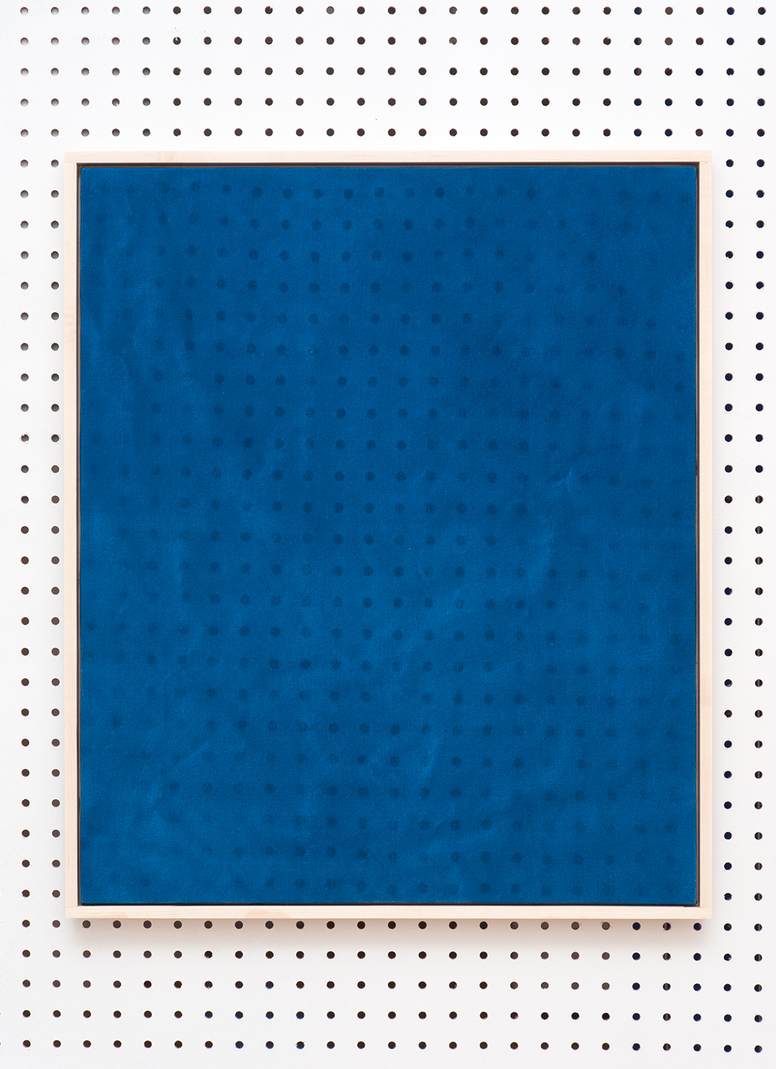
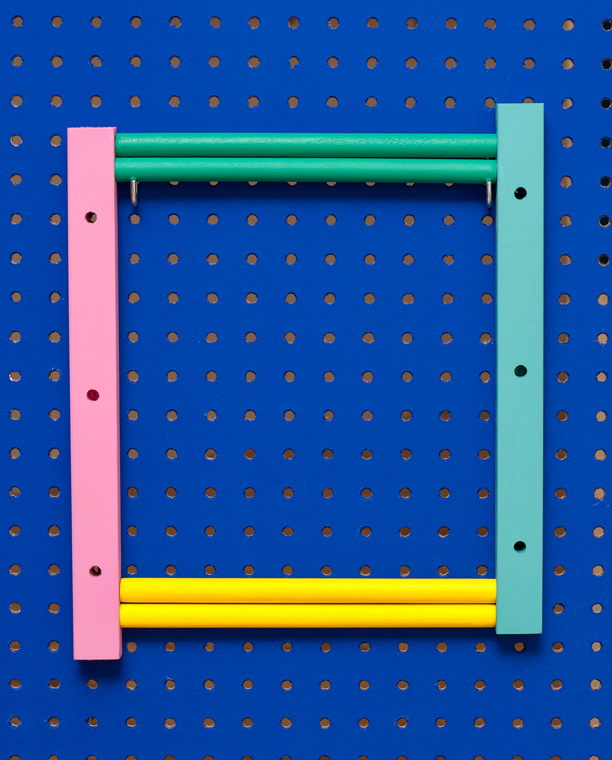
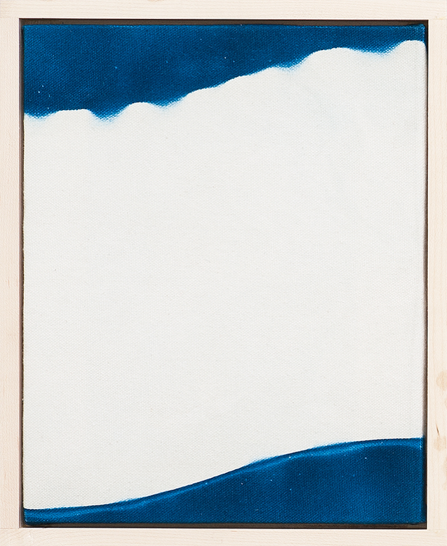
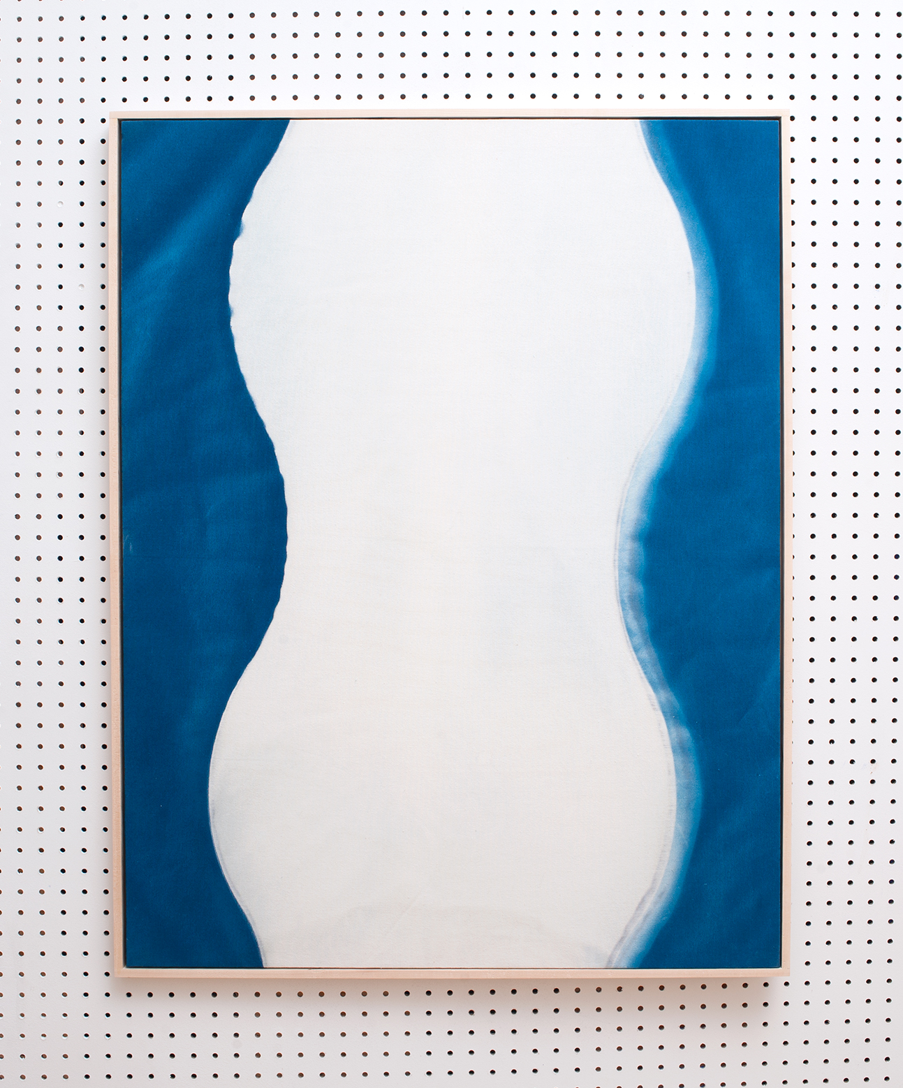
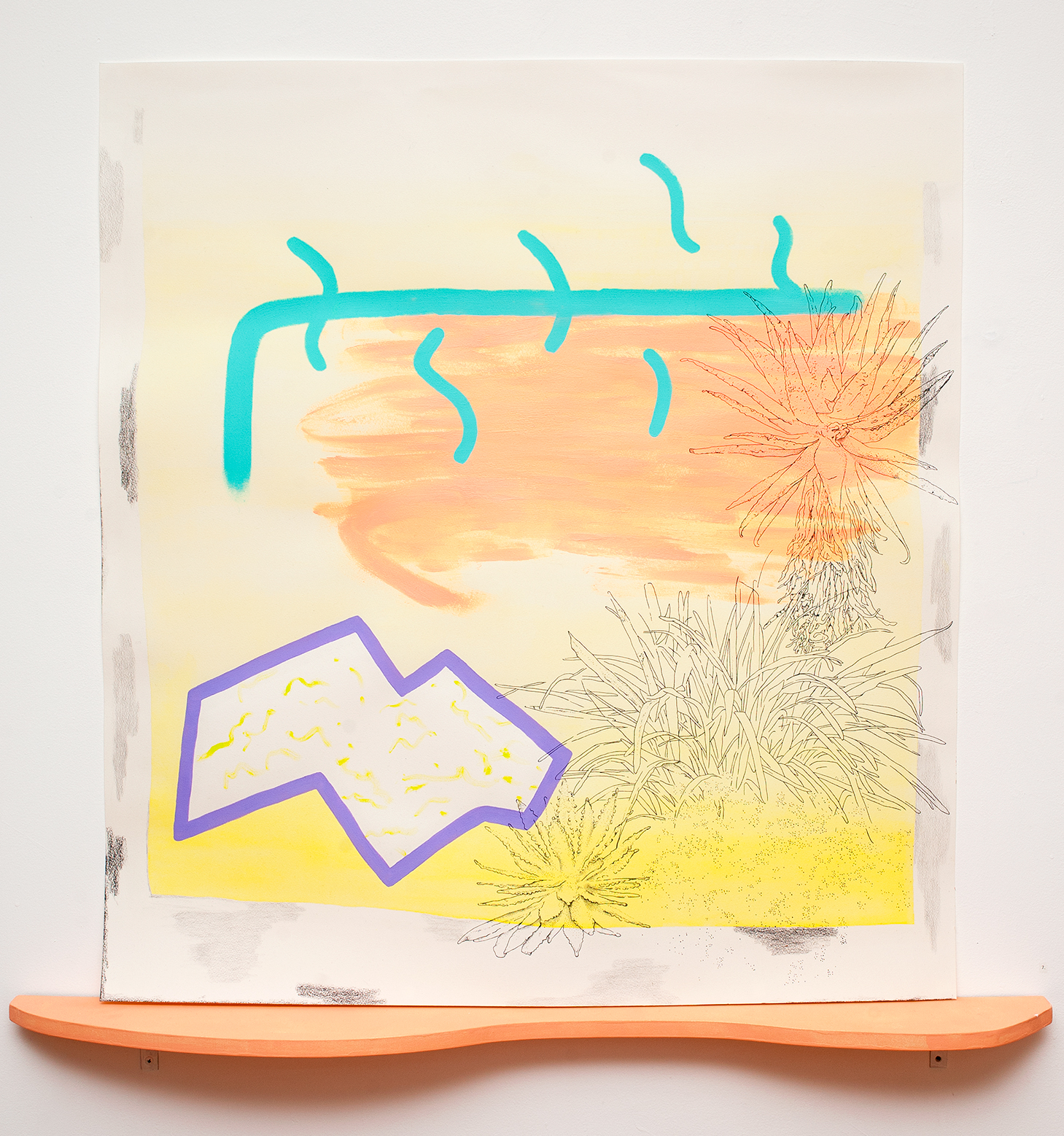
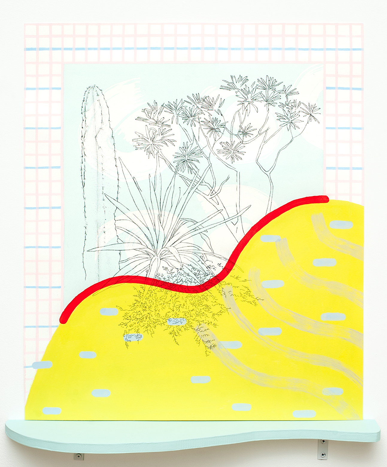
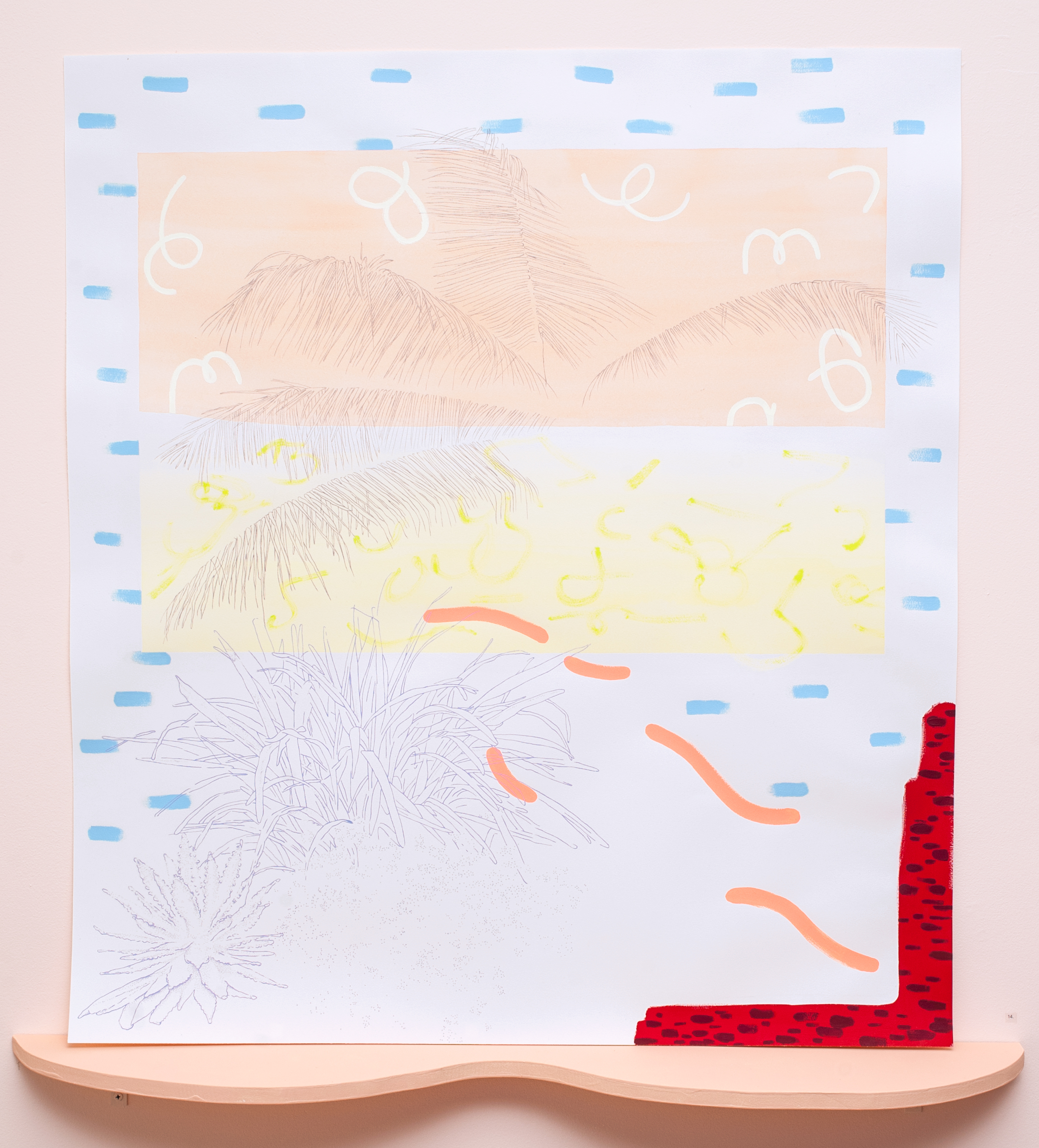
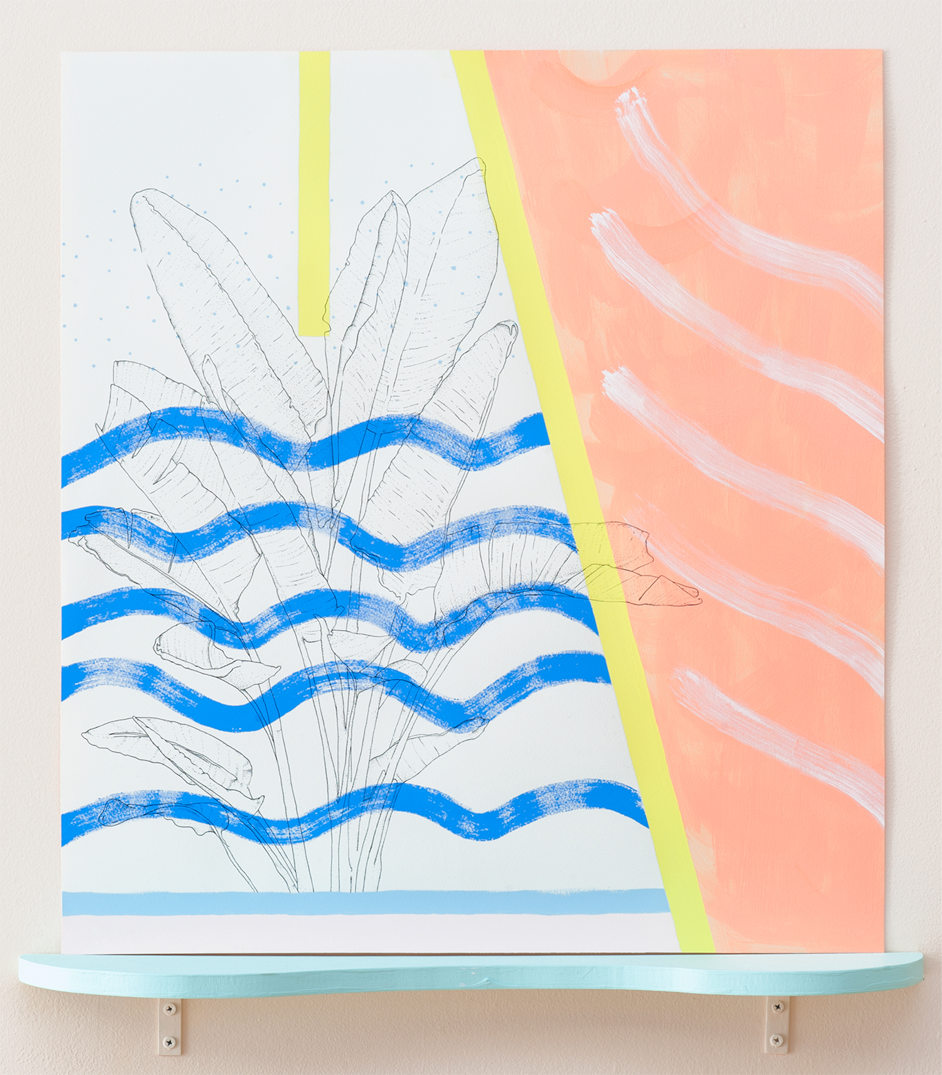
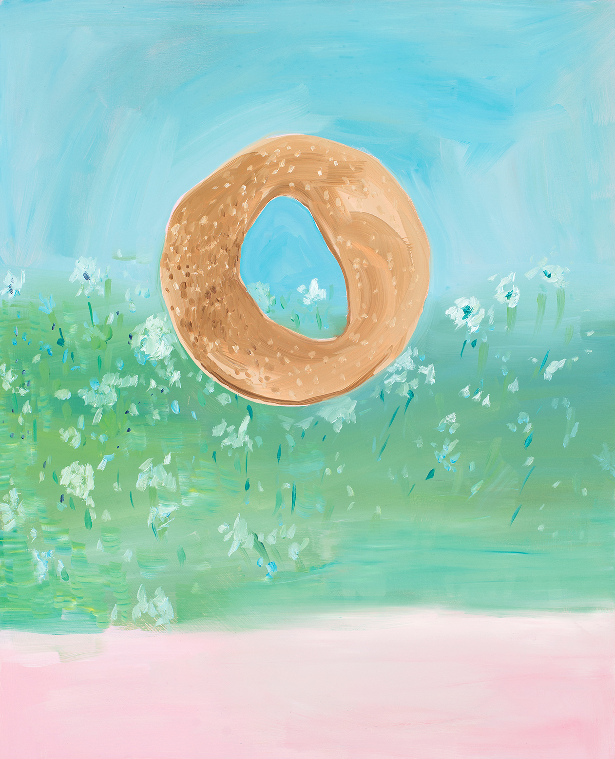
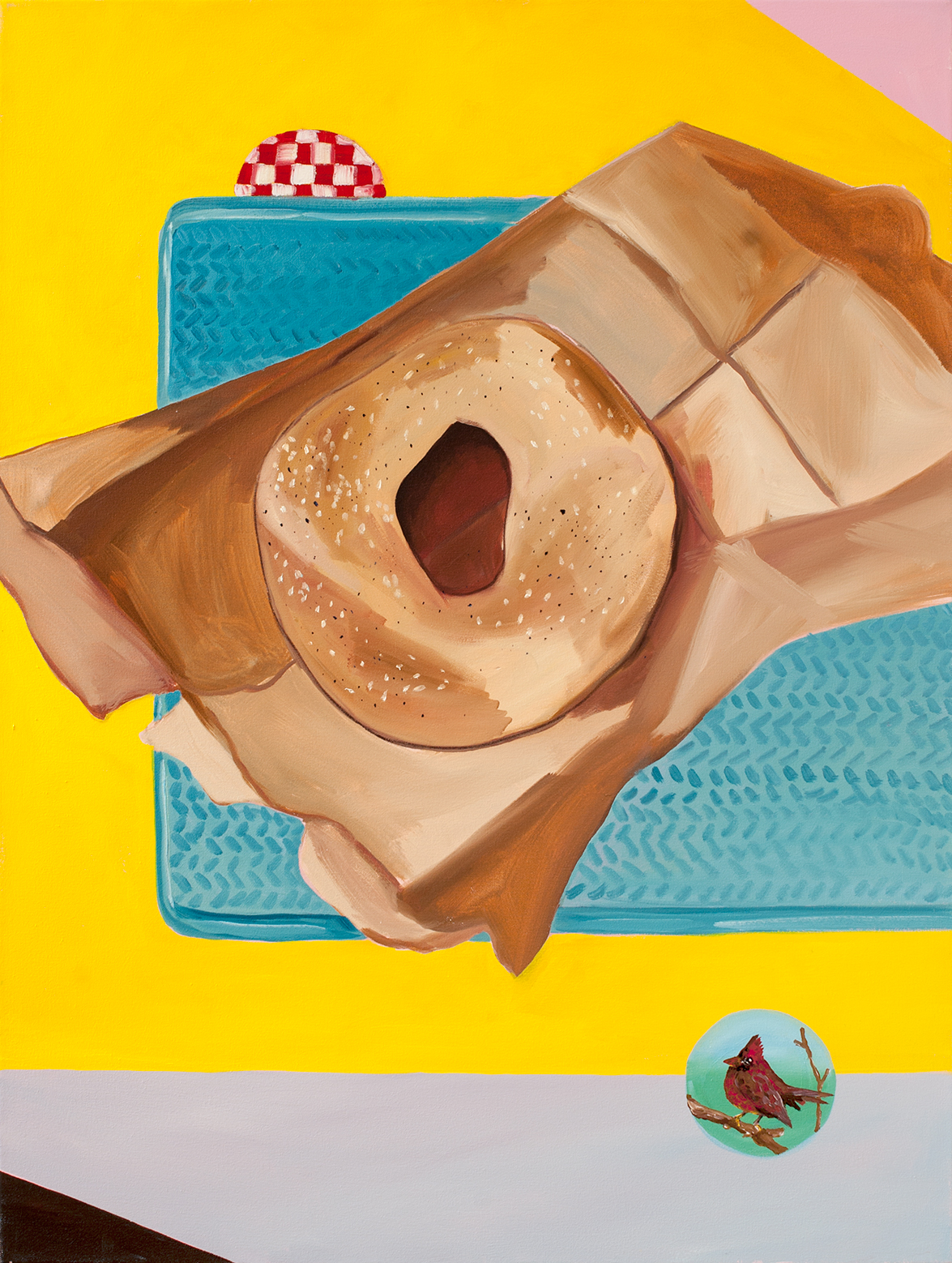
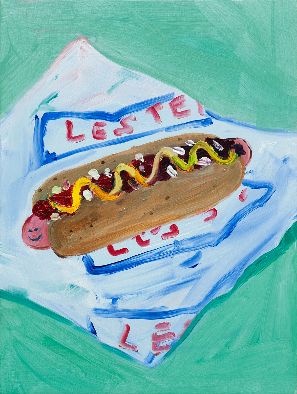
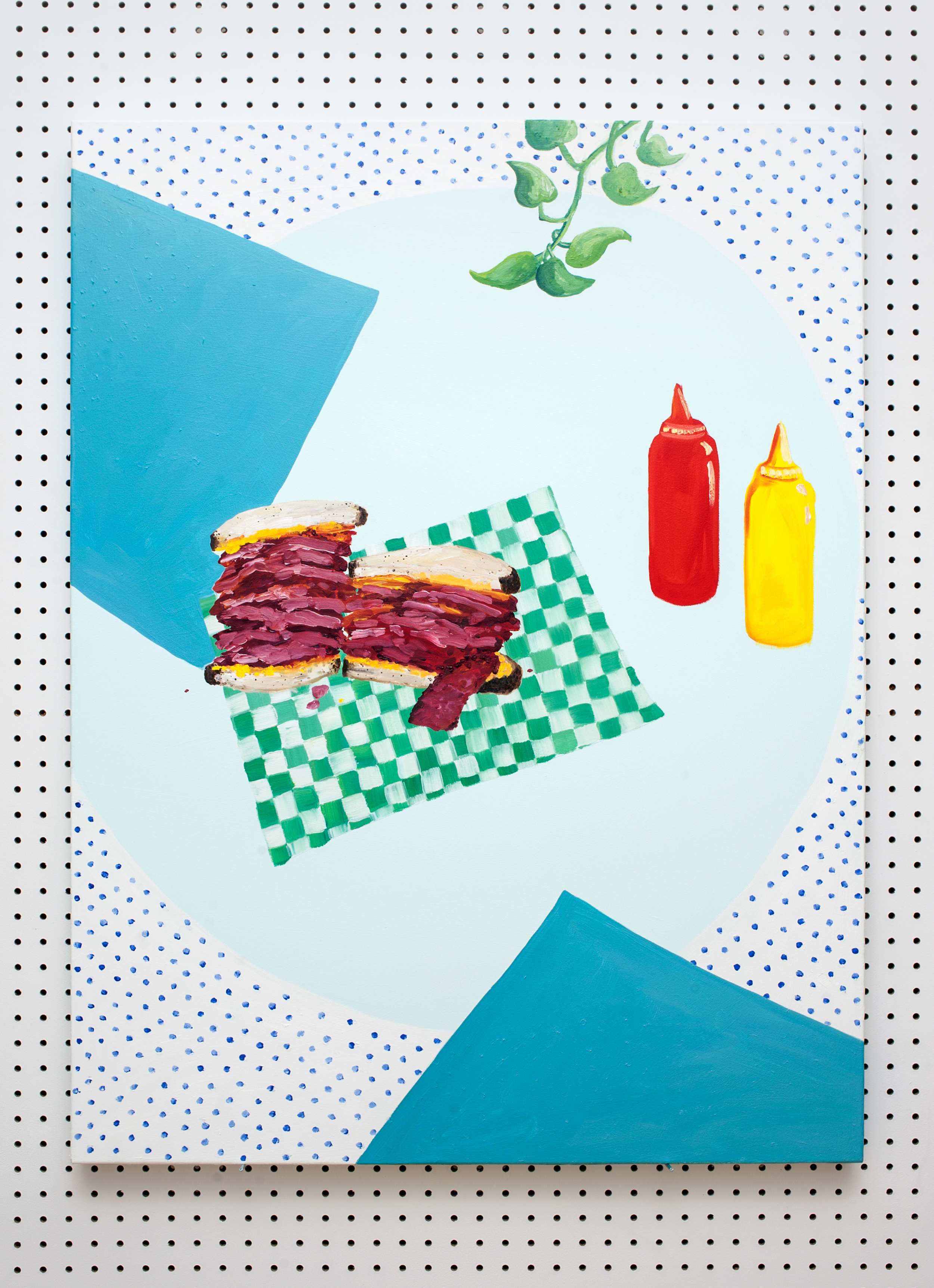
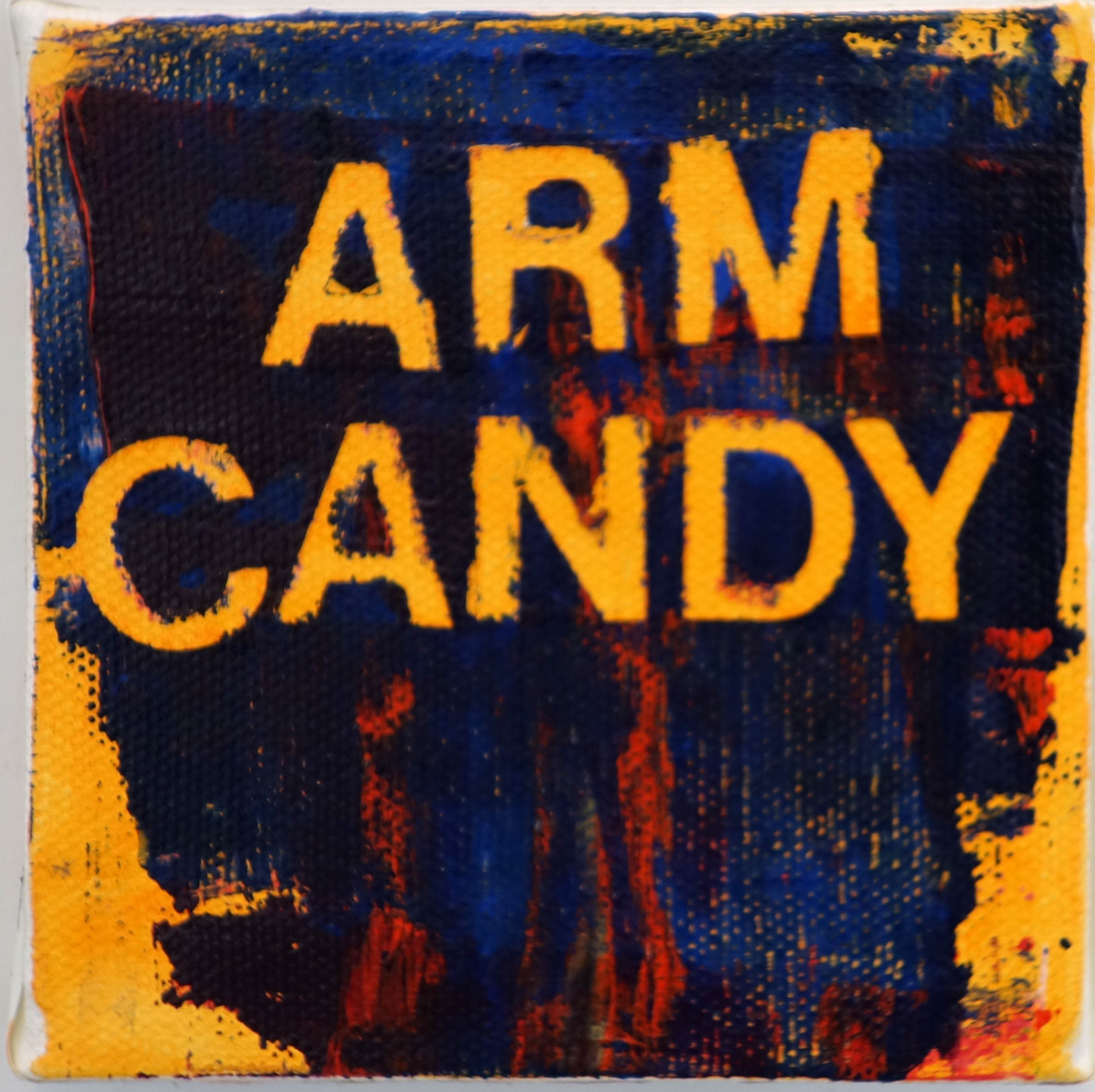
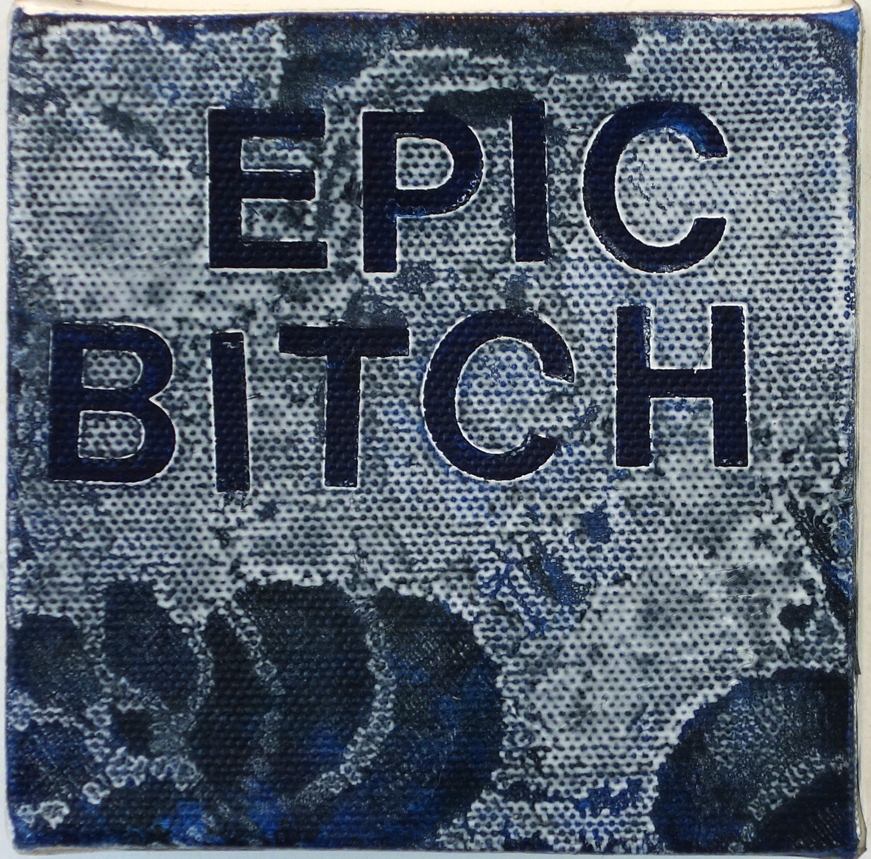
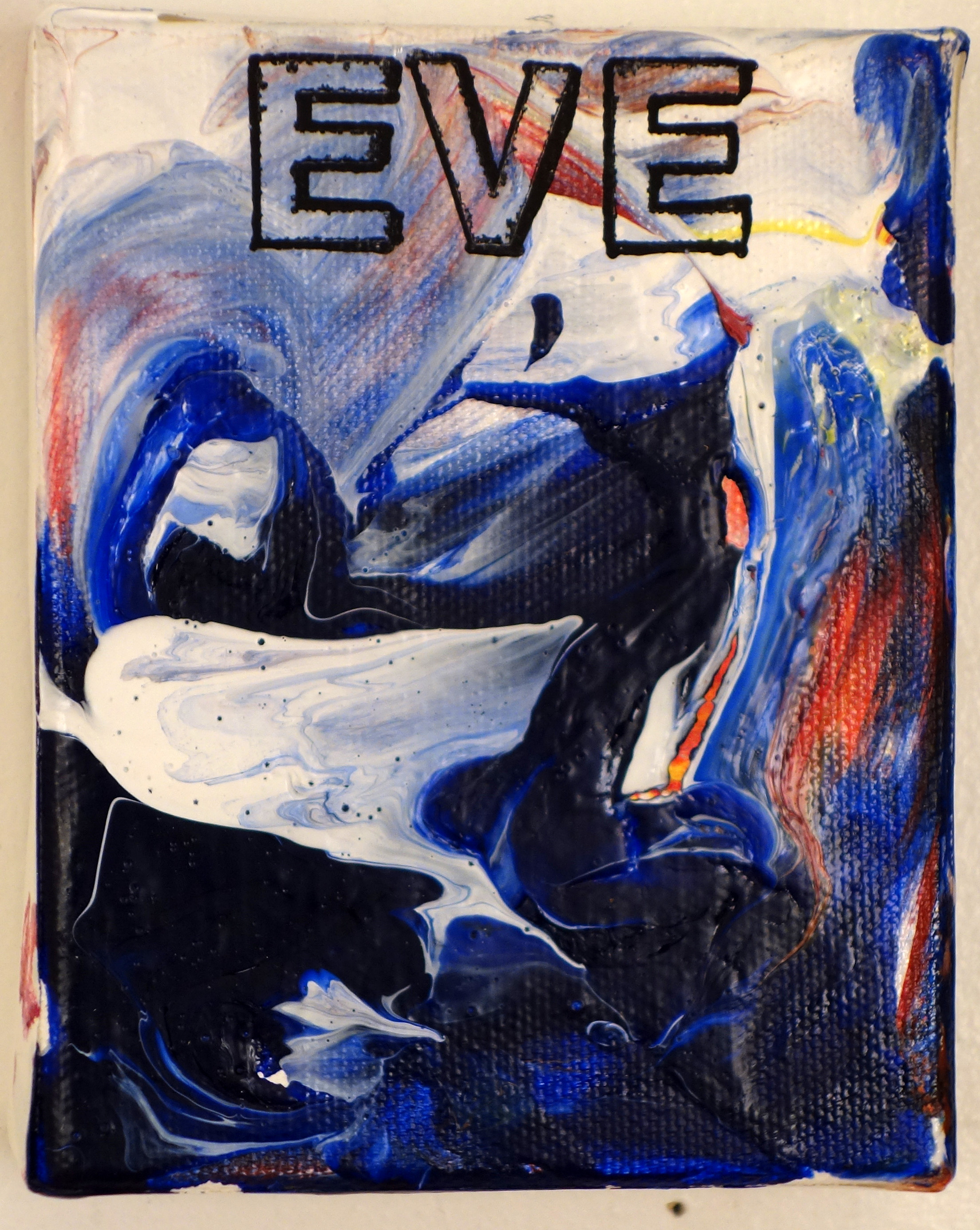
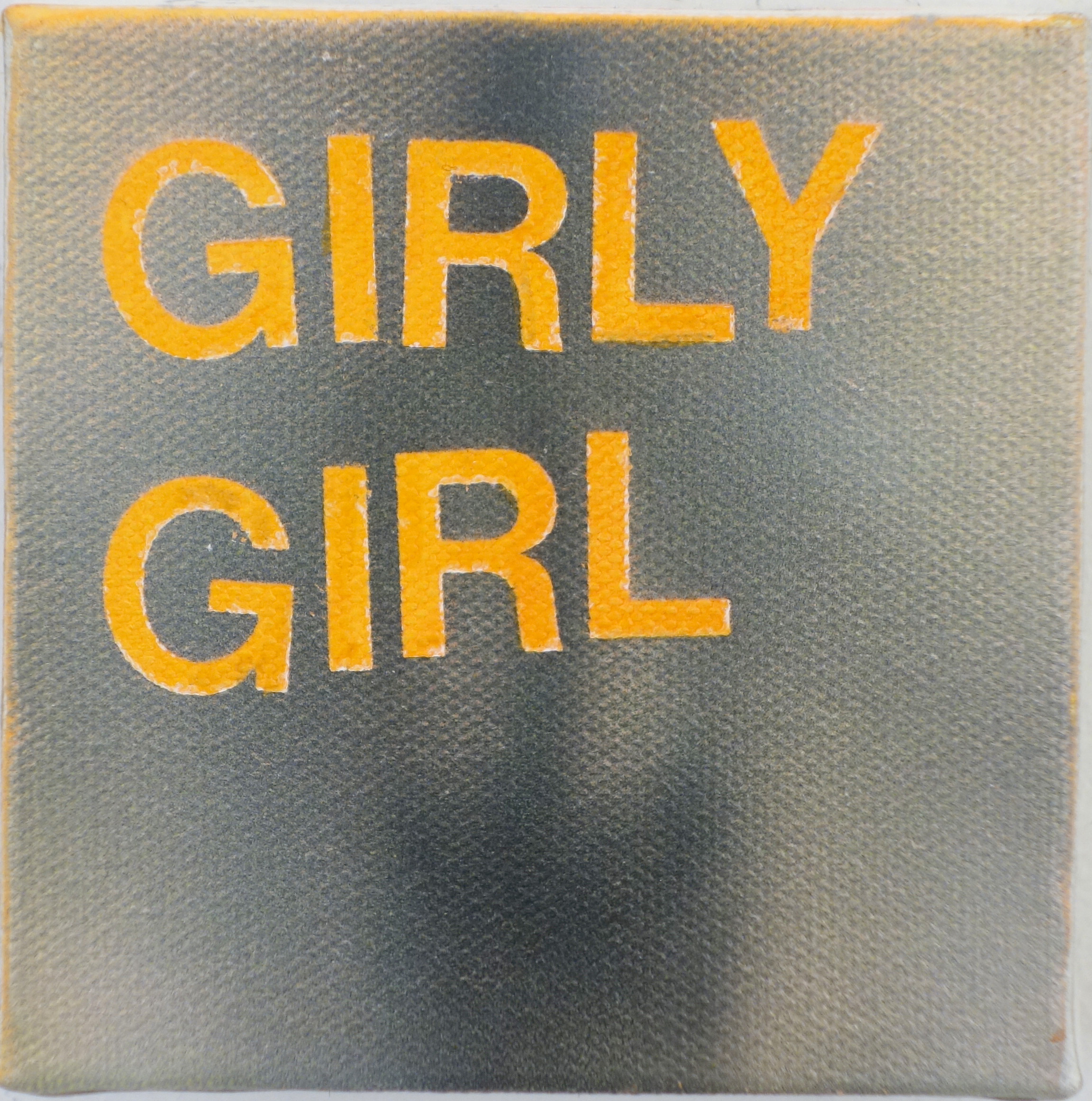
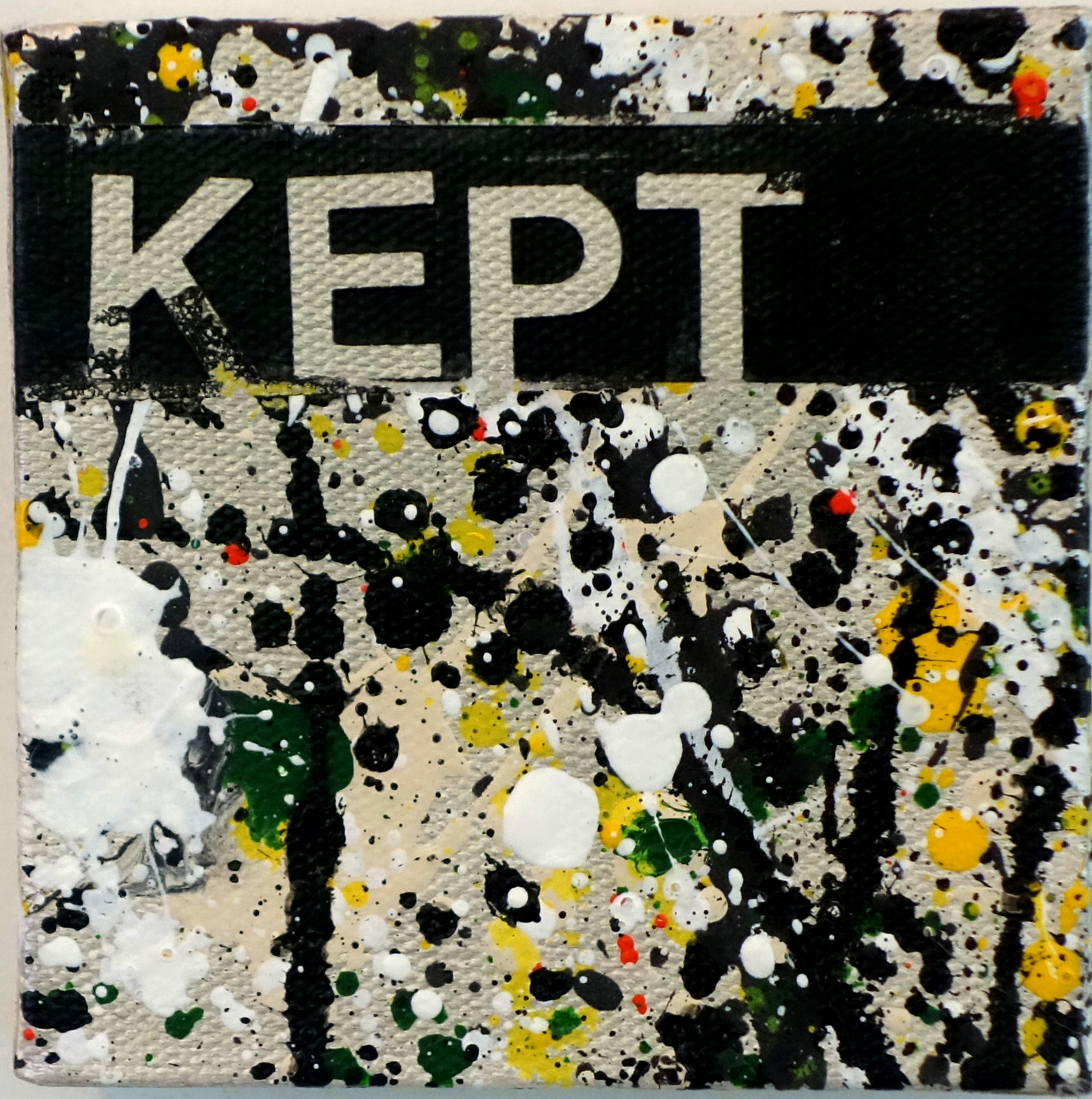
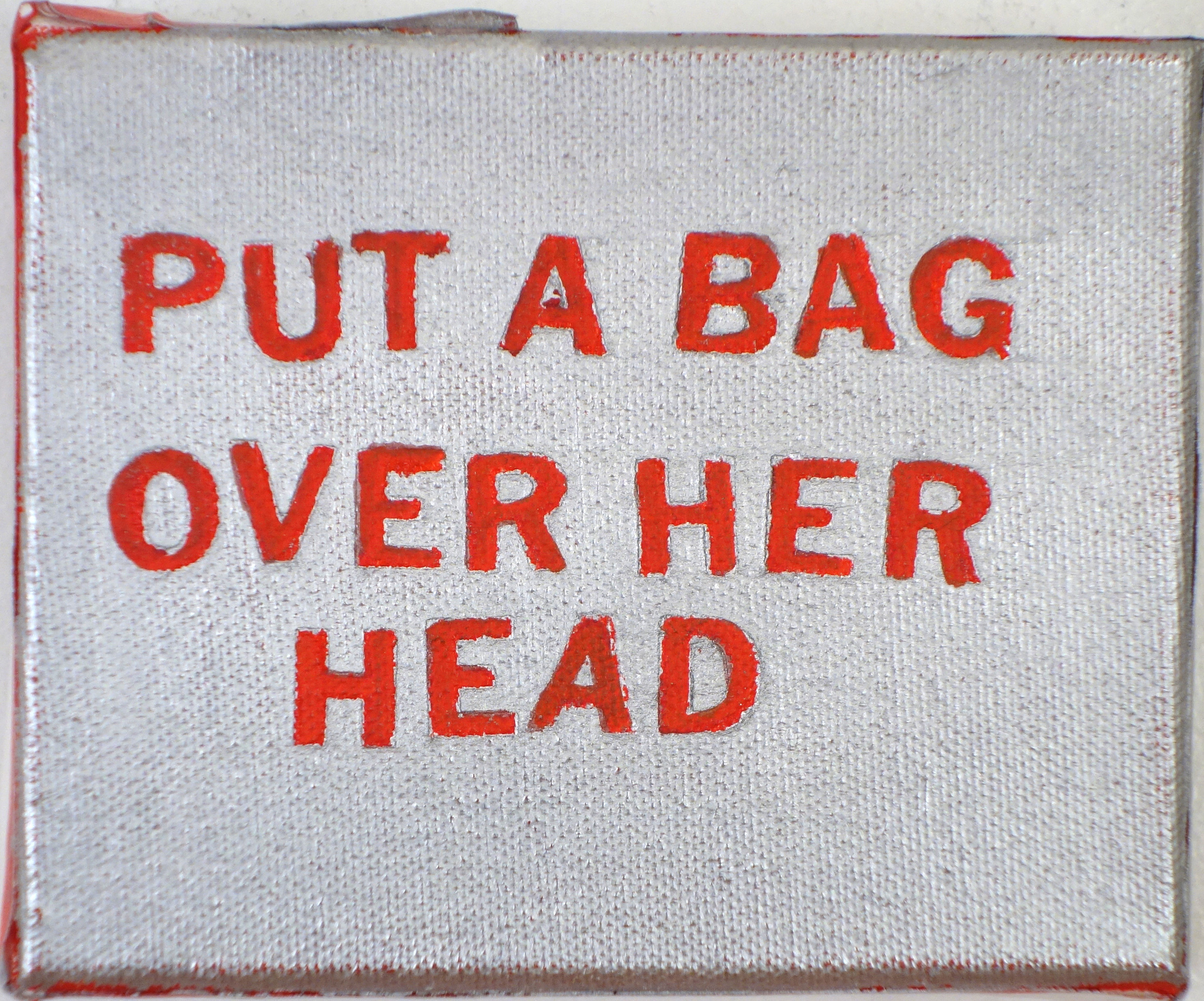
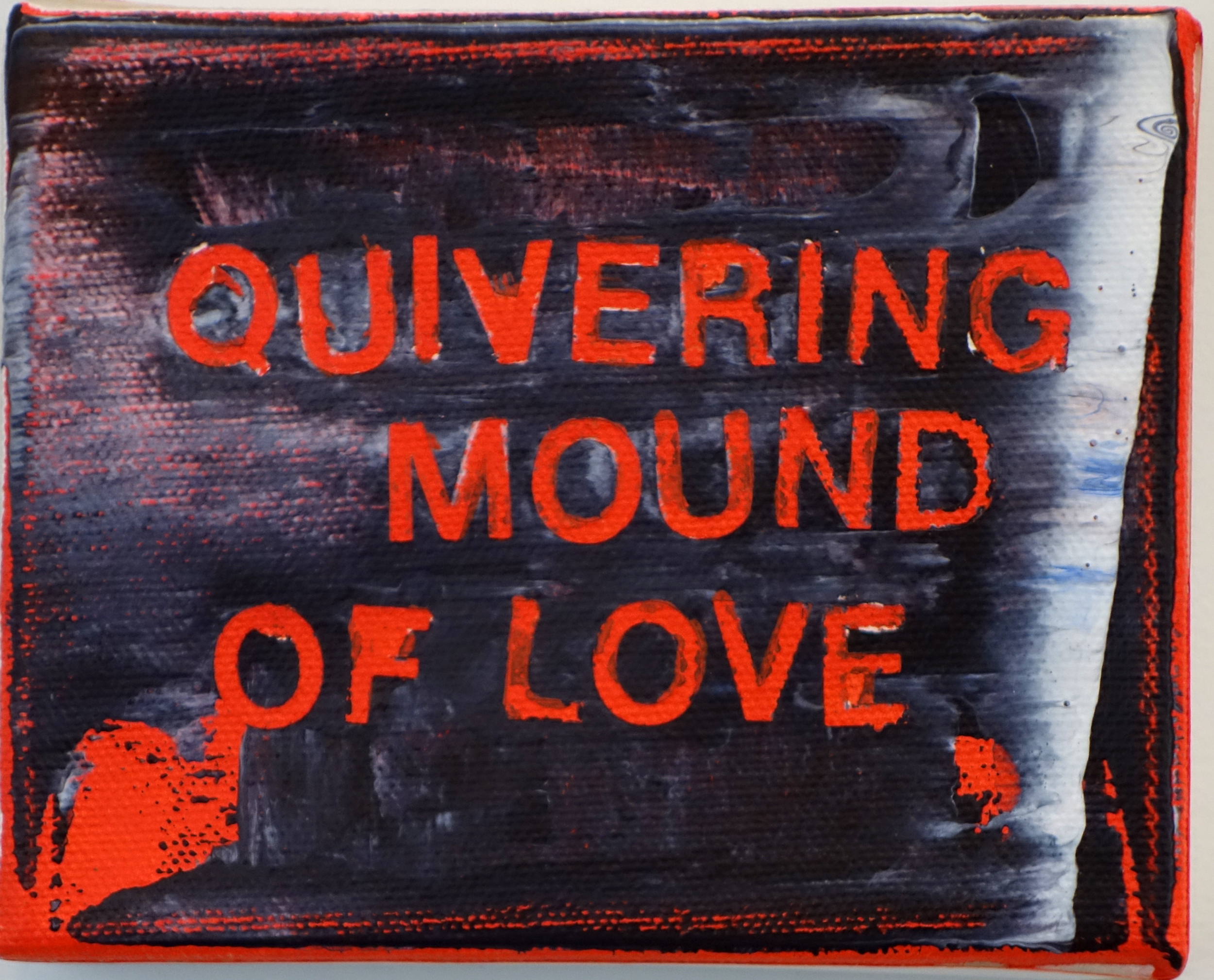
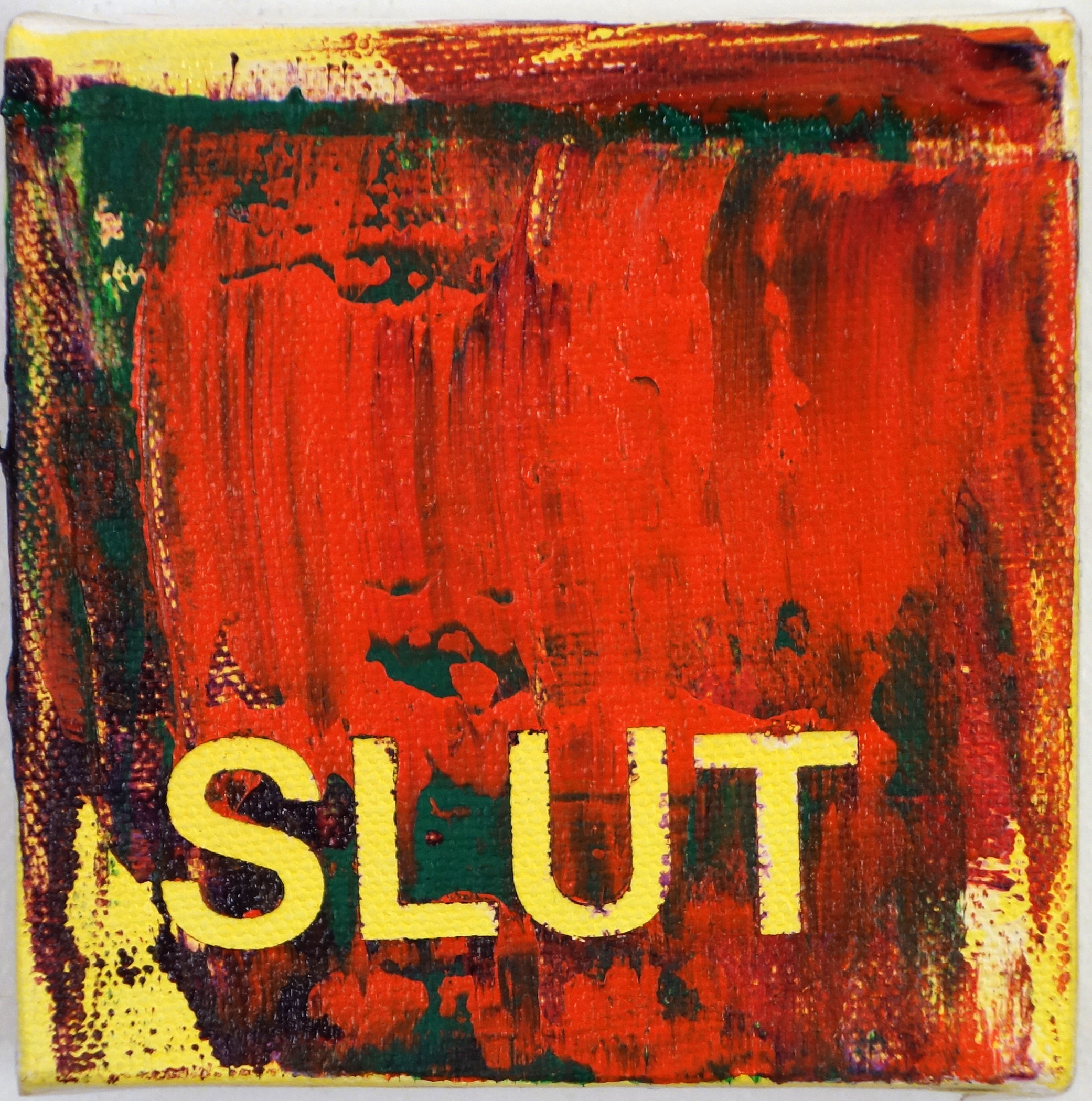
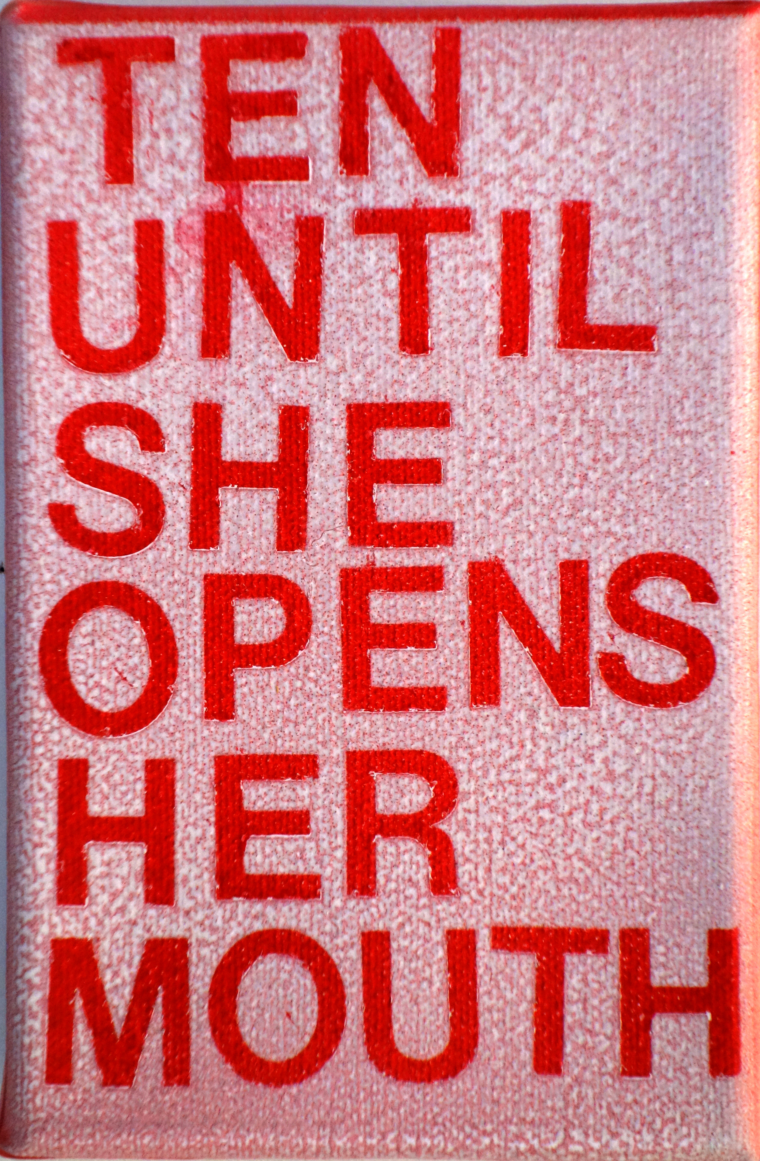
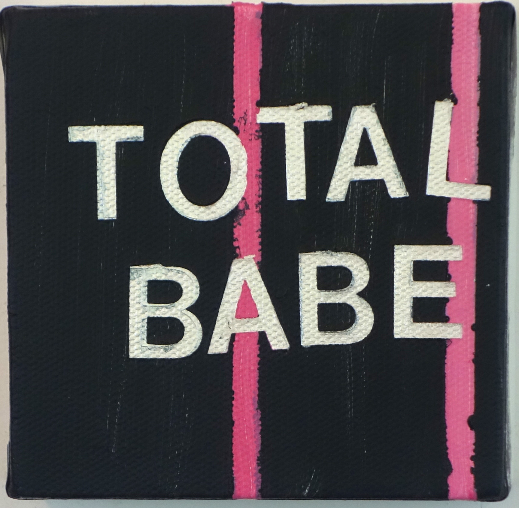
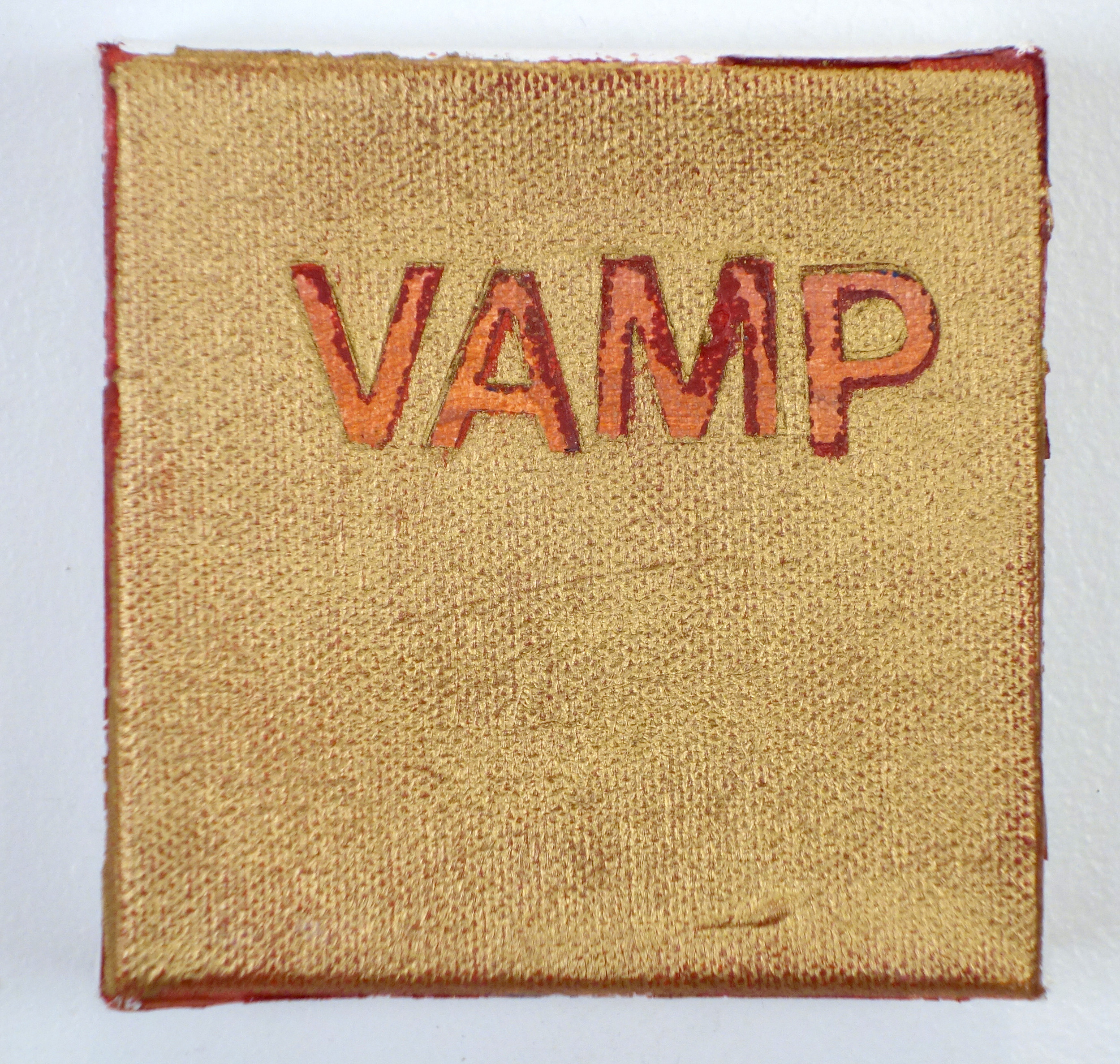
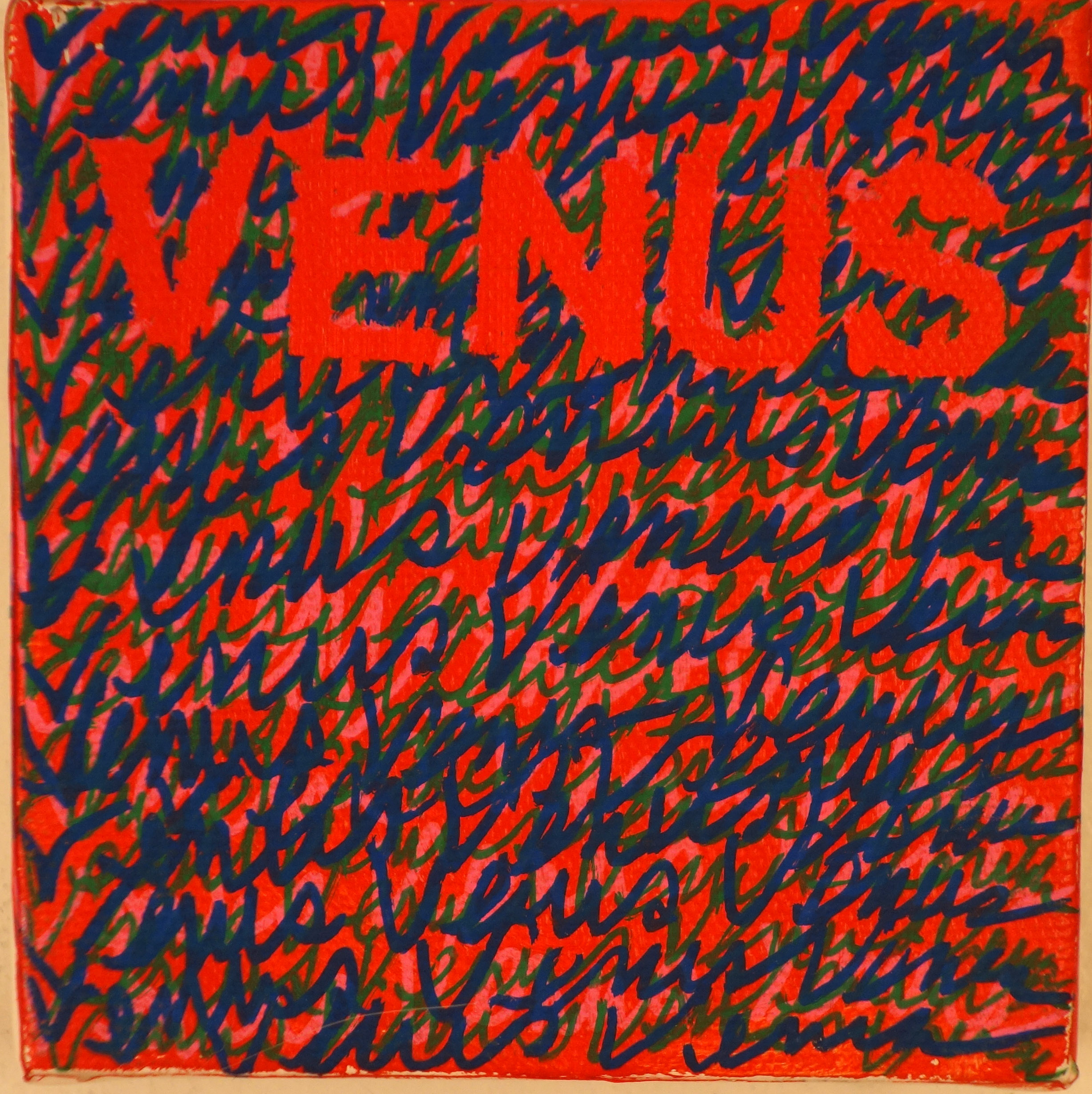
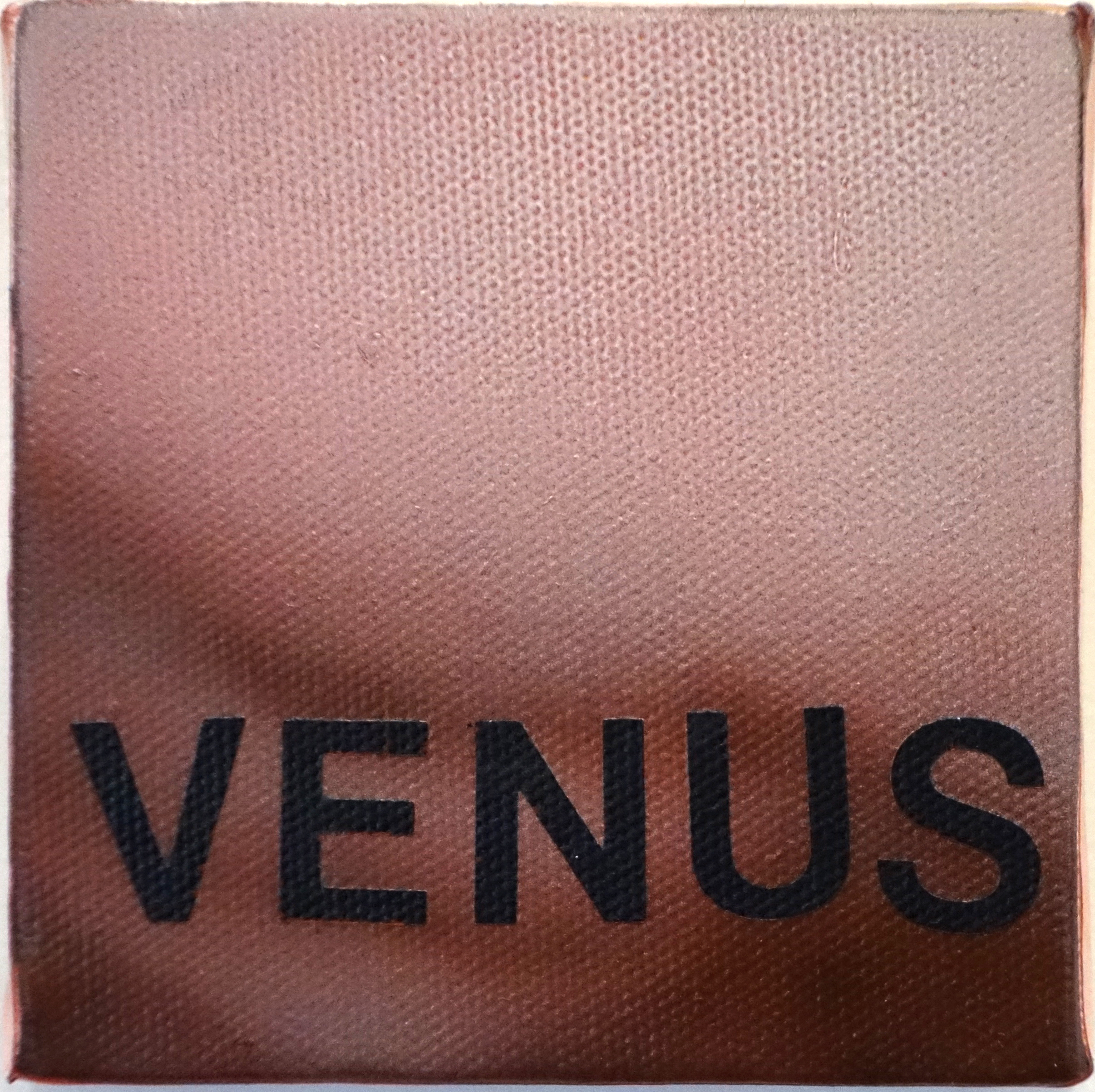
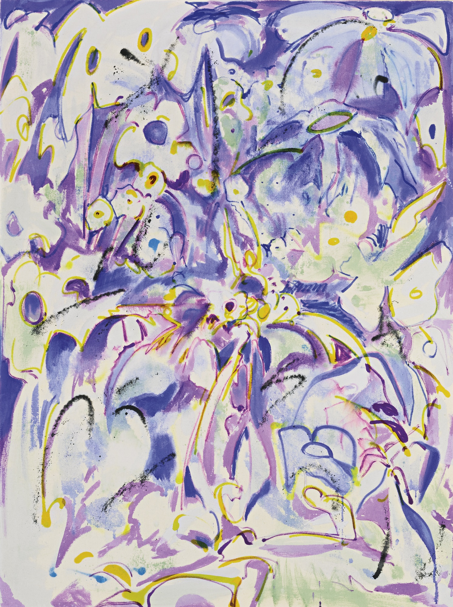
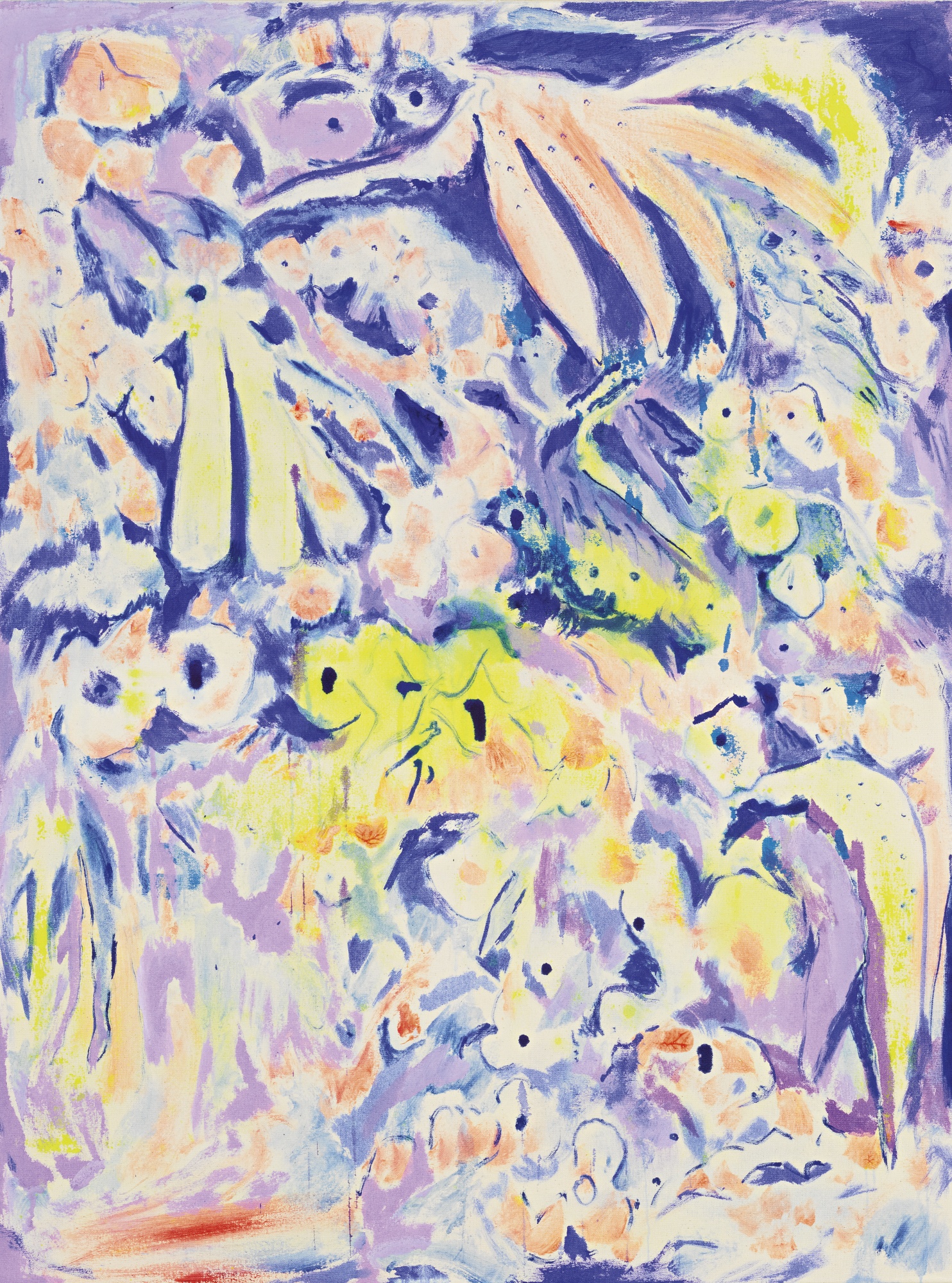
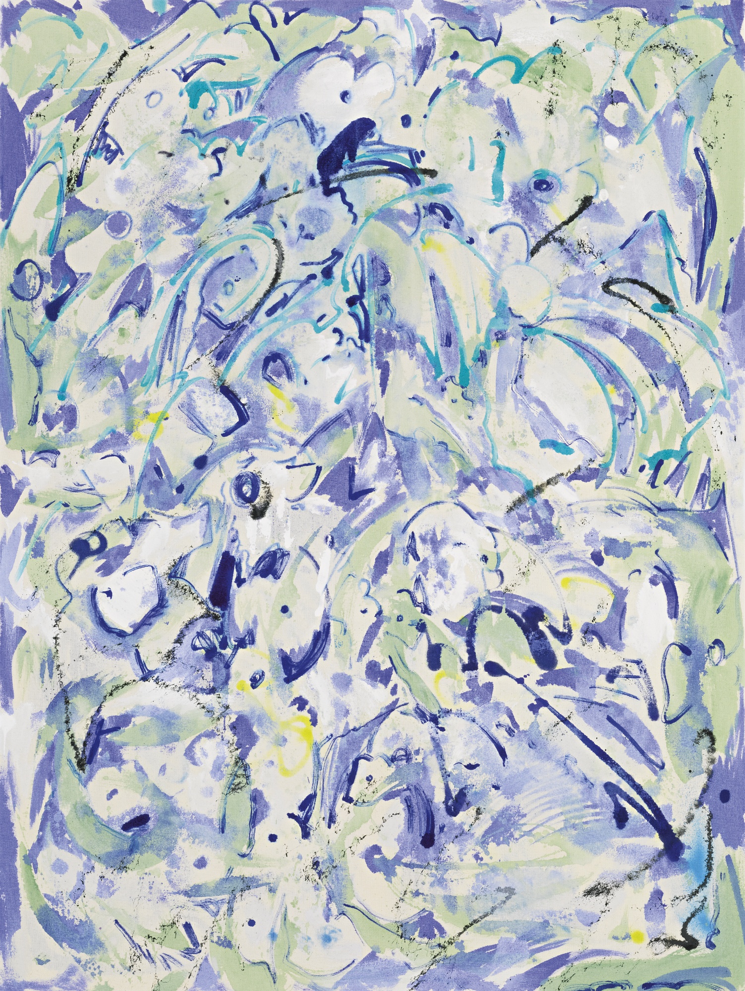
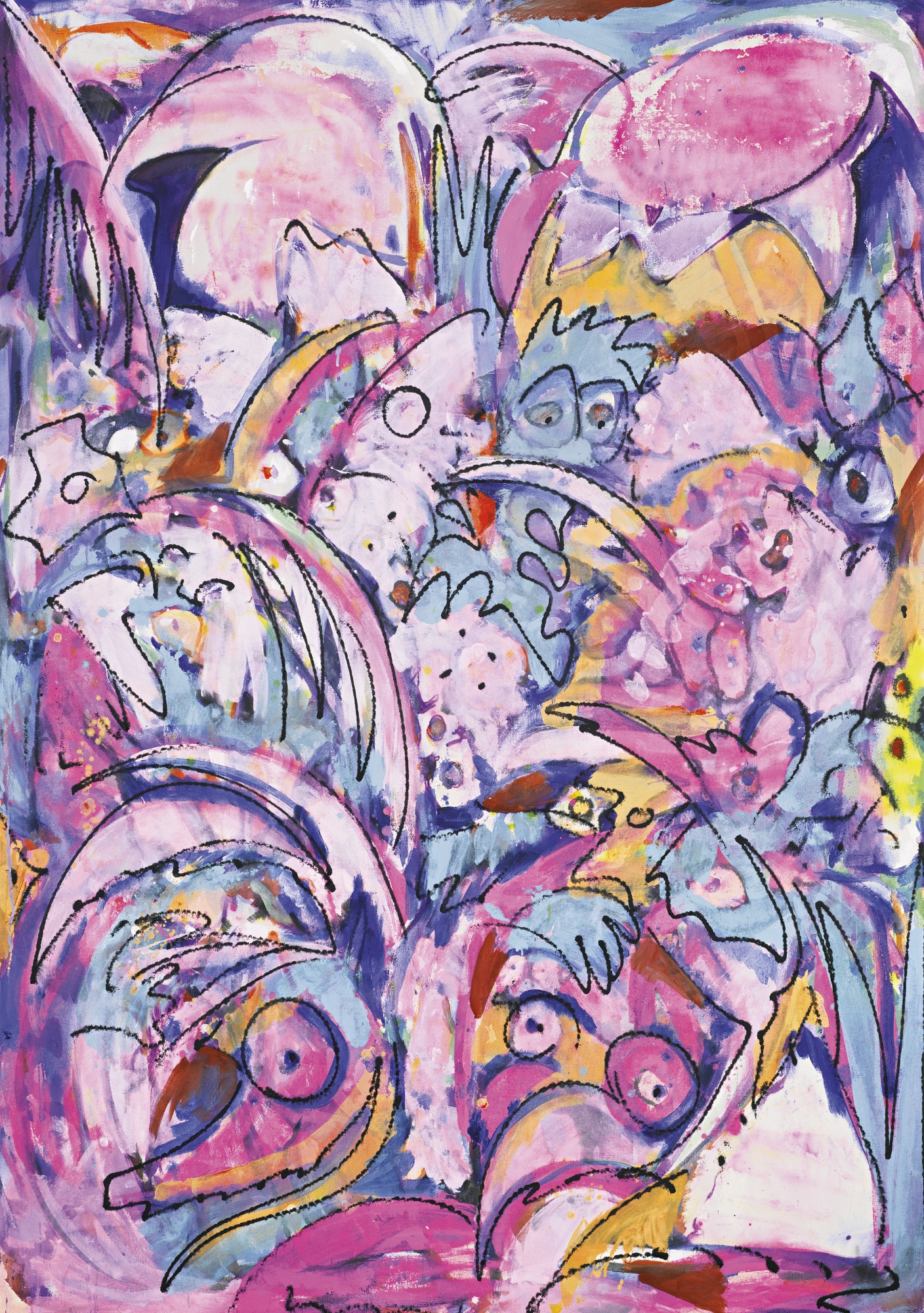
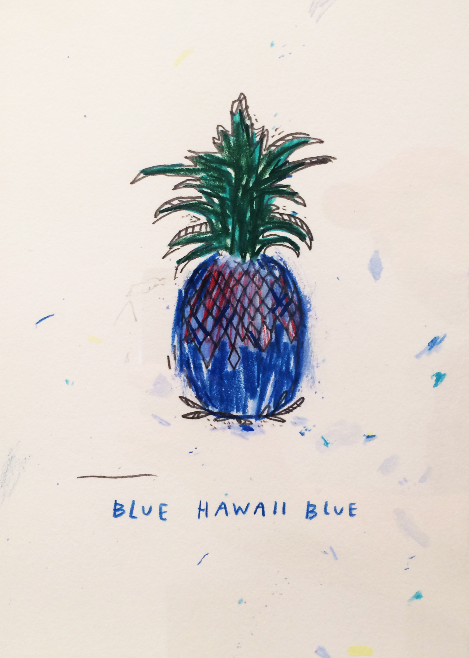
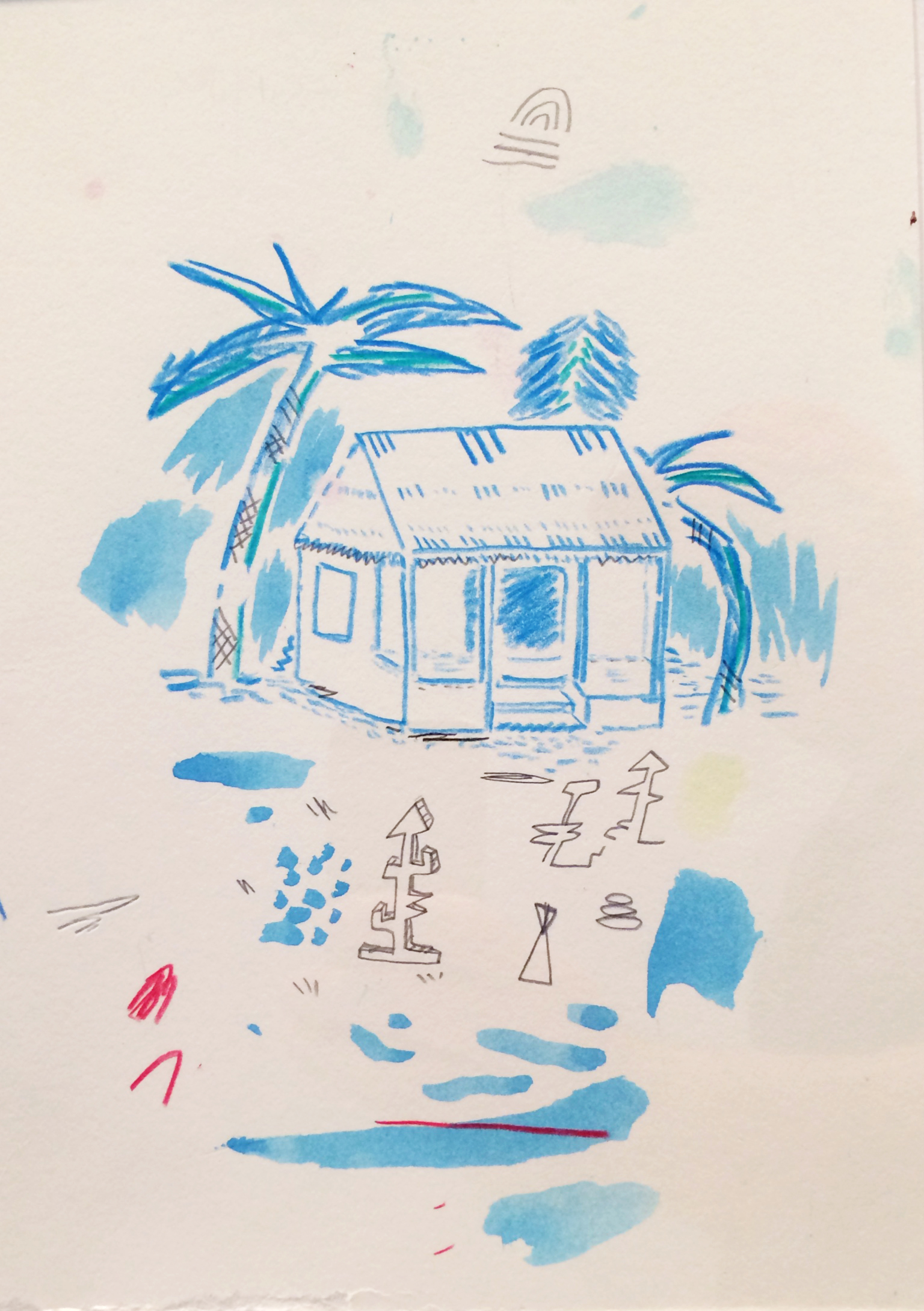
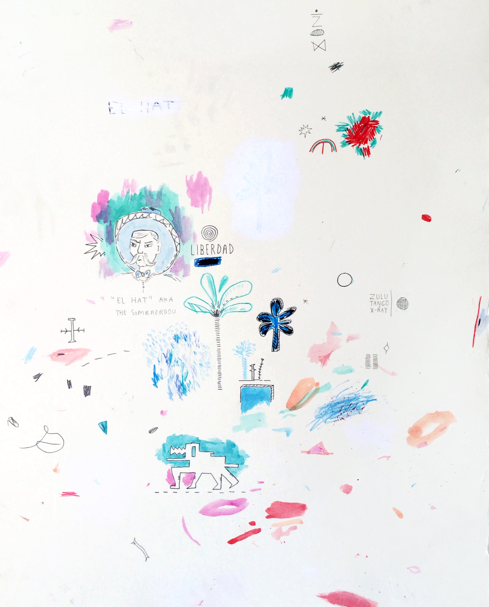
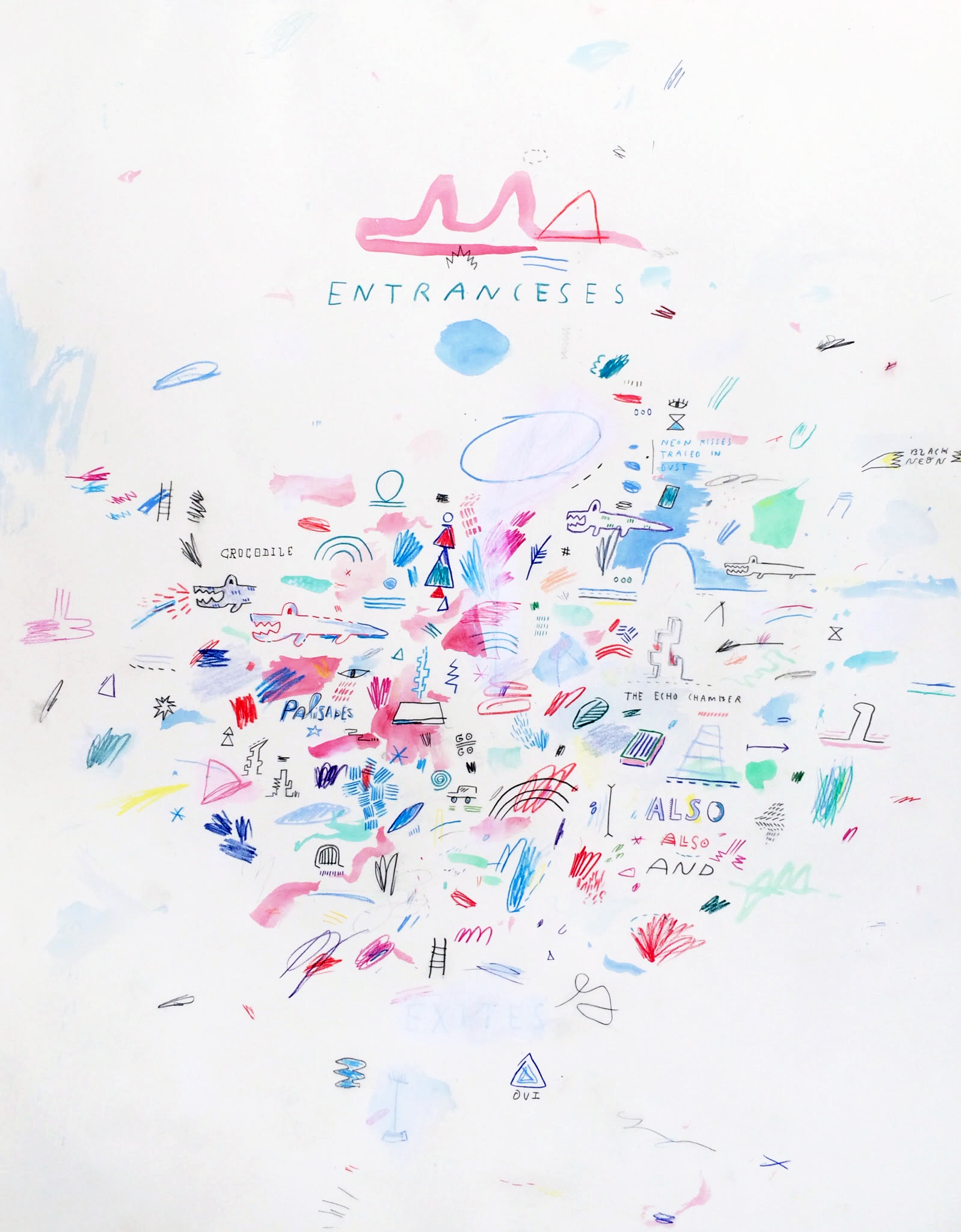
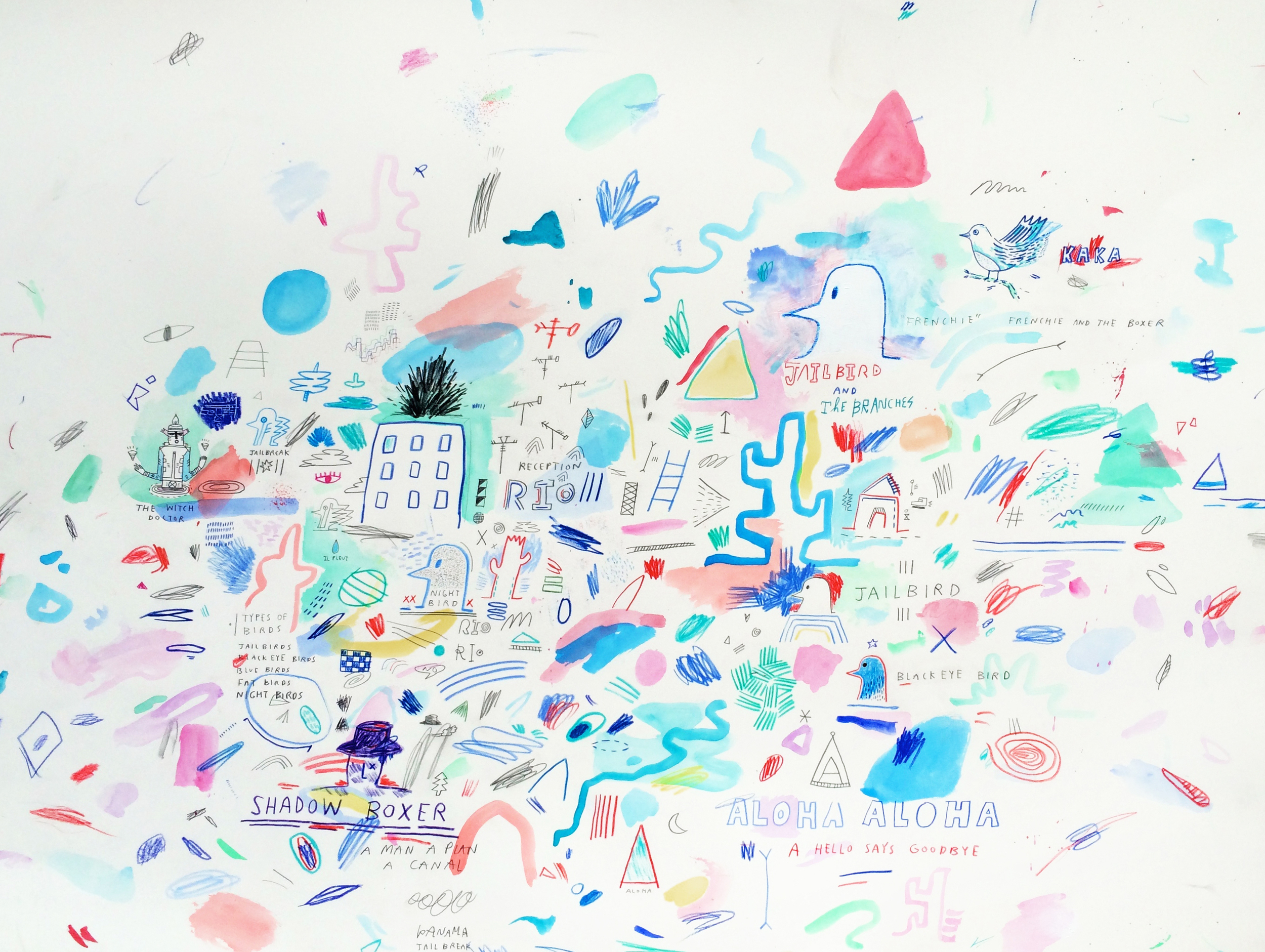
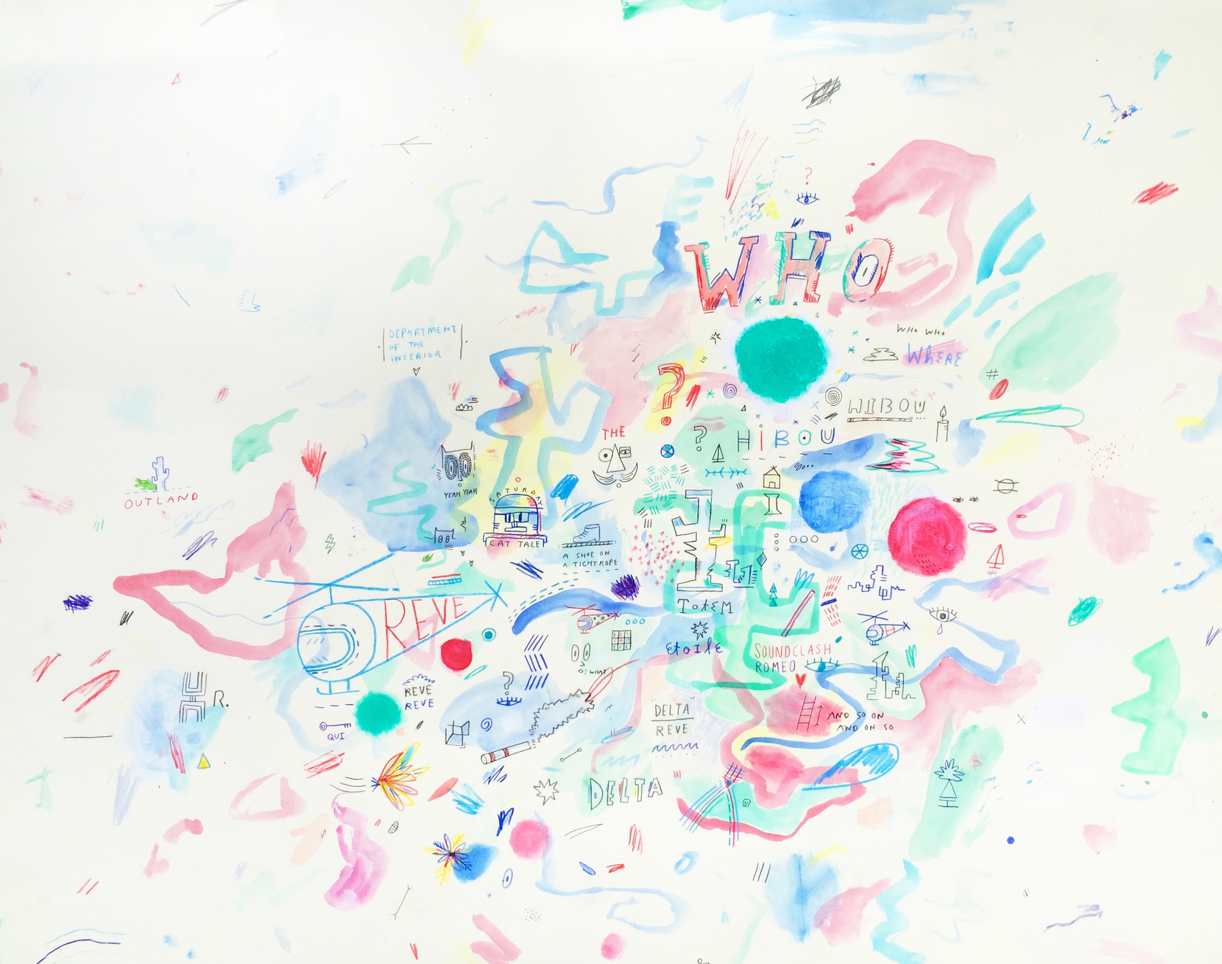
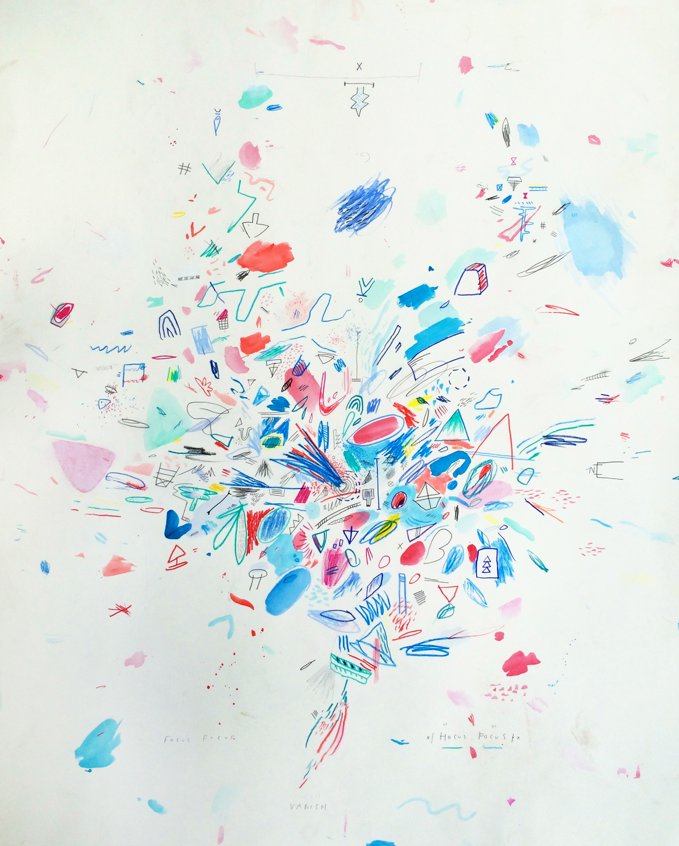
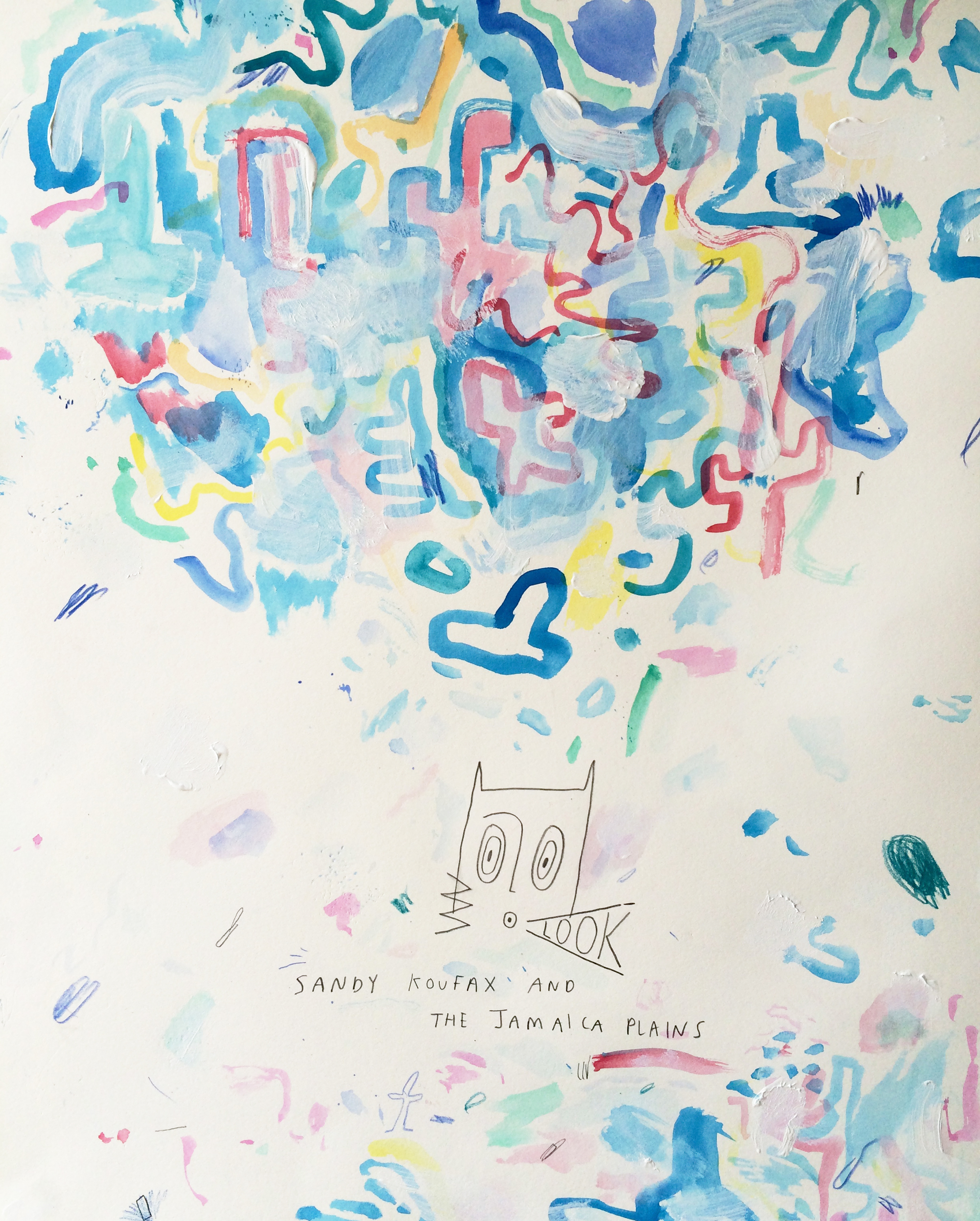
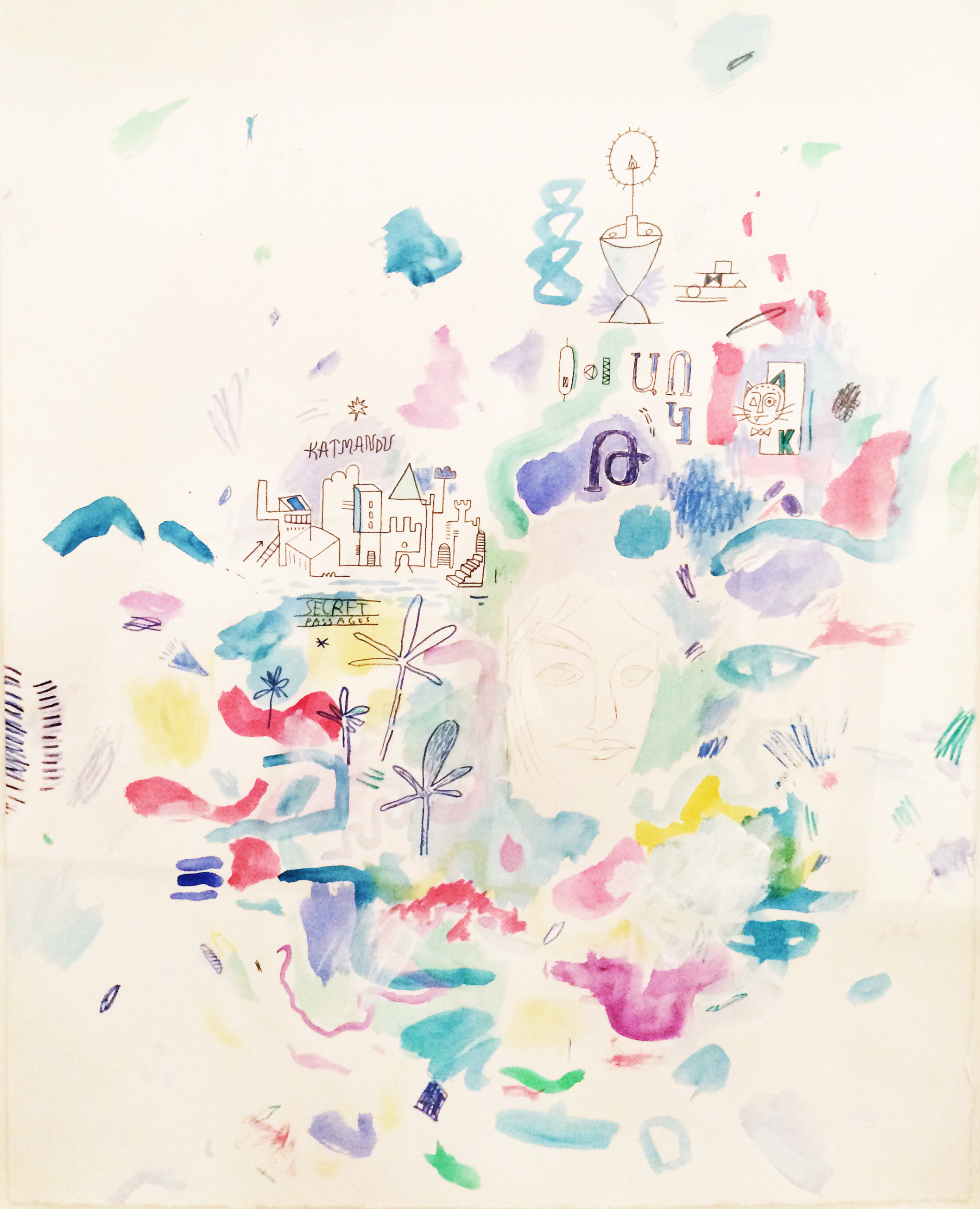
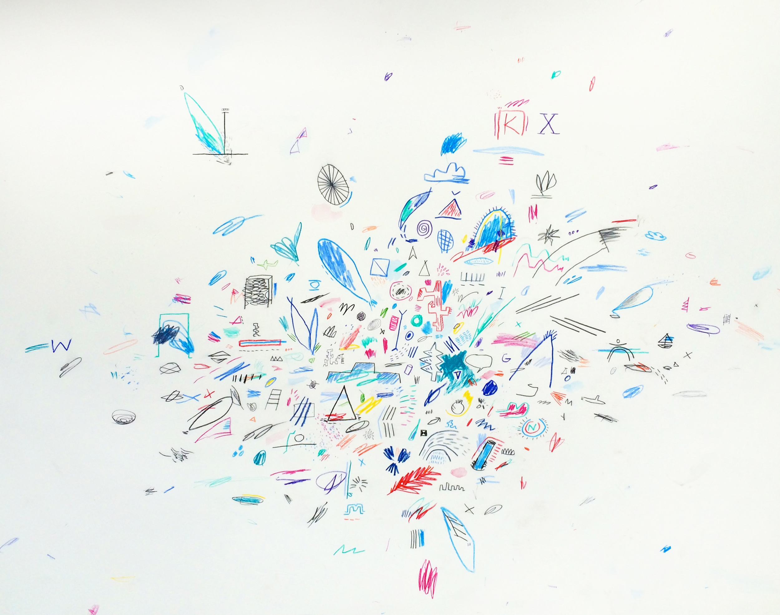
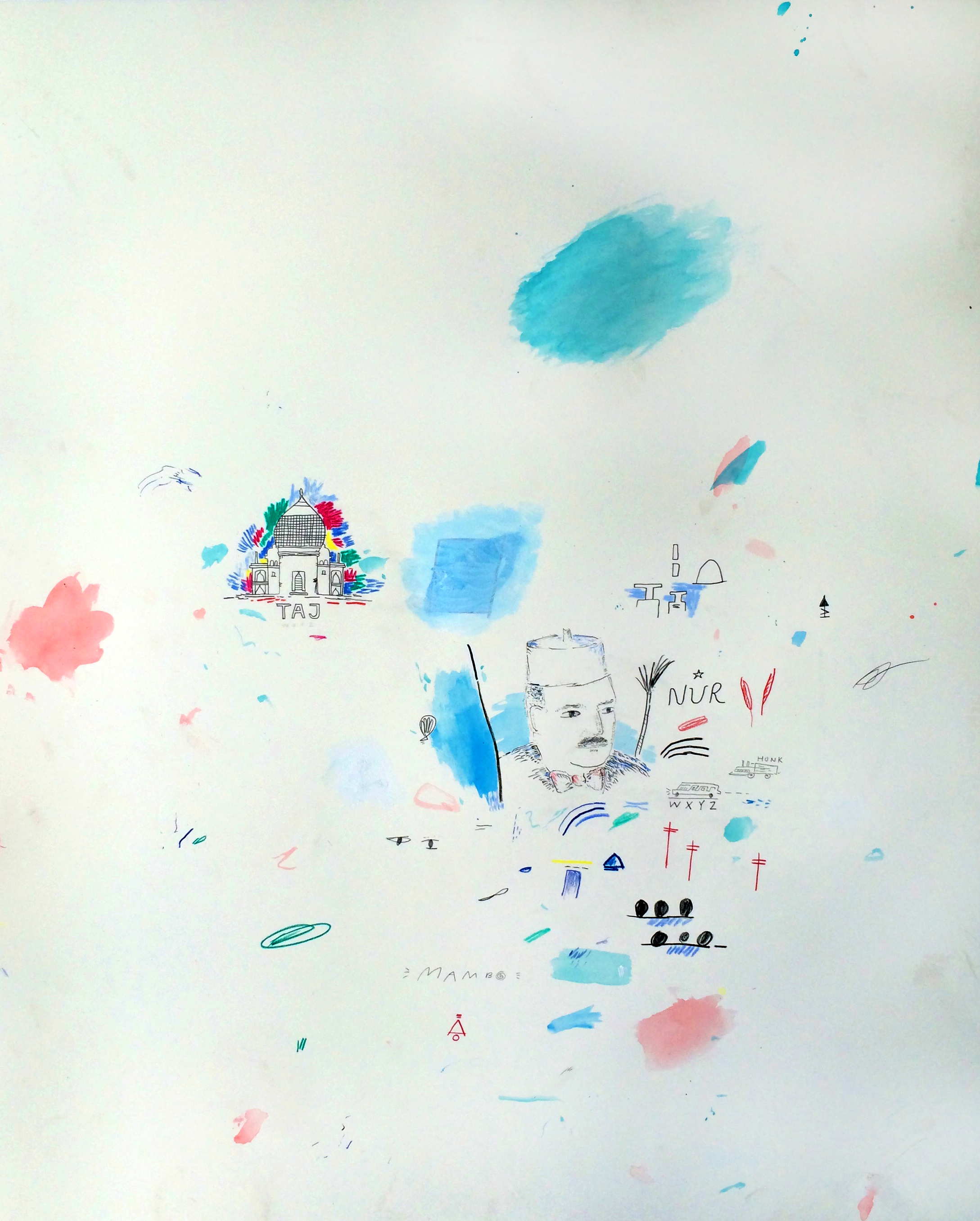
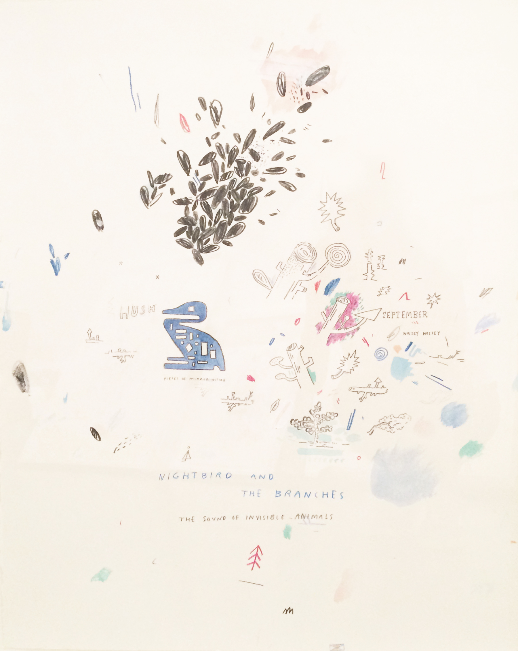
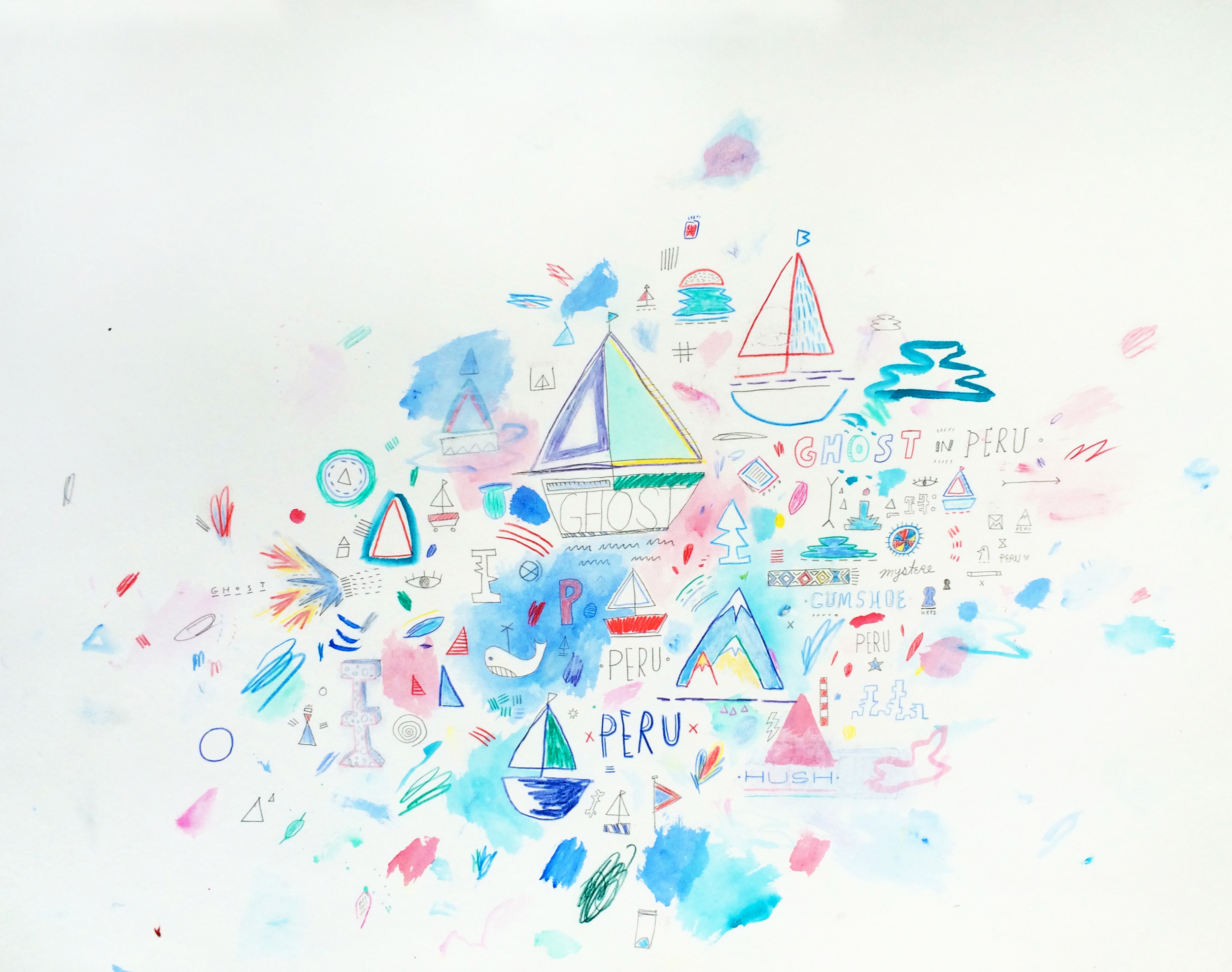
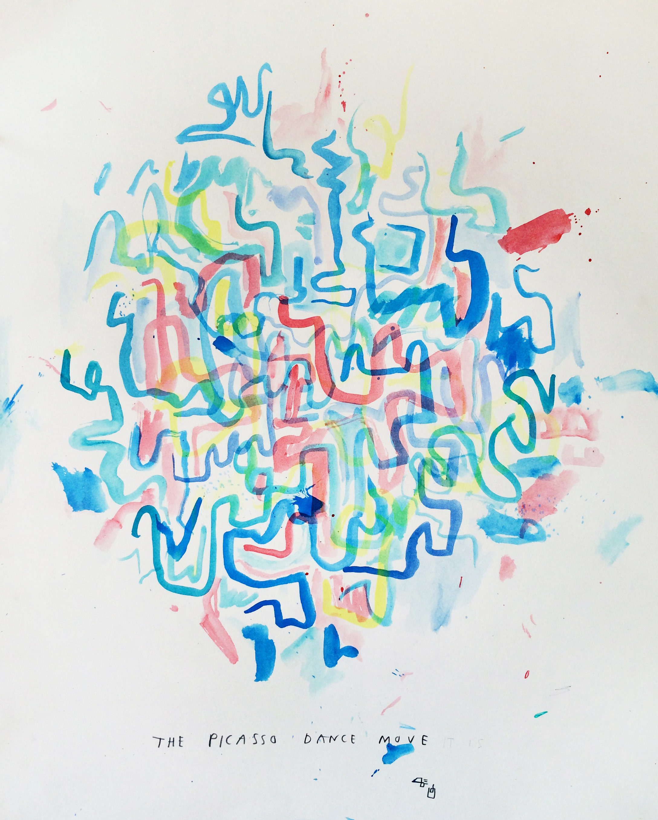
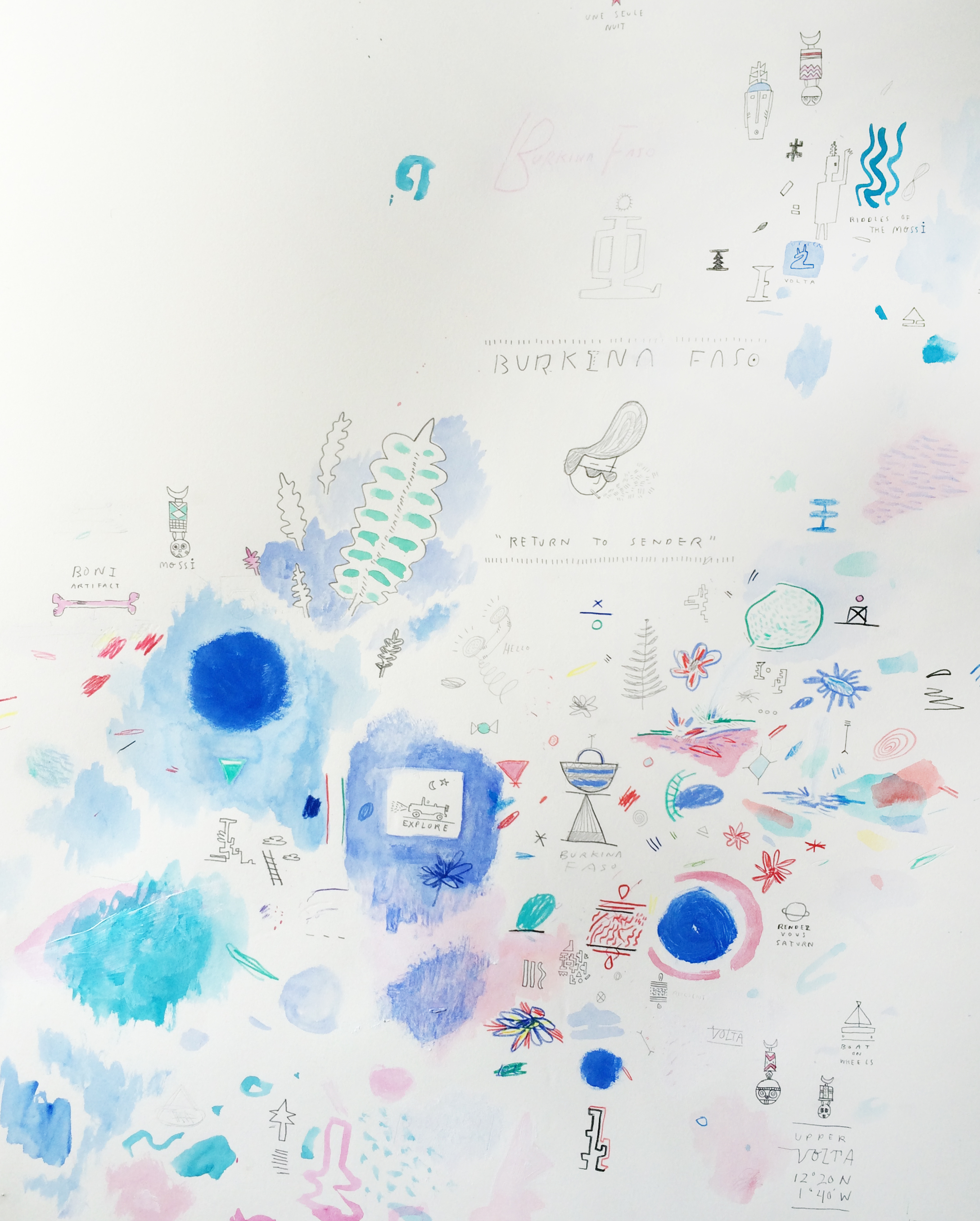
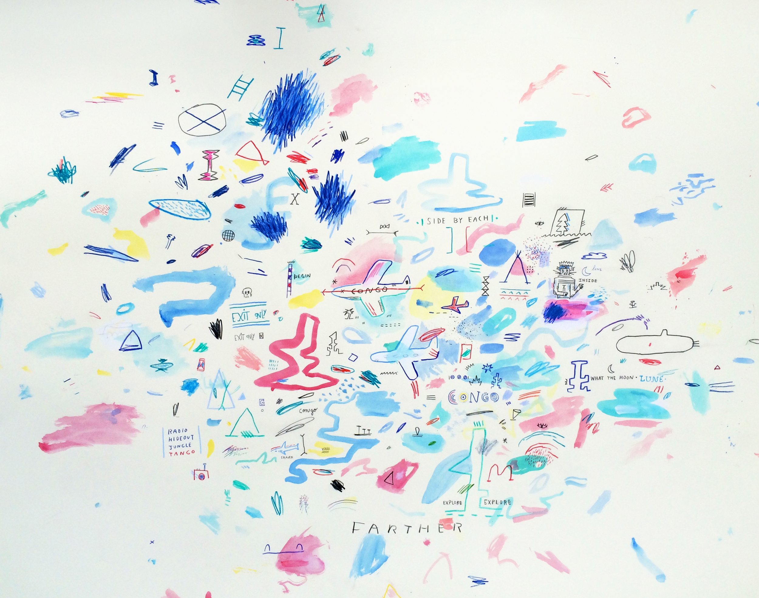
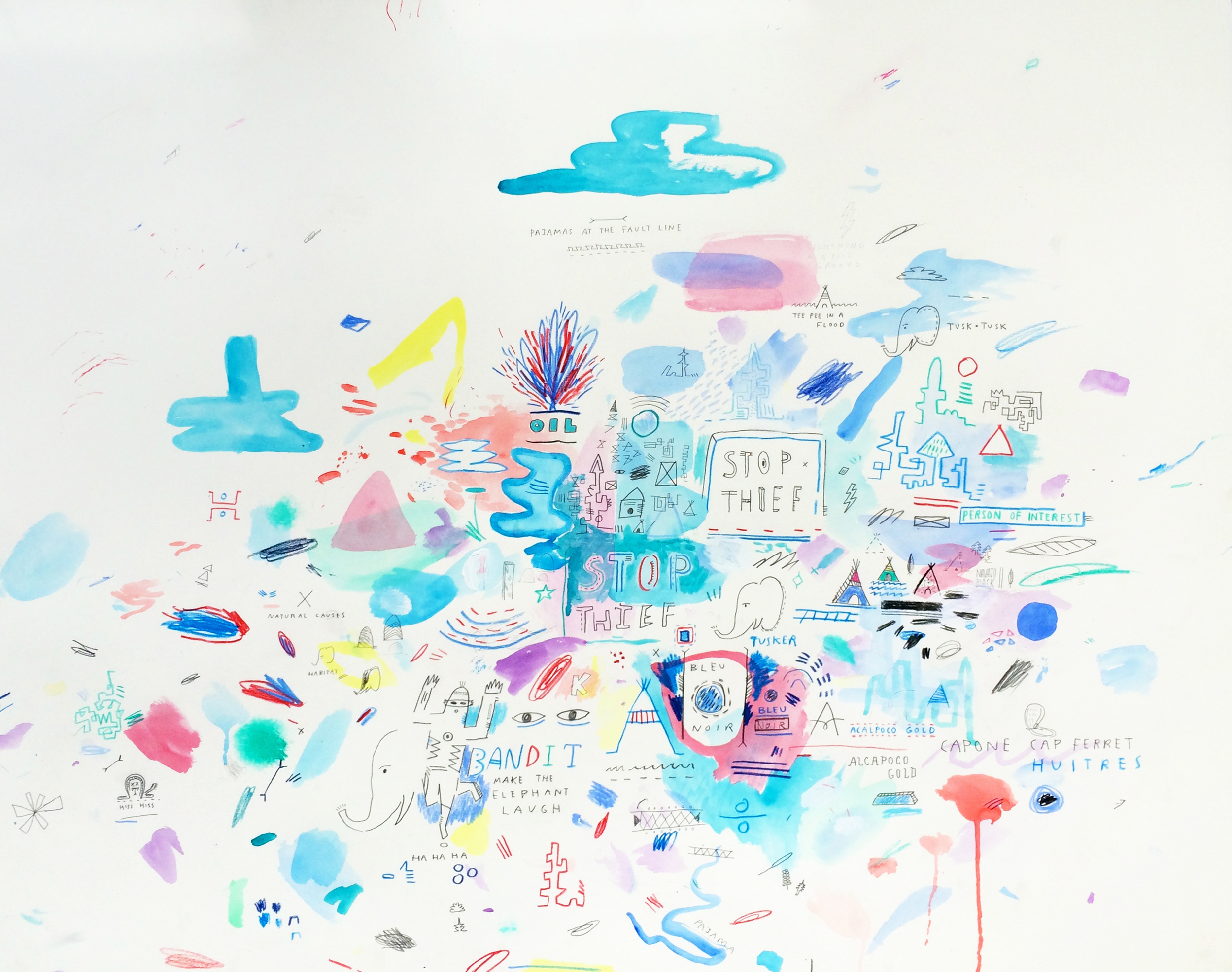
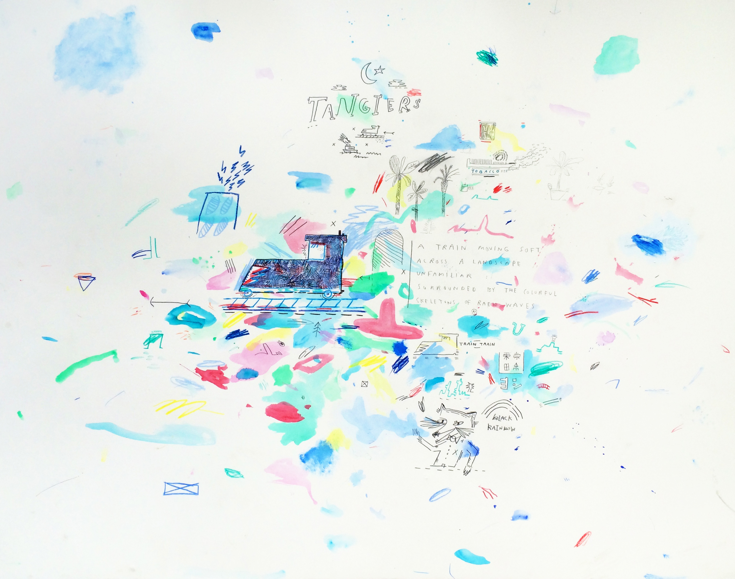
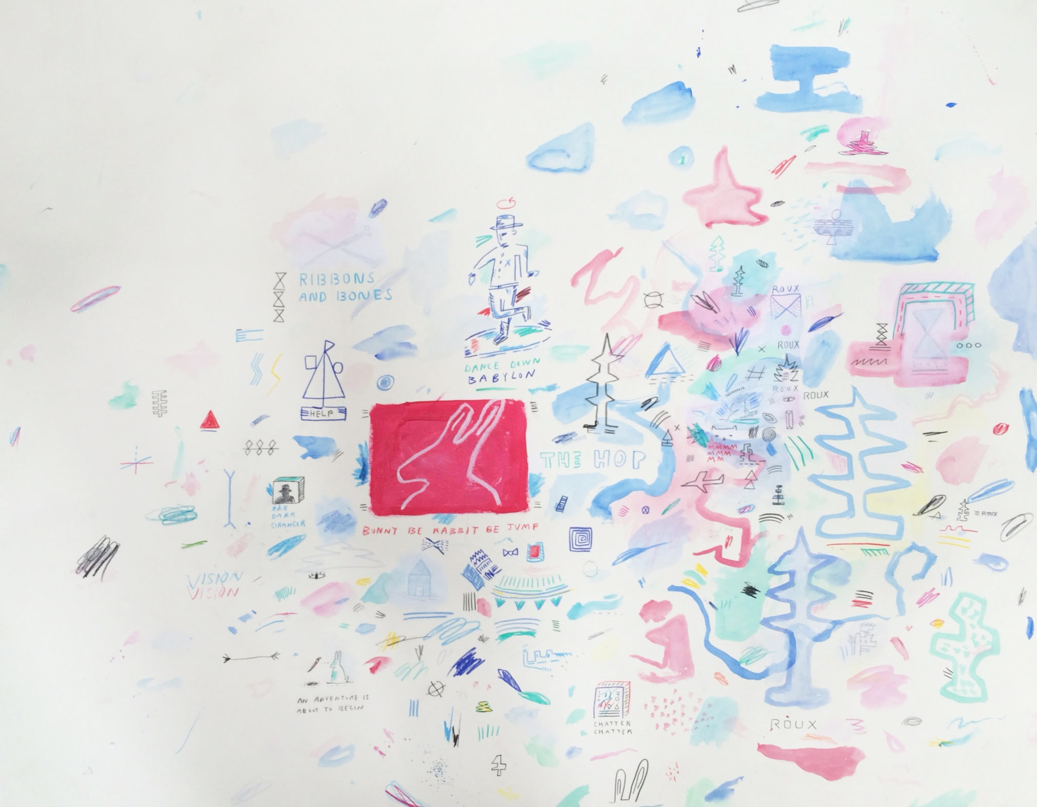
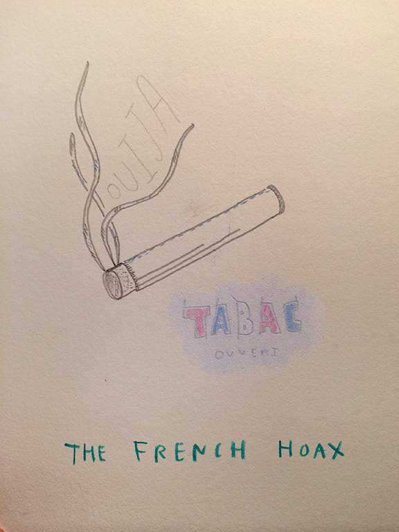
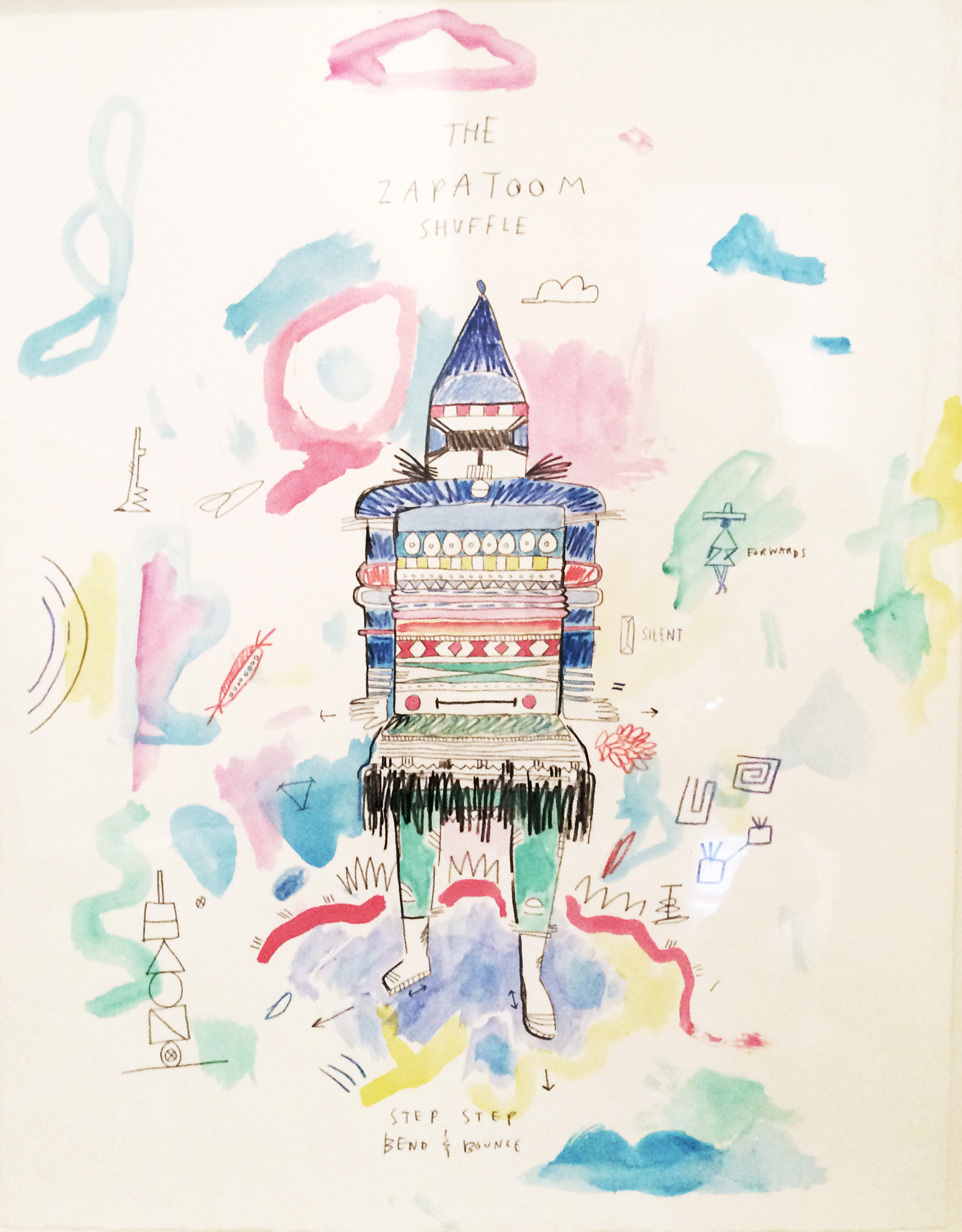
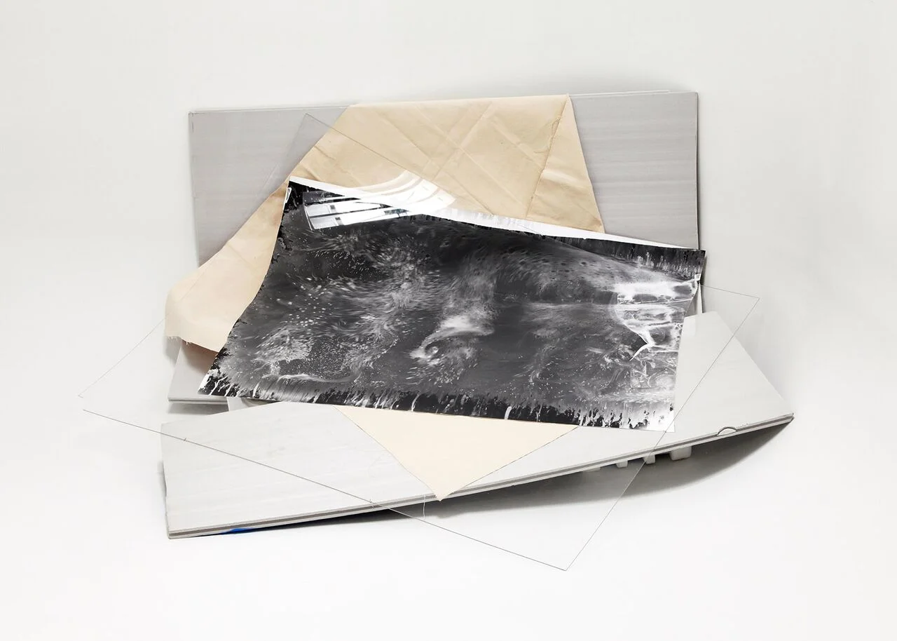
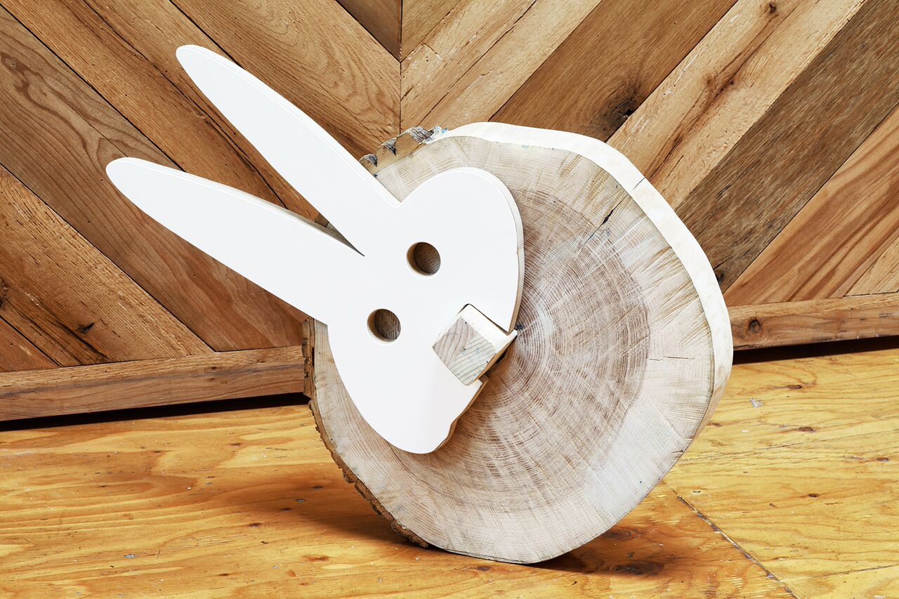
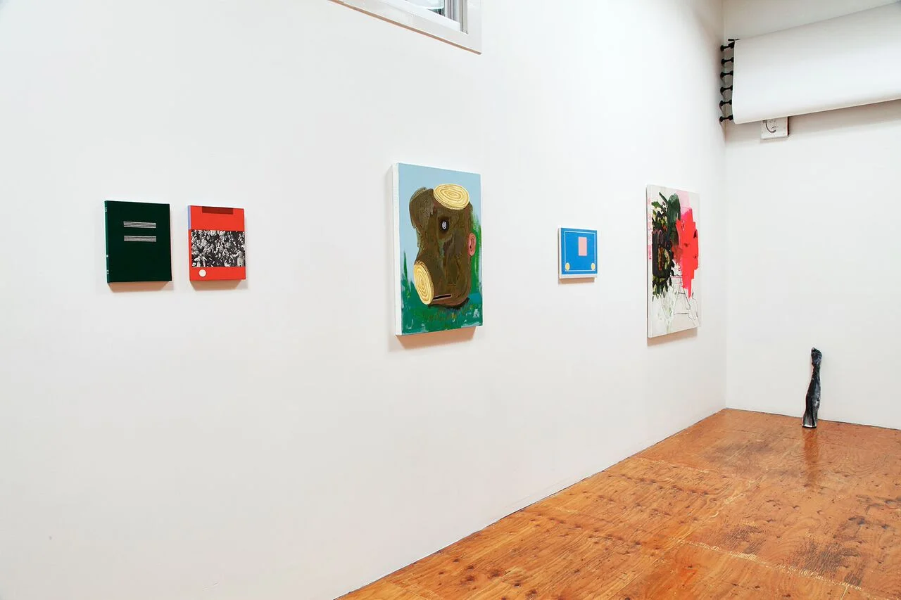
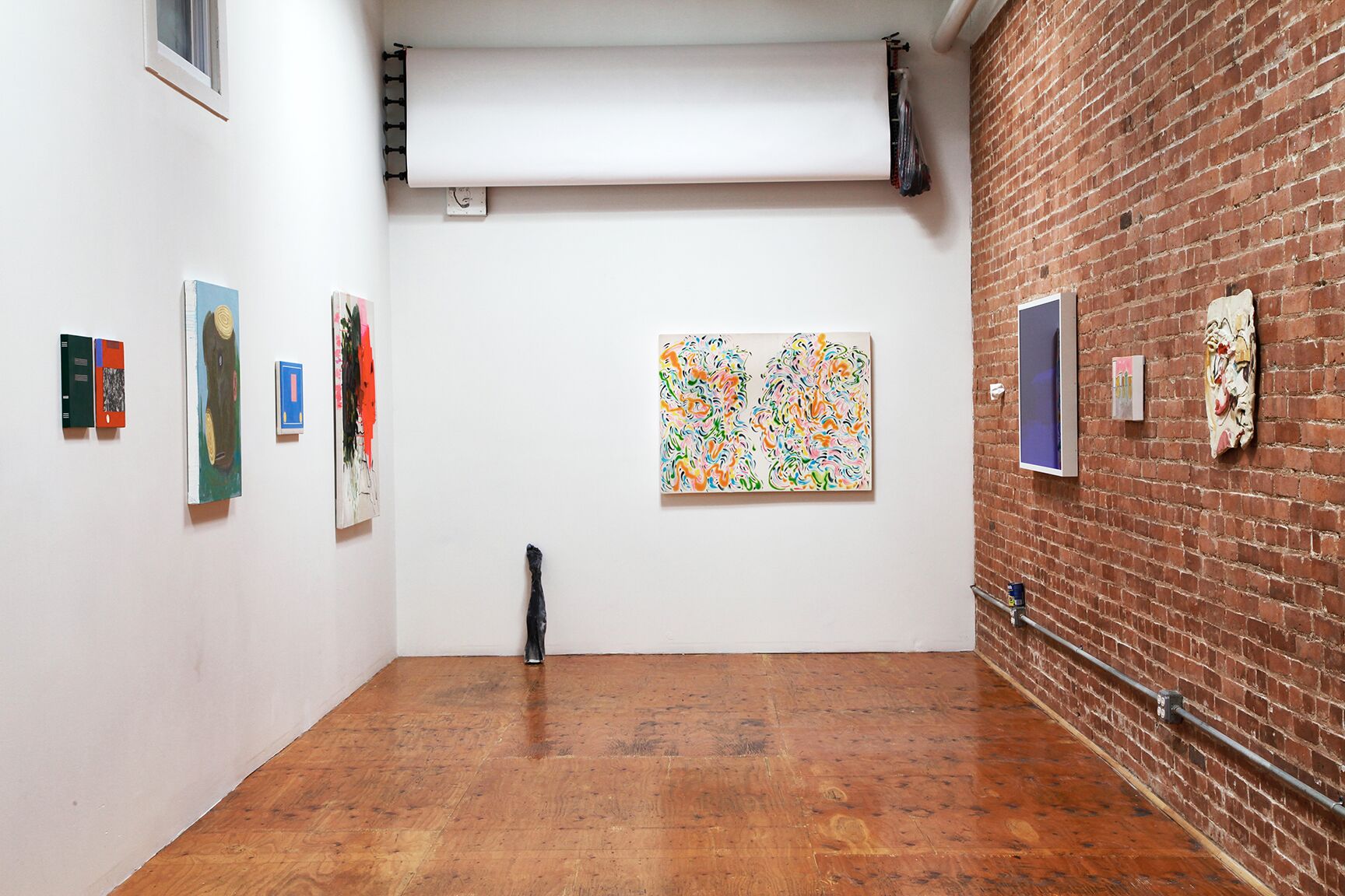
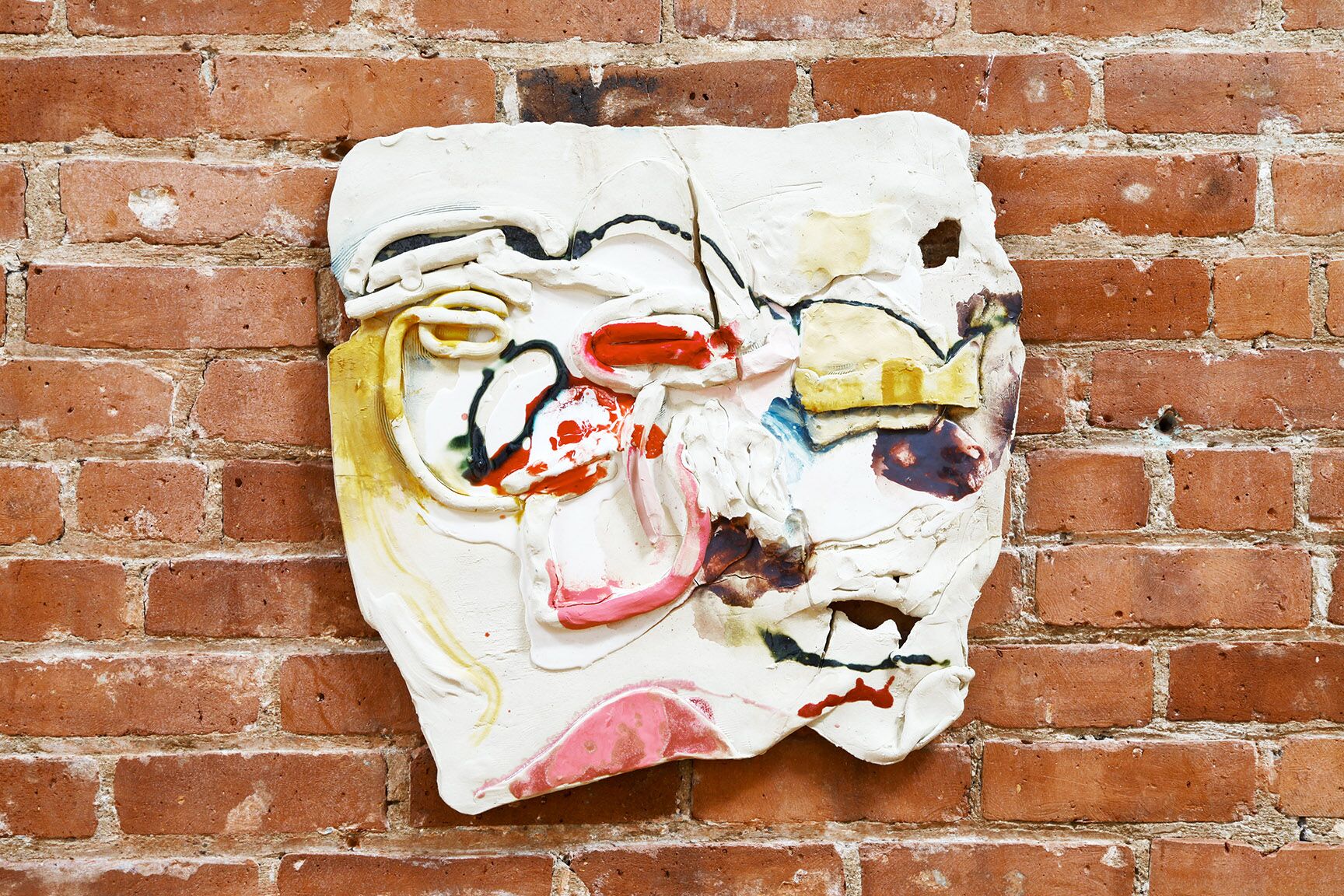
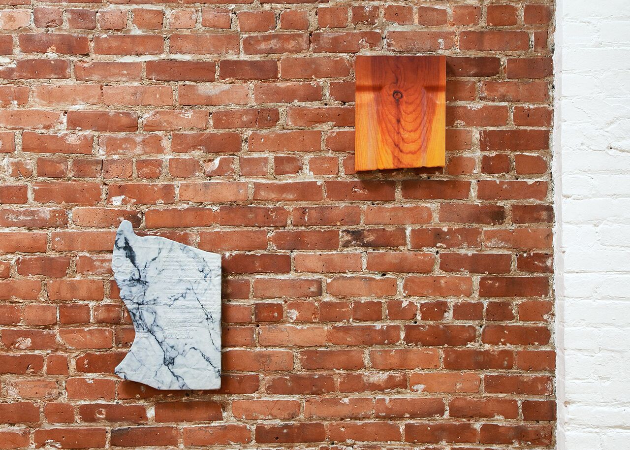
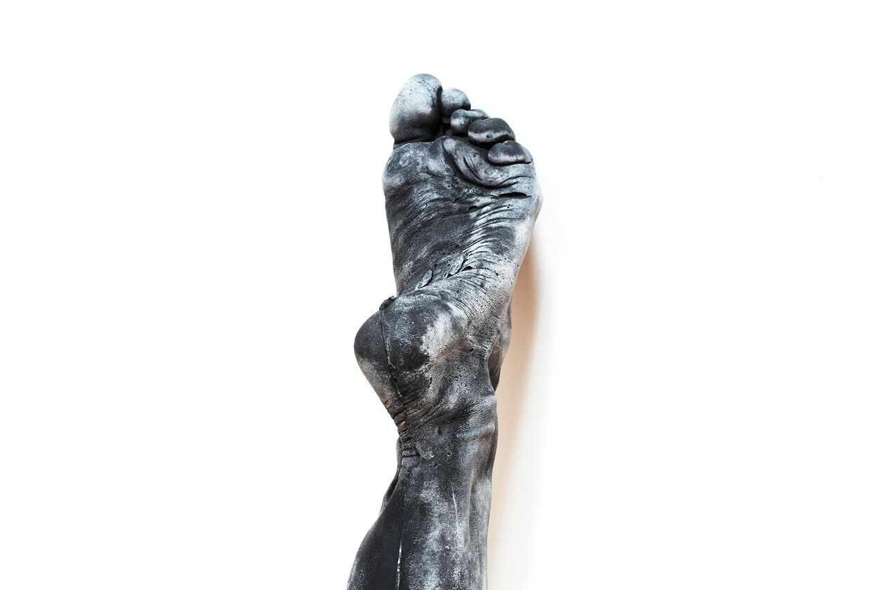
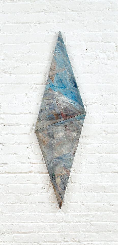
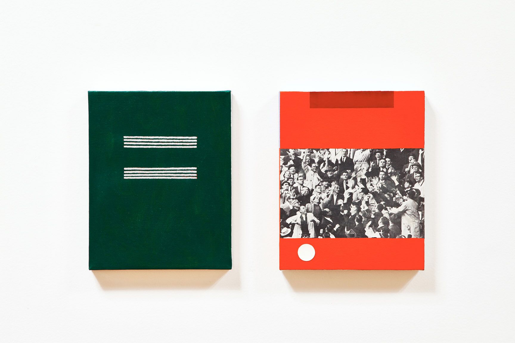
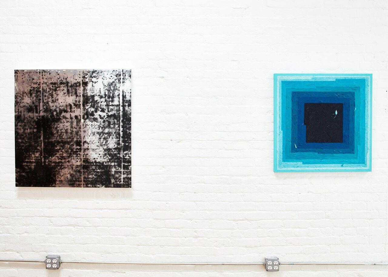
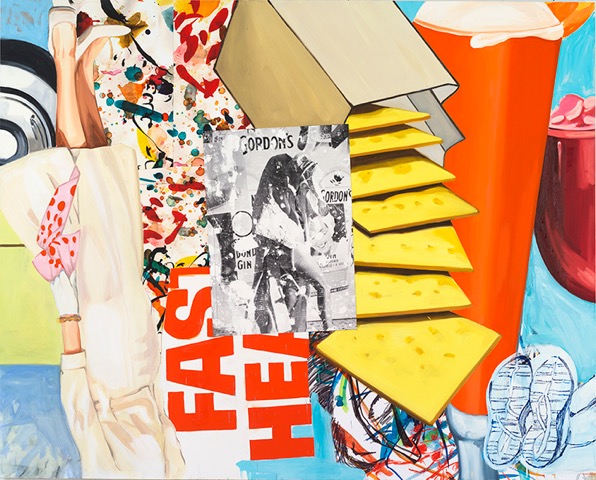
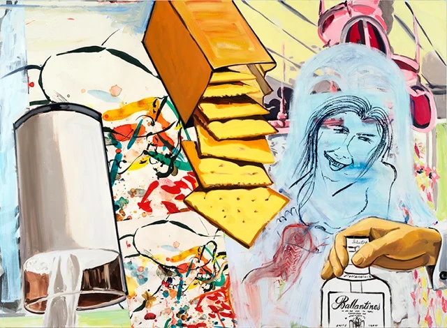
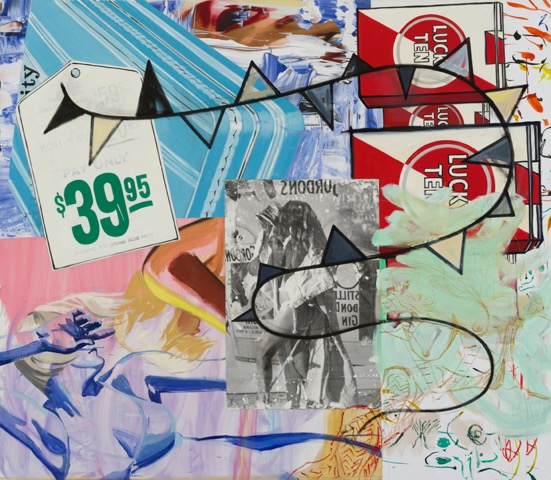
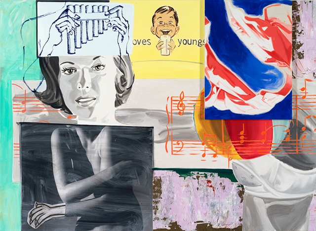
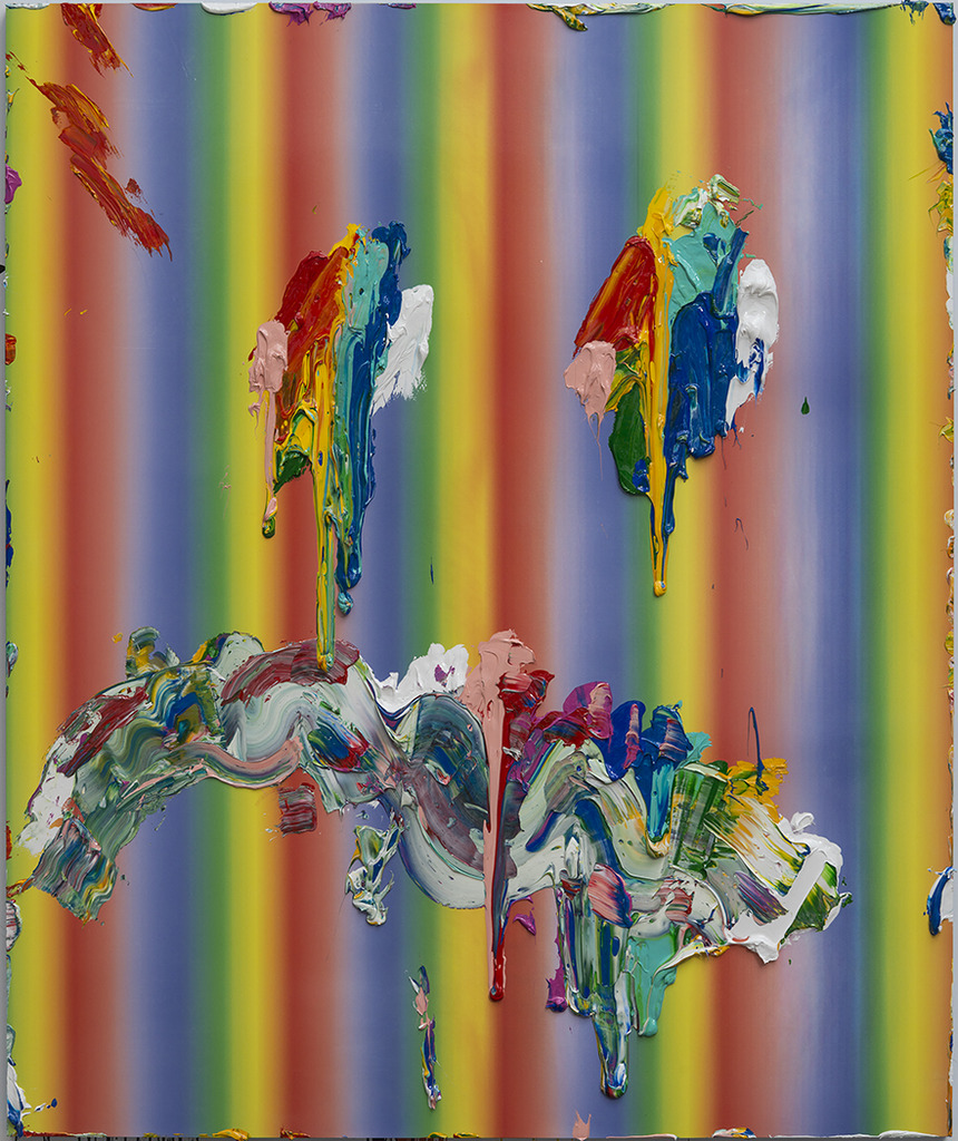
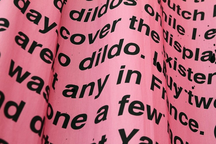
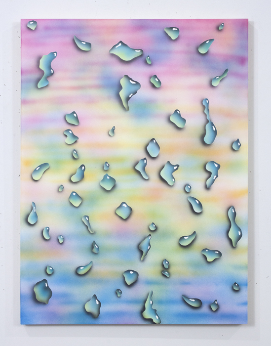
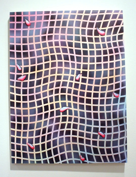
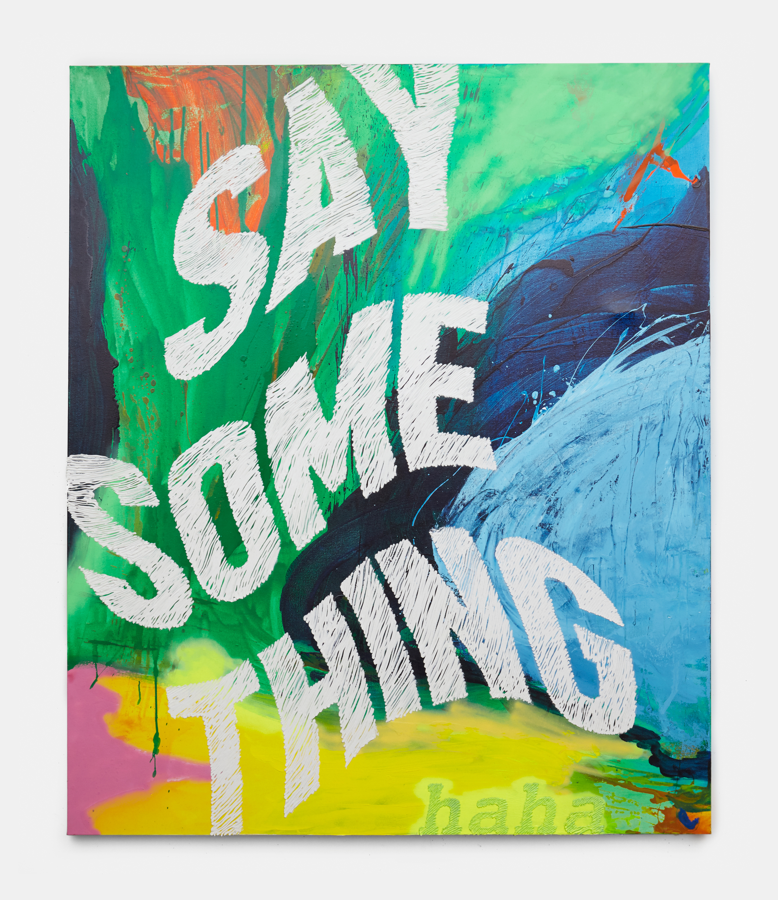
perennial millennial is a a group of gestural assemblages incorporating pop culture and textual tropes rooting this series in the language and preoccupations of social media and internet culture, a through line to the unique state of the so­-called millennial generation—sometimes derisively so—who occupy a dichotomous space of anxiety and full­-throated confidence.

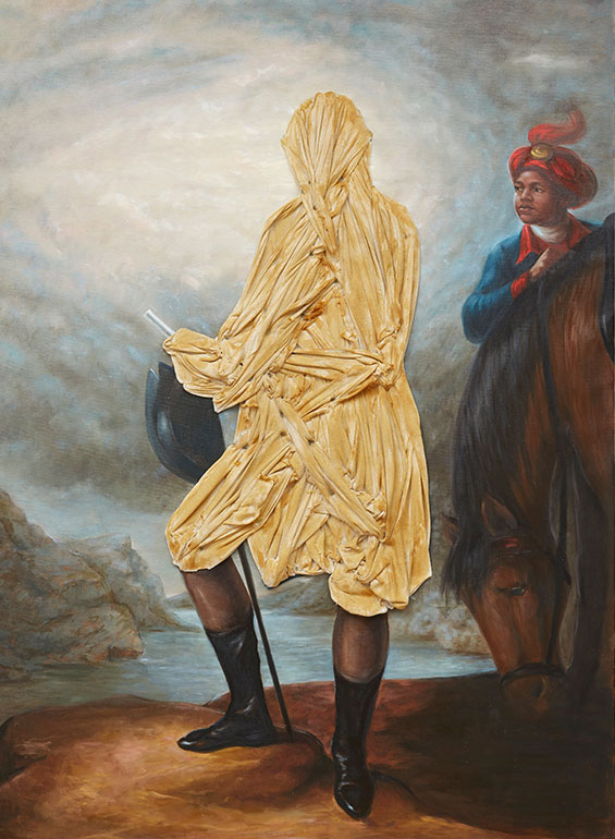
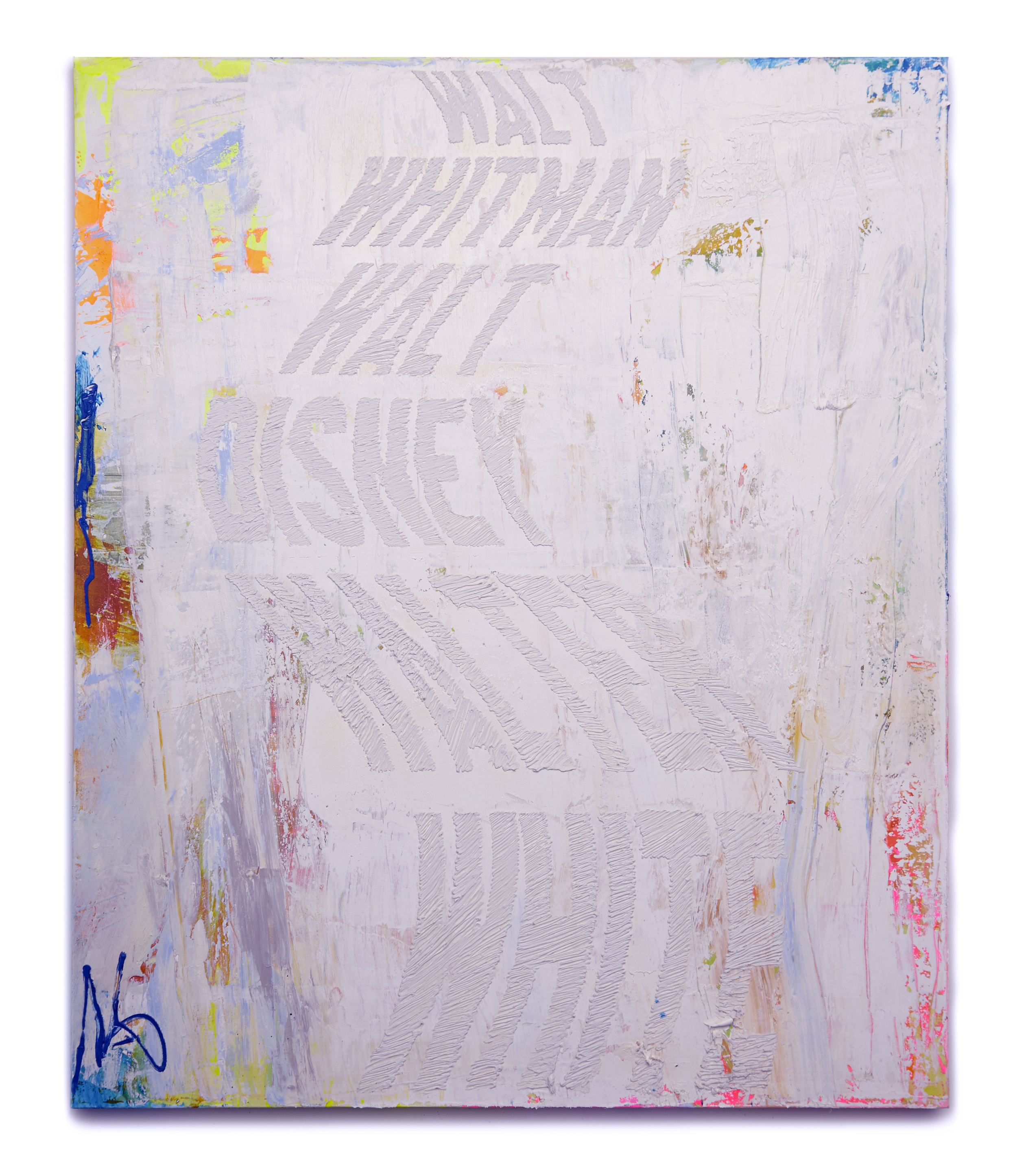
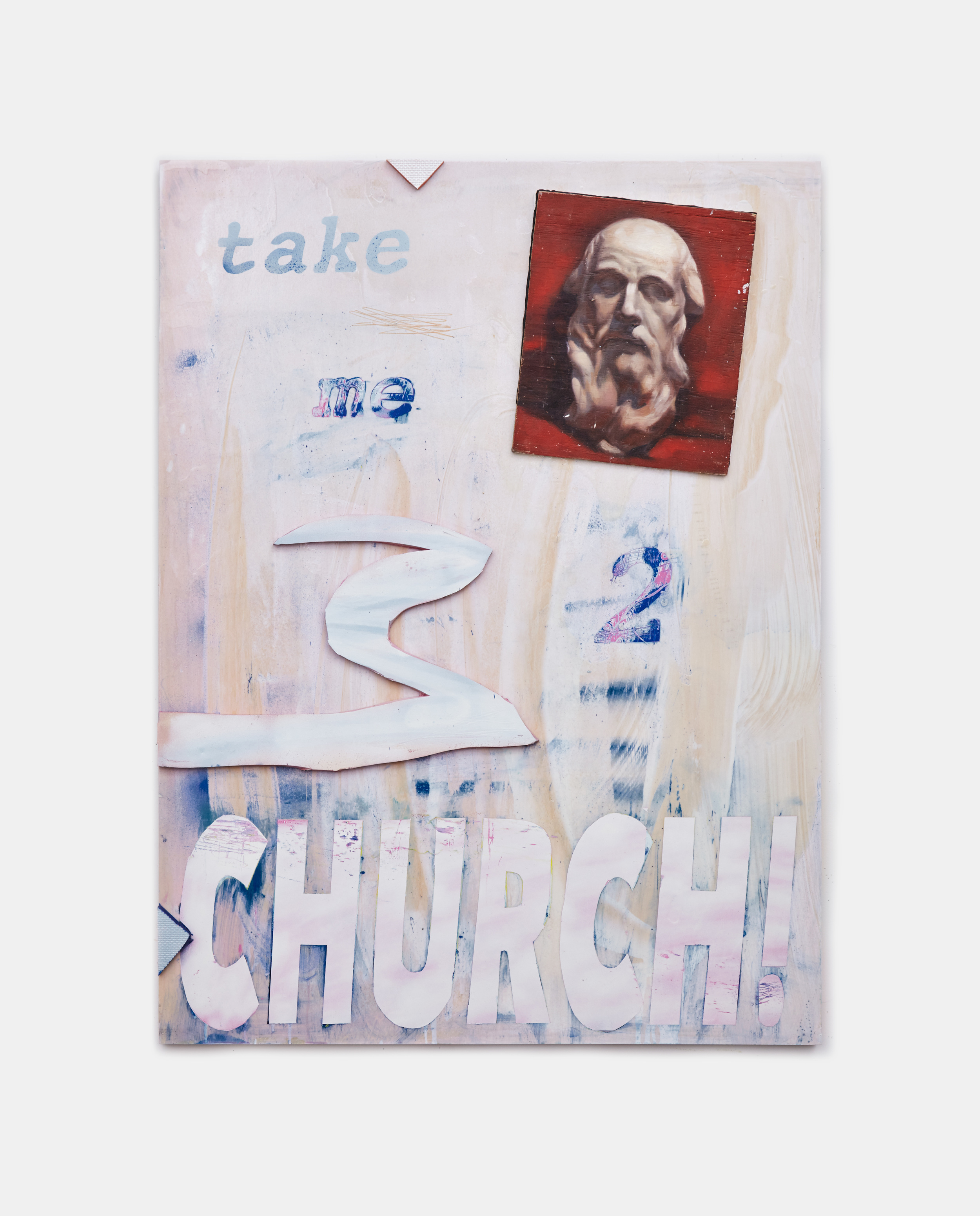
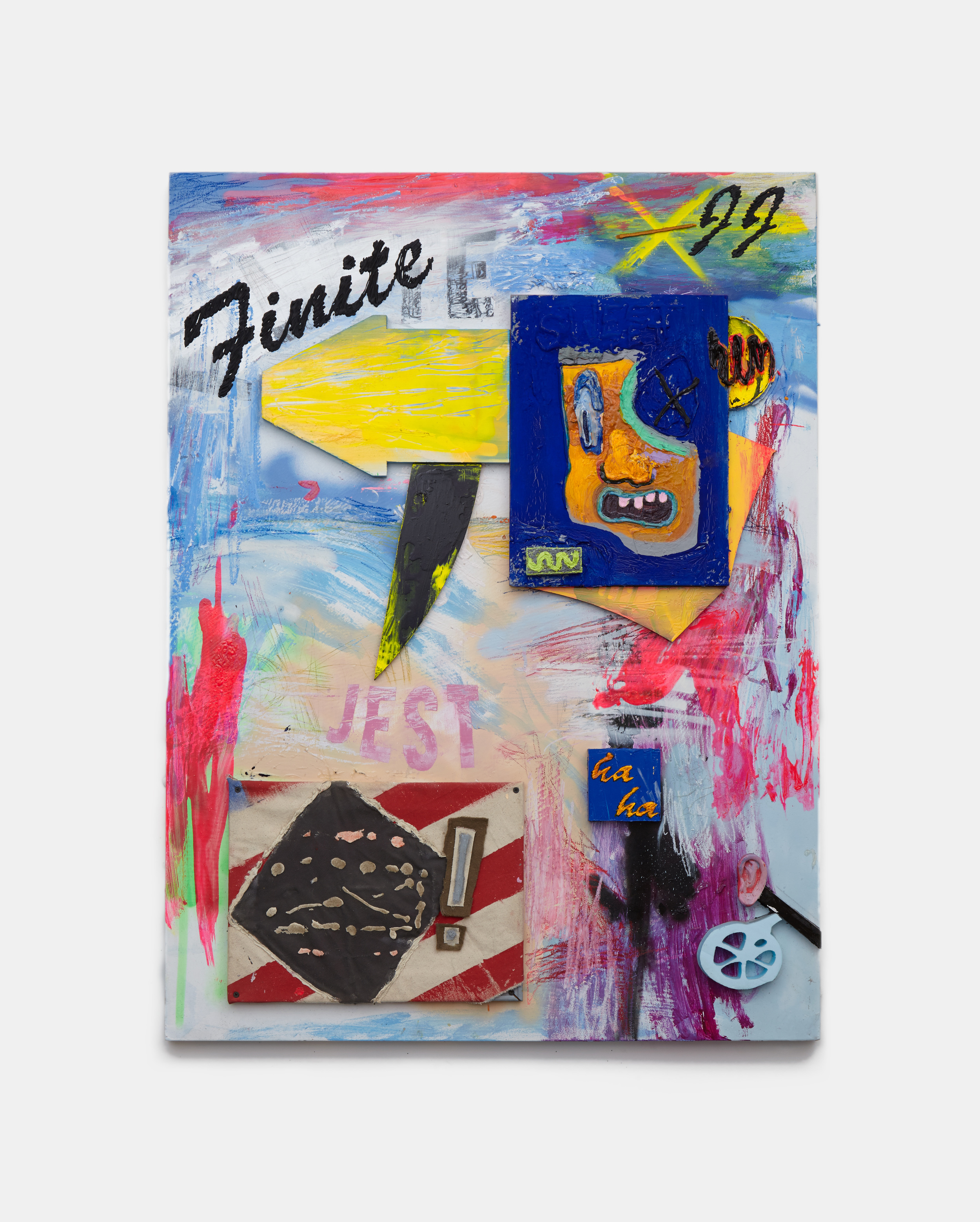
as seen by the invented millennial “jackson johns,” the theoretical progeny of robert rauschenberg and jasper johns within the alternative reality where such a thing might be possible, the works constitute an imaginative revival of dada image making.
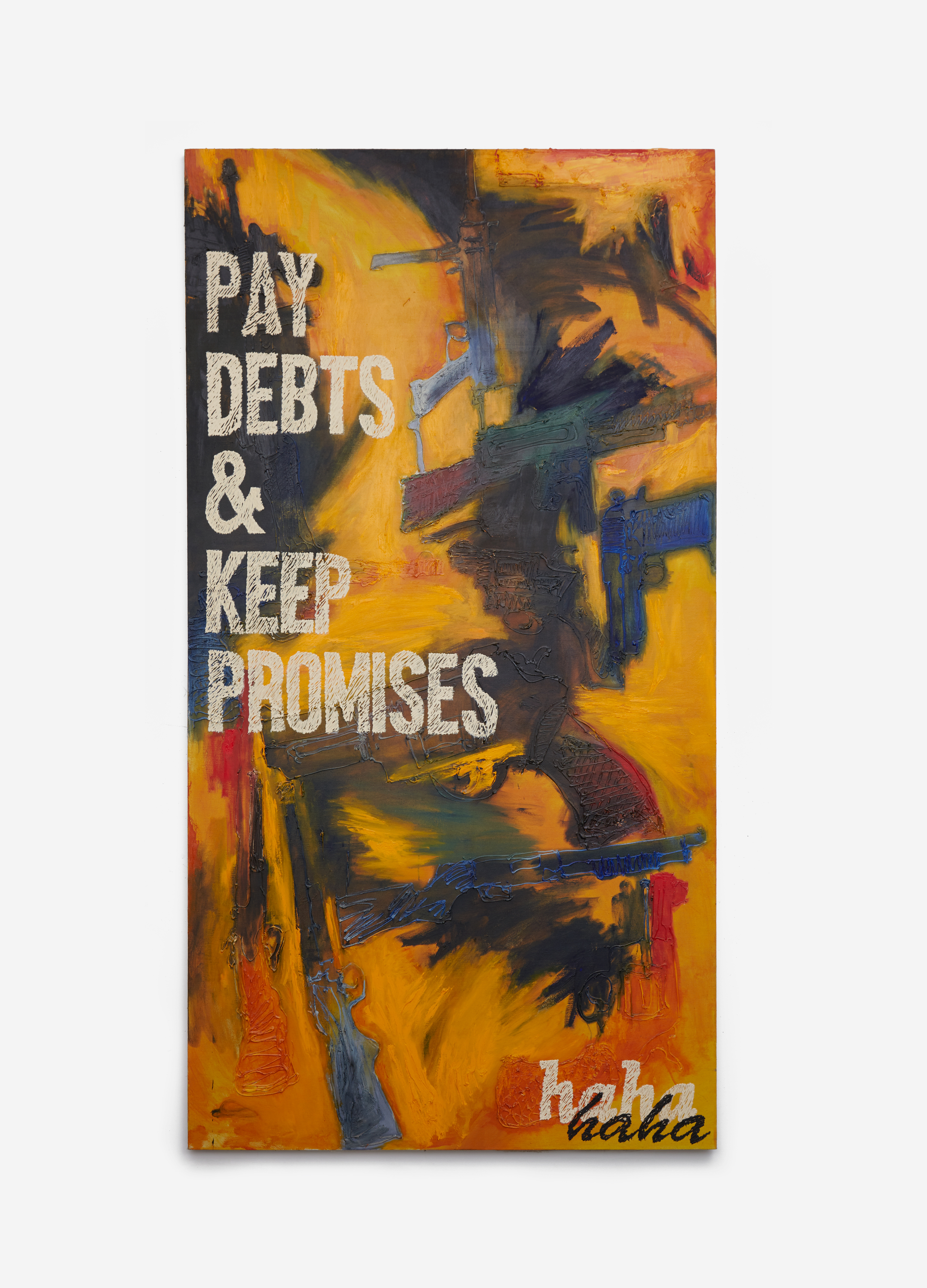
as rad says, “this kind of lightly­worn hat of a persona seems very natural for anyone who had 10 screen names growing up.” expanding on rad’s fluid exploration of the rifts and frissons between the physical, textual, and digital worlds, perennial millennial conjures an expressive lexicon layered with references to corporate information design, emoji, social media, and other modern detritus from a constantly evolving and imploding contemporary visual vocabulary. shifts in scale, brusquely applied strokes and varying degrees of layering and impasto lend an immediate physicality to the works. as a dialectic about who paintings are for, and the real and invented narratives generated therein, a second, self­ reflexive commentary emerges, one which engages generational attitudes toward painting as a medium, and the self­ assurance/self­ doubt feedback loop that seems to characterize contemporary art. as a deconstruction of the built associations of recognizable imagery, they distill the aggressive momentum and anxiety of the information age.

* see more of nic's work here *


art exhibit // tangerine dream collective // galerie pangée, montreal


to my delight, my delicatessen collaborator, sarah osborne, was also showing work in another exhibit during our pop-up/my montreal stay called tangerine dream collective. it took place at montreal's galerie pangée and featured work by sarah plus two of her friends, joani tremblay and elise windsor. the exhibit was playful, colorful, bright and fun. although the three girls have diverse styles, their artworks complemented each other well and i most definitely wanted to buy all of it. see pictures and more info below:

the tangerine dream collective is composed of artists sarah osborne, joani tremblay and elise windsor. with a young and contemporary vision,  the collective plays with simple and bold forms as well as large-scale installations composed of several works on paper seen and presented as objects. what influences this collective the most are flora, architecture and the world of art, as well as their status as women. for the occasion of this exhibit, the gallery was transformed into  a living sculpture in the form of an installation using pop colors and mixing paintings, drawings, photographs, objects, plants, shelves and other sculptural devices. works on paper became objects displayed as in a showcase window such as to question the relationship between staging and curation.

more images of the work can be found on artsy here.


art // women words, phrases, and stories: 1,000 paintings by betty tompkins // flag art foundation


one of my latest, favorite exhibits just closed: women words, phrases and stories: 1,000 paintings by betty tompkins at the flag foundation. there the walls were full of various sized paintings covered in words that describe women. i felt a lot of synergy with the artist and her process as she is at heart a collaborator. i even had the chance to attend a special event in the exhibition space, where betty allowed women from all backgrounds to get up in front of the group and read out the words on the walls. it was empowering and magical. 

more about this exhibit below (from the flag website):

in 2002 and 2013, tompkins circulated the following email: “i am considering doing another series of pieces using images of women comprised of words.  i would appreciate your help in developing the vocabulary.  please send me a list of words that describe women.  they can be affectionate (honey), pejorative (bitch), slang, descriptive, etc. the words don’t have to be in english but i need as accurate a translation as possible. many, many thanks, betty tompkins.” the response was overwhelming, with over 3,500 words and phrases in seven languages submitted, equally split between men and women. in 2012, tompkins was invited to create a performance in vienna where 500 of the words and phrases were read aloud. inspired by that performance, the artist then set out to create 1,000 individual word paintings, intending the series to be presented en masse once complete. on january 1, 2013, tompkins created the first painting slut (#1).

throughout women words, tompkins layers stenciled, freehand drawn, and pressed-on text over imagery, which includes lace overlays, gauzy close-ups of the female body, and a sampling of styles from what the artist refers to as the “old-boy painting” network – de kooning, fontana, guston, morris louis, newman, pollock, and richter.  derogatory, reductive, and dismissive language such as venus, piece of ass, and the only thing that would make her more beautiful is my dick in her mouth, seem to reveal that women are often still viewed through the lens of desire or reproach. is such language the result of love, fear, control, or anger? tompkins does not offer answers, presenting women words in the same straightforward and non-judgmental approach as her renowned fuck paintings.

tompkins’s oeuvre has never demurred from provocative subject matter; the artist’s ongoing fuck paintings (1969-1974; reprised in 2003) center on tightly cropped photorealistic images of sexual intercourse. according to the artist, “my first husband had this great collection of porn and i was looking at it one day and thought: if you take out the heads and legs—all this boring stuff—and get down to the money shot, this is beautiful…really formally beautiful.” highly sexualized imagery and language have since become ubiquitous in mainstream culture and have shifted the context and reaction surrounding the fuck paintings, once dismissed as too explicit and because of tompkins’s position as a female artist with a sex-positive attitude. it wasn’t until the paintings’ presentation at the lyon biennale in 2003, that the work received an extraordinary reception and established tompkins at the forefront of first generation feminist art.

* photos are by genevieve hanson, nyc -- all images are copyrighted by betty tompkins


art exhibit // gordon harrison hull at bryce wolkowitz gallery


my favorite exhibit of the summer, department of the interior featuring work by gordon harrison hull, just closed at bryce wolkowitz gallery. i love hull's work and it's inspired me to get drawing again; it's simply curious and colorful. one of these days i solemnly swear i will start a daily practice focused on drawing and poems. the exhibit was featured in t magazine in which hull said, "there's no such thing as a mistake -- i have to deal with anything that could be a mistake and i make it into something that's positive." well said.


art exhibit // swingers wknd @ bushwick open studios // curated by tribble & mancenido


my longtime pals + collaborative art couple, tribble & mancenido, curated a stellar exhibit at bushwick open studios this weekend. swingers wknd featured creative work by an eclectic mix of contemporary artist couples including  russell tyler & trudy benson, ethan greenbaum & sun you, heather rasmussen & julian hoeber, gina magid & ryan steadman, tribble & mancenido, carrie yamaoka & joy episalla, holly coulis & ridley howard, jennie jieun lee & graham collins, jennifer coates & david humphrey, saira mclaren & mike hein and tamara zahaykevich & grant huang. the exhibition pays homage to a 1949 exhibit artists: man and wife at the sidney janis gallery. then, work by 9 renowned artist couples like jackson pollock & lee krasner, and françoise gilot & pablo picasso were paired together. sixty-six years later, tribble & mancenido "continue to explore the perpetual complexities of artistic partnerships that are reinforced by shared domestic spaces. each artist’s practice is embedded into one another, both subtle and layered despite their differing approaches to making work."

see images + more info below:

from their press release // the familiar narrative of the artist couple is steeped in the mythology of creative partnership. the married artist collaborative, tribble & mancenido will examined this archetypal phenomenon in their pop-up exhibit, swingers wknd.

the colloquial term “swinging” dates back to the sexual revolution of the 1960’s and is still used to describe recreational fornication between multiple couples. in the case of this exhibition, creative couples were invited to participate in an artistic orgy (pun intended) and to engage in free flowing discourse within a communal space. a few of the participating couples collaborated on producing work specifically for the show, while the individual members of each remaining couple chose to exhibit work from their personal artistic practices. objects from the couples’ homes were displayed alongside their respective works as symbols of domestic connectedness.


art exhibit // david salle: new paintings // skarstedt gallery


i stumbled into the new david salle show at skarstedt gallery this weekend and was blown away by his new paintings, part of his late product paintings series. the show is up 'til the end of june so you must go! in regards to his use of collage, salle says, "i want the differences to show, but to somehow be resolved anyway. it's symphonic. sometimes i like to think of myself of a kind of orchestrator." well said. i love his choice of images, juxtapositions, color usage and the titles of his pieces. they are large scale and got me thinking that i'd love to make some huge collages someday.

according to skarstedt gallery: "david salle's new paintings are characterized by both immediacy and complexity; their vibrant color and highly energized, dynamic compositions display a marked evolution from his most recent exhibition, ghost paintings, shown at skarstedt's upper east side gallery in 2013. salle's late product paintings can be seen as both revisiting and providing an extension to his 1993 series, early product paintings, in which flatly painted backgrounds of collaged product advertisements were the stage upon which present-tense painting operations were carried out. salle's late product paintings bring this premise to a much fuller, performative, and masterful resolution. exploring the intangible relationships between subjects, salle's images float in a fragmented world of poetic simultaneity. drawing images from a variety of sources, salle combines them into paintings as one would create a collage. though often surprising, his connections are never forced; they have a non-programmatic, improvised quality, and they arrive at a place of buoyant equilibrium." more about this exhibit here.


* images courtesy of skarstedt gallery // exhibition is open thru june 27 *


curatorial // 5 phat art exhibits recently


i make it my mission to see art as often as humanly possible. living in chelsea means free, easy access to constant visual stimulation and inspiration. these were 5 of my favorite exhibits as of late:

1 // devin troy strother: space jam at marlborough chelsea

from the press release: "the exhibition’s title, space jam is taken from the hit 1996 film starring michael jordan and the looney toons. conceptually strother looked towards space jam as a sentiment, a film he grew up with, but also a play on words: “space” in relation to being challenged with marlborough chelsea’s large space, and “jam” as a verb meaning to do something quickly, art and growth in this case. the galleries will be paved with three different floors, two replicating proper basketball courts, and one of stock carpet depicting outer space, typically for outfitting movie theaters or children’s daycares. the paintings and sculptures further Strother’s existent artistic lexicon, which challenges stereotypes, and points to pop culture and art history. strother explores the idea of basketball not necessarily as a sport or form entertainment, but rather an aesthetic: the hats and trading cards that have hologram stickers, the flags that are strewn about a stadium, the souvenir cups that visitors take with them. all of these important symbols at an event have transpired into strother’s paintings. there is also the allusion to space, from the exhibition’s name to the gradients in the paintings that reference jordan’s limbo state in the film. the feeling of the unknown and darkness are ever present."

2 // the memphis group at koenig & clinton

from the press release: "following its debut at the milan furniture fair in 1981, the memphis group grew to include numerous artists, designers, and architects. the gallery’s presentation spotlights a small sliver of memphis’ numerous associates: martine Bedin, andrea Branzi, aldo cibic, michele de lucchi, shiro kuramata, peter shire, ettore sottsass, and george sowden. these individuals were part of a larger group that also included founding members marco zanini, matteo thun, and nathalie du pasquier. the emblematic furniture and lighting designs on view demonstrate the collective’s greater ethos of irreverence, a challenge to modernist tenets of good taste and efficacy. pillars of memphis design include unconventional combinations of materials—such as slabs of marble alongside fiberglass and laminates—and historic forms embellished with kitsch patterns and gaudy colors. joyful, witty, and rebellious, memphis forms do not follow function. instead, memphis infiltrates the traditionally feminine domestic space with stubborn architectural structures that playfully overturn the roles of comfort and practicality in interior design. and while memphis is often classified as postmodern because of its provocative blending of historic styles, it was also international in origin and reach."

3 // lili reynaud-dewar: live through that?! at new museum

from the press release: "lili reynaud-dewar creates environments and situations in which she uses her own body, as well as those of others, to examine the dual experiences of vulnerability and empowerment associated with acts of exposing oneself to the world. evolving through a range of mediums such as performance, video, installation, sound, and literature, her works consider the fluid border between public and private space, and in so doing, challenge established conventions relating to the body, sexuality, power relations, and institutional spaces."

4 // show #24: brian willmont nevermore at field projects

from the press release: "continuing his investigation into graphic abstraction, willmont combines painting techniques- from tromp l’oeil and airbrush to hard edge abstraction- to create a unique visual vocabulary that is at once phenomenological and atmospheric. employing a surprising palette of bright pastels, Willmont’s paintings hum, pulse and vibrate, before coming into focus."

5 // titus kaphar: drawing the blinds at jack shainman

from the press release: "through the manipulation of seemingly classical and canonical imagery, kaphar introduces us to an alternate history that runs concurrent to the dominant narrative. truths emerge to reveal the fiction and revisionism inherent in history painting and the visual representation of a moment or memory. kaphar cuts, slashes, erases, layers and peels back the surface of his paintings. each method is specific to the subject and meant to ignite and recharge the image, often that of the underrepresented body."


art exhibit // spaced out: migration to the interior


red bull studios is a project space in new york that serves as an exhibition space, a recording studio, radio booth, a lecture hall and a performance space. a recent exhibit there, spaced out: migration to the interior, just closed. luckily i popped in there on the second to last day with my good friend + fellow trend forecaster sarah. we were in total awe of the supremely cool psychedelic space + proceeded to roll around on the pink fur carpet while snapping silly pictures of us and wishing we could move in there permanently.

curator phong bui says, "when i came to red bull... i at once discovered this space being quite unconventional, it has incredible curved walls, and in addition you also have the men's room and the women's room painted in glossy, acidic, fluorescent red and yellow, it had all the potential to be a film set for an austin powers movie."

redbull studios video // conversation and exploration, curator phong bui and fellow artists describe their inspiration and artworks featured in the group show spaced out: migration to the interior, held at red bull studios new york from october through december 2014.

some thoughts: it was intriguing to hear how seeing the space initially affected the ultimate theme and curation of the exhibit. and i'm also bummed i didn't know about the amazing restrooms since i have an odd obsession with colored bathrooms. but knowing us (#sara_h), we would've done a shameful selfie shoot so this is probably for the best!


art exhibit // the shapes project: perfect couples by allan mccollum


Allan McCollum // The Shapes Project: Collection of Twenty-four Perfect Couples // 2005 - 2014Acrylic with varnish on New England Rock Maple with cradled basswood panelsEach panel size: 10 x 10 inches; 25.4 x 25.4 cm

Allan McCollum // The Shapes Project: Collection of Twenty-four Perfect Couples // 2005 - 2014
Acrylic with varnish on New England Rock Maple with cradled basswood panels
Each panel size: 10 x 10 inches; 25.4 x 25.4 cm

to put it simply, allan mccollum's recent exhibit at petzel gallery in chelsea, new york was colorful + abstract. "perfect couples" featured over 30 billion unique shapes meant to represent every person in the world. while the shapes were paired together due to their similarity in form and color, the work is a beautiful representation of unique human relationships. some 280 custom colors were used, ranging from darks to brights to pastels. "perfect couples" was a compelling installation that just gave off organic energy. and as my friend rebecca stated candidly, "there's a thing behind it that causes you to think." indeed it did that.

for a saturday in september, the gallery was surprisingly empty but that made for the best viewing (and instagramming) experience. one very important person happen to make an appearance, allan mccollum himself! i thought we had asked a stranger to snap our pic in front of the art, little did we know it was the actual artist. and though the instagram turned out blurry, it was certainly a cool happening. i then (stalked) picked mccollum's brain about his work. he was approachable and honest as he explained his color usage and process. i briefly explained my own vocation and mccollum suggested i listen to terry allen's song "pink and black is coming back" from the 1950s. an appropriate recommendation, since pink is really back and black... well, it's always in. especially in new york.

AM_14_007L1.jpg

* images via petzel gallery // more about allan mccollum's work here *