compare + contrast // motorway mood


motorway mood // cultureisland 2015 // ground zero rtw fall 2015 // schmott transparent cuts 2015

motorway mood // cultureisland 2015 // ground zero rtw fall 2015 // schmott transparent cuts 2015

two completely unrelated things i've been inspired by lately: ground zero's recent fall 2015 ready to wear collection and these "transparent cuts" photographs of stones by schmott.

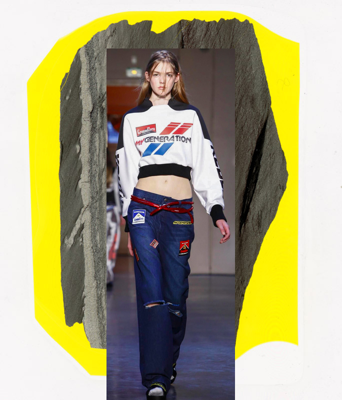
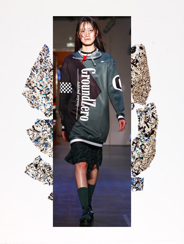
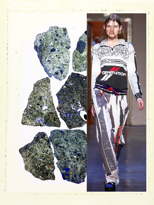
ground zero's collection uses photocollage, patches, bold + clever verbiage and graphics that look like a cross between a cigarette pack and a car racing uniform. plus oddly shaped futuristic sunglasses that are wonderful and weird.

schmott's photos feature thin sections of stone samples from the f.a. finger institute for building material science weimar, which come from motorways and buildings. the stones reflect light making them appear transparent, then they are enlarged in the darkroom and reproduced on color paper.

motorway mood // cultureisland 2015 // ground zero rtw fall 2015 // schmott transparent cuts 2015

motorway mood // cultureisland 2015 // ground zero rtw fall 2015 // schmott transparent cuts 2015

motorway mood // cultureisland 2015 // ground zero rtw fall 2015 // schmott transparent cuts 2015

motorway mood // cultureisland 2015 // ground zero rtw fall 2015 // schmott transparent cuts 2015

motorway mood // cultureisland 2015 // ground zero rtw fall 2015 // schmott transparent cuts 2015

motorway mood // cultureisland 2015 // ground zero rtw fall 2015 // schmott transparent cuts 2015

motorway mood // cultureisland 2015 // ground zero rtw fall 2015 // schmott transparent cuts 2015

motorway mood // cultureisland 2015 // ground zero rtw fall 2015 // schmott transparent cuts 2015

motorway mood // cultureisland 2015 // ground zero rtw fall 2015 // schmott transparent cuts 2015

motorway mood // cultureisland 2015 // ground zero rtw fall 2015 // schmott transparent cuts 2015

motorway mood // cultureisland 2015 // ground zero rtw fall 2015 // schmott transparent cuts 2015

motorway mood // cultureisland 2015 // ground zero rtw fall 2015 // schmott transparent cuts 2015

motorway mood // cultureisland 2015 // ground zero rtw fall 2015 // schmott transparent cuts 2015

motorway mood // cultureisland 2015 // ground zero rtw fall 2015 // schmott transparent cuts 2015


compare + contrast // blue + white wears


blue + white wears // cultureisland 2014

blue + white wears // cultureisland 2014

compare + contrast: taking inspiration from ancient chinese blue + white porcelain as well as dutch delft pottery from the middle ages, valentino's fall 2013 collection (middle + bottom images) + undercover's fall 2014 collection (top left) have made what once was fragile and antiquated, modern and wearable.

* art details // portrait painting by kris knight (middle left), 2013 + fragile flow blue photograph by kim joon (upper right corner), 2010*

compare + contrast // digital geology


digital geology // cultureisland 2014 // acne studios mens fall 2014 x seamless pattern design by bethan laura wood 2010

digital geology // cultureisland 2014 // acne studios mens fall 2014 x seamless pattern design by bethan laura wood 2010

while jonny johansson, creative director and co-founder of acne studios, called his fall 2014 men's concept "winter beach," designer bethan laura wood was inspired by the contrast of authentic and fake marble from venice, italy. both combine rock-inspired print, color and texture that feels hyper-real.

* acne products are shoppable now on the acne studios website // check out more of product designer bethan laura wood's work here *